Yogiyoga UI has been completely revamped. In digital products where incremental improvement is popular, a complete overhaul is a challenge that fundamentally changes usability. Yogiyo, which had been engaging in intense marketing with discount passes, has transformed into a service that provides AI-tailored personalization with the concept of ‘the app that knows me best.’
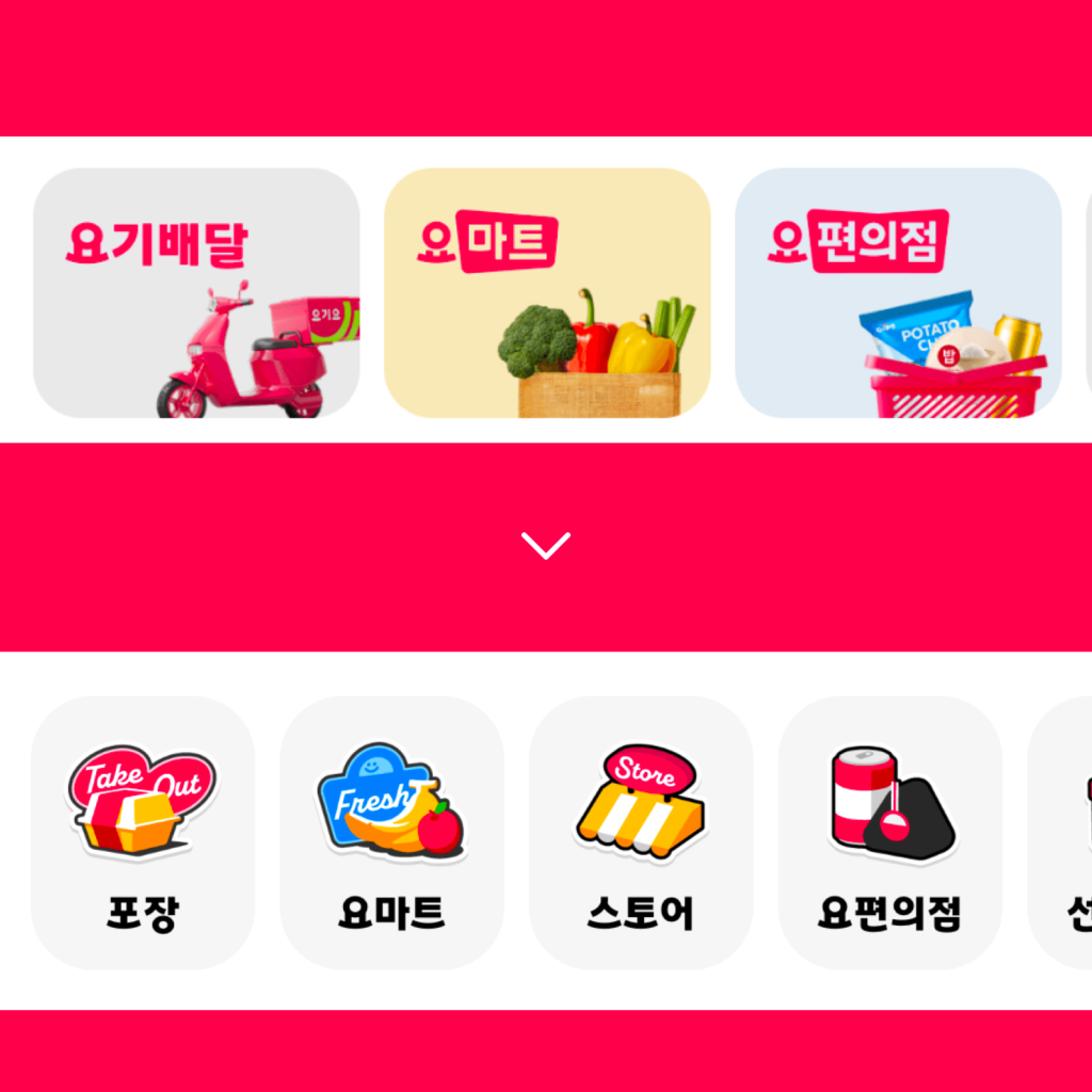
The ‘Favorite’ and ‘Search’ tabs have been removed and the ‘Discount’ tab has been created. A variety of events, promotions, and partner benefits are gathered in one place. Rather than finding and saving a specific restaurant or menu, I feel the intent is to help people get food delivered at a cheaper price. The delivery fee has become very expensive.
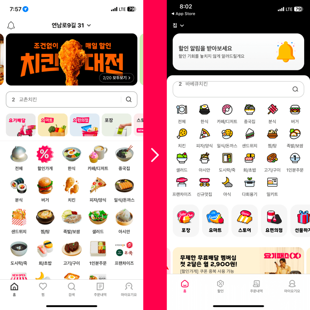
Not only does it recommend the food you previously ordered, but it also recommends menus that suit your taste, taste, and texture. The top of the home tab, which is the first thing you see when you turn on the app, displays information tailored to the customer's context, such as order status, discounts, and weather. It is said that AI personalized recommendations will be developed more elaborately in the future and will be updated sequentially.
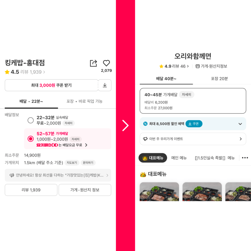
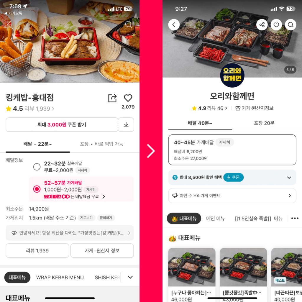
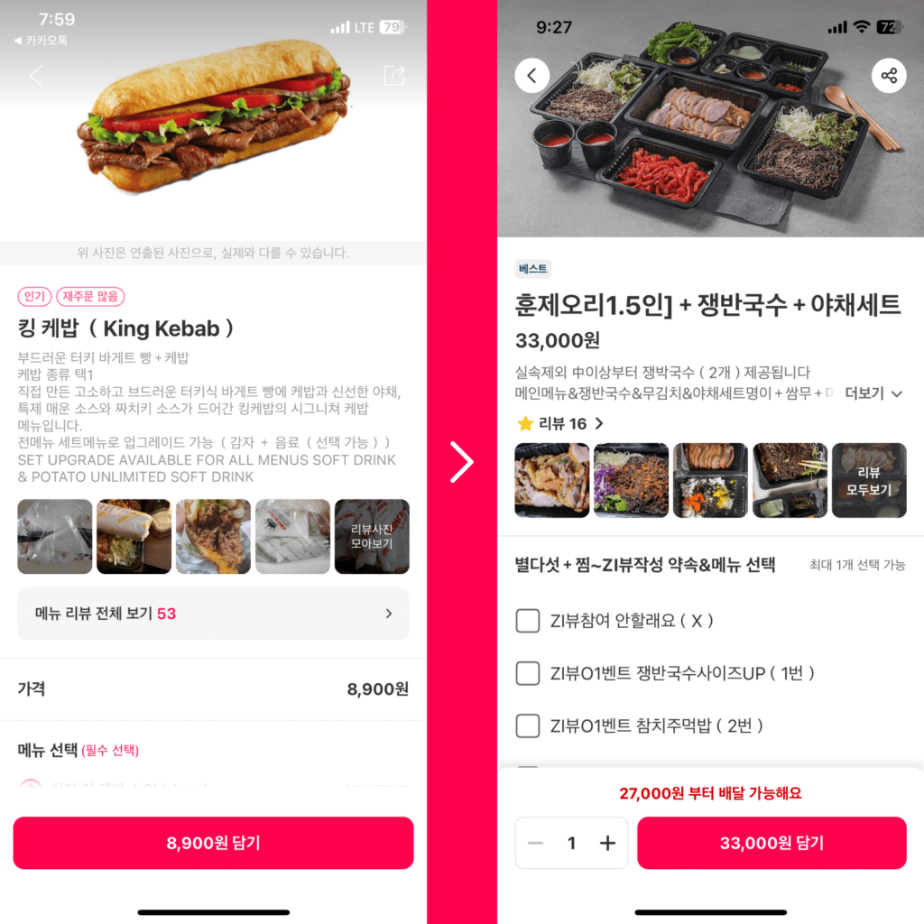
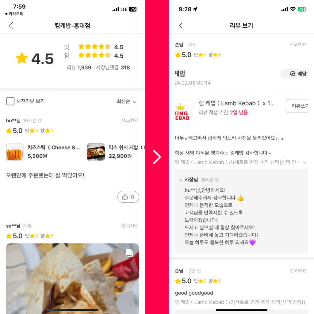
Overall, the contrast of visual elements has become stronger. In particular, the visual impression of key pages during the food menu navigation process has changed significantly.
Home's menu icons, which have many color levels and detailed shapes, have been replaced with a simpler, clearer style. It was difficult to identify because there were multiple highly complex visual elements, but identification was made easier by limiting the number of shades and using dark, dark outlines. Category icons are depicted three-dimensionally using perspective.
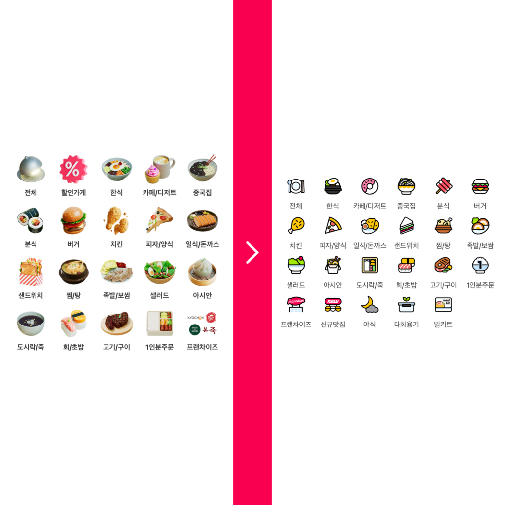
The thin, light-colored font has been changed to a bolder, darker color to make it easier to read. The alignment lines that were divided into several columns have been tidied up, and a sense of rhythm has been created in the irregular font sizes.