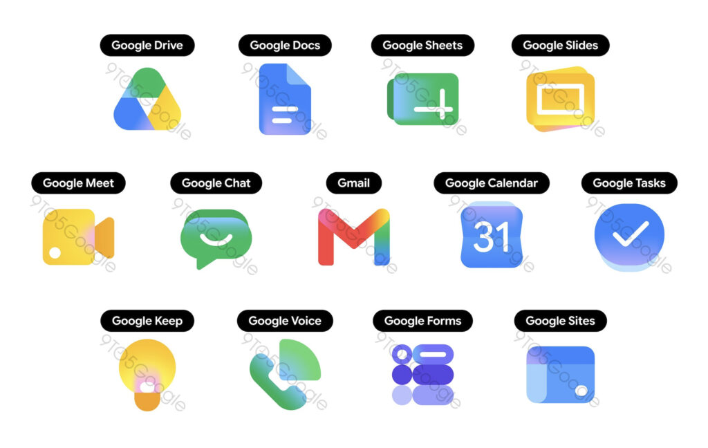
Speculation is circulating that Google app icons across the board will change to a gradient style. According to an internal source at the Android-focused media outlet 9to5Google, Google is internally preparing a new gradient-centered icon system.
This change aligns with the new brand direction that Google has recently been expanding. Google applied a gradient to its new 'G' logo in 2025 and has already applied gradients to five Google services.
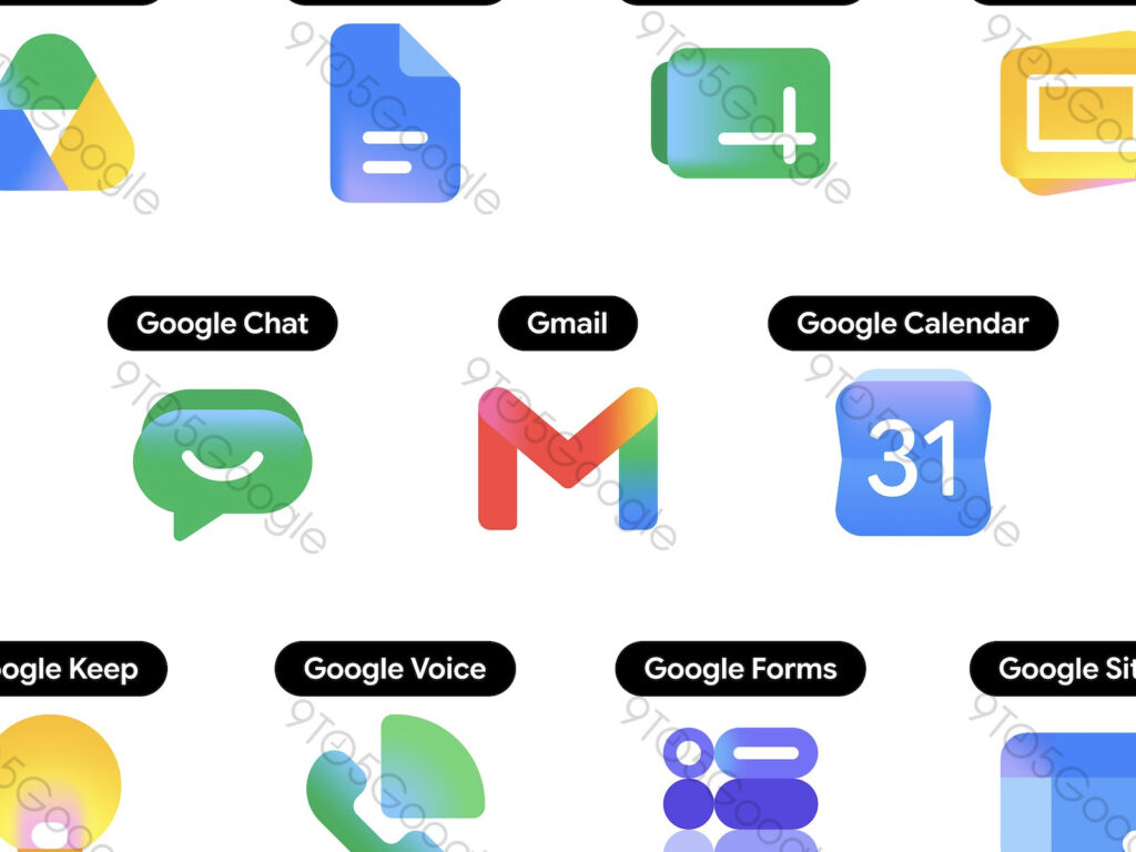
The leaked icons feature a shape centered around rounded figures overall. Gradients were extensively used to give each app a distinct personality. Gmail has a high proportion of red, while Calendar is blue-centric.
This redesign appears to be a move to strengthen the visual language of the AI era, centered around Gemini. The final design and release date have not yet been officially confirmed.