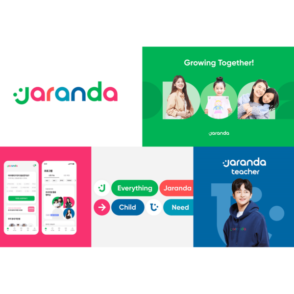
Kids edtech platform Zaranda has released a new BI.
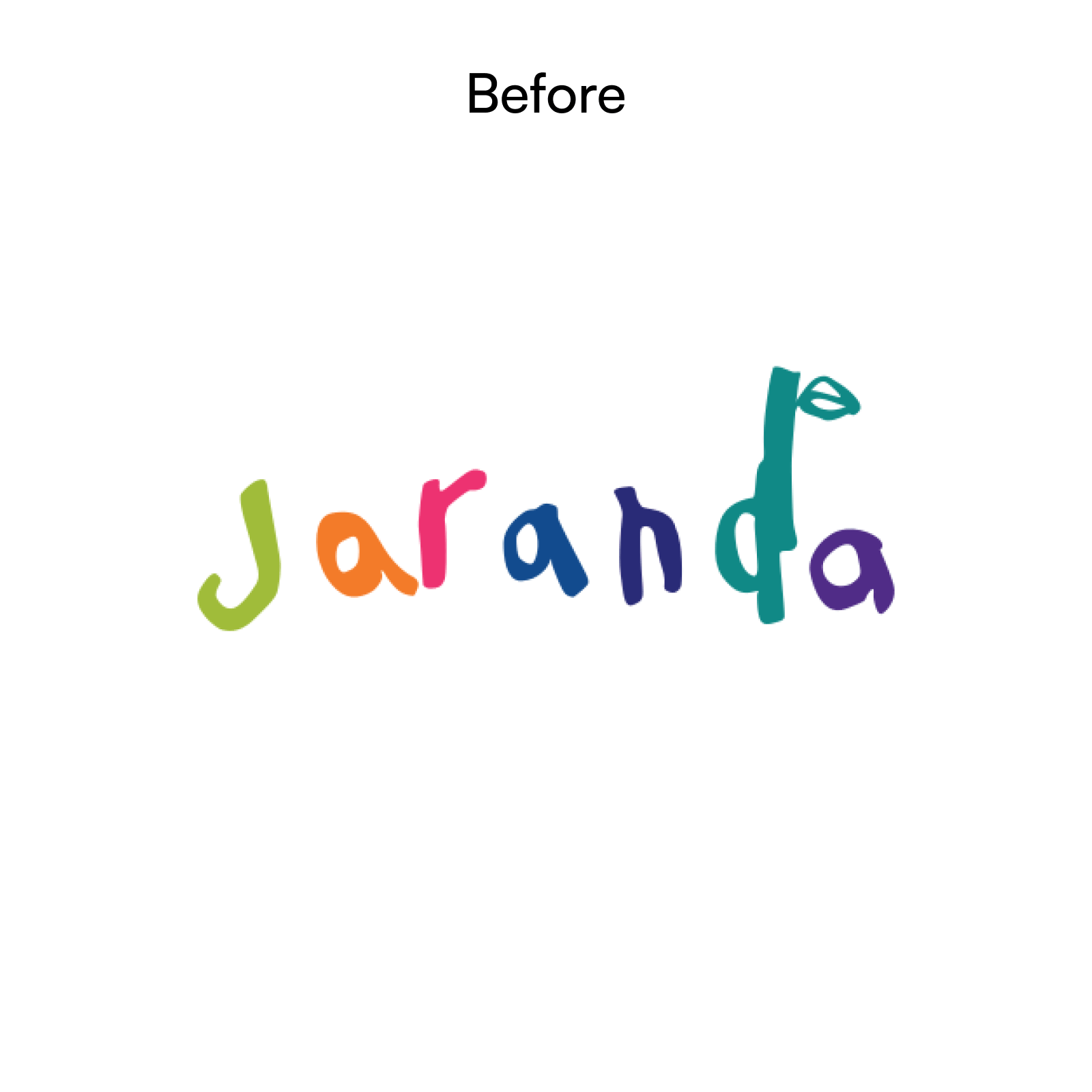
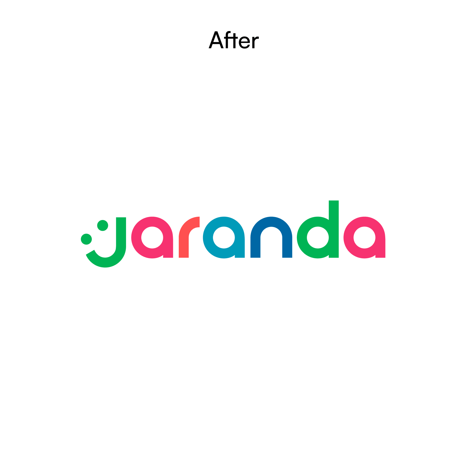
The previous logo was a calligraphy written happily by CEO Jang Seo-jeong's child who received grape jelly. The new logo embodies the joy of growth and evolution through systematic professional services. The logo has changed from a logo full of fun with children to a logo that expresses professional services that change the care experience by focusing on parents.
Jalanda acquired 'Growing Mom', a data-based parenting consulting company, to strengthen its expertise, and established 'Child Growth Research Institute'. At the Child Growth Institute, experts in clinical developmental psychology gather to research parenting solutions that suit the child's temperament. We also unveiled a 'Premium Care Membership' that provides 1% teacher satisfaction and 100% matching, self-made play kits, and an emergency care hotline.

Typography feels like it has gone from nature to puzzle. The impression of strong rapport with children has changed to the impression of having a systematic system. Freedom and enjoyment can be strengthened when expressing expressions related to children. In this rebranding, the impression of 'growth' was emphasized rather than 'play'.
Typography feels like it has gone from nature to puzzle. The palette retains the tones of the previous logo, while still retaining the natural colors. It seems that it is difficult to understand what the symbol of a smile means by itself. I think it can be more strongly imprinted if it is used more boldly while following the rules rather than using it as it is written in the word mark.