Typography Seoul carried out rebranding together with Manual Graphics. Typography Seoul is a family company of Yoon Design Group and has been published since 2011, claiming to be a 'type & typography specialized media'. Highlights notable contemporary designs and designers.
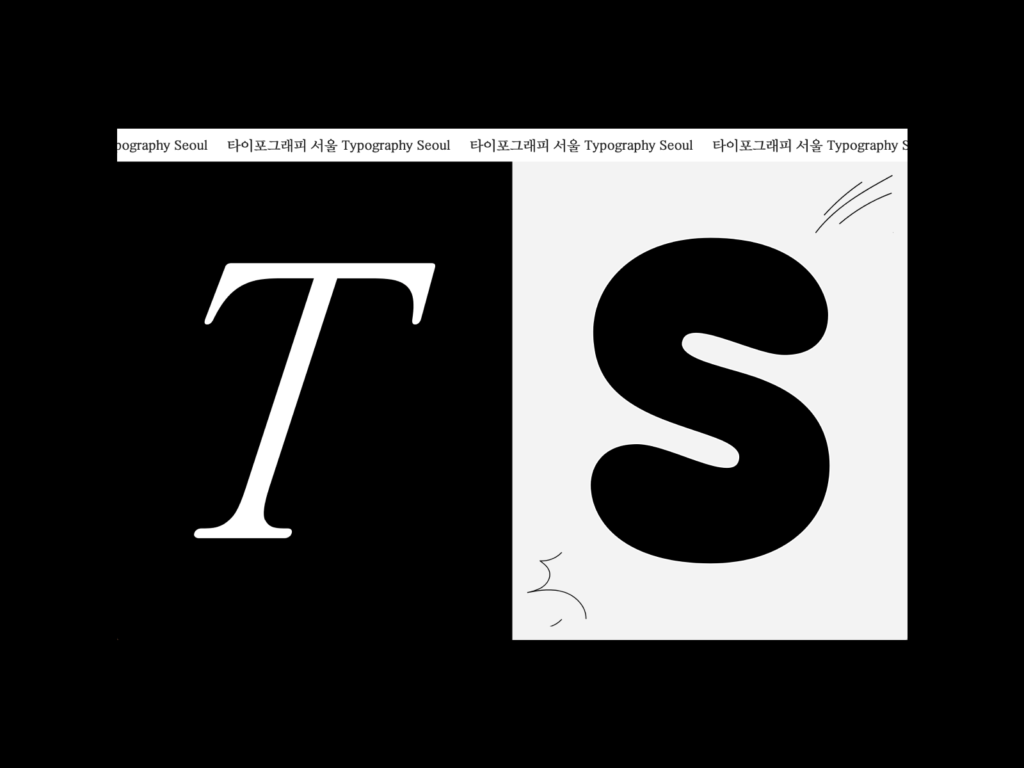
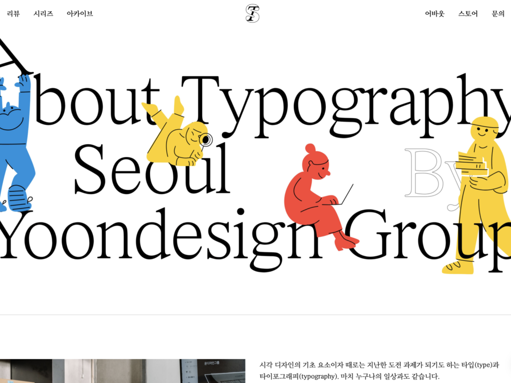
The homepage has been improved with a new logotype and symbol, and a unique design. We constructed an identity using Typography and the first letters of Seoul, T and S. The shape of the slanted T inside the S made of lines is impressive. The elegantly shaped title font and naturally flowing body font are attractive.
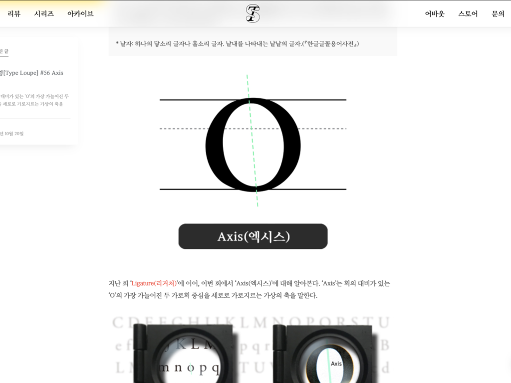
When accessing the homepage, it is divided into T mode and S mode. T is a neat shape that is good for exploring information, and S is a unique shape that is fun to look at. You can switch modes anytime, anywhere by pressing the bottom right button, and the animations are really attractive. The various content on the Archives page is now searchable, and you can also search tags by interviewee, column, or author.