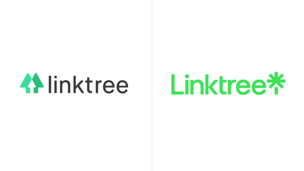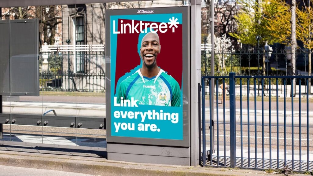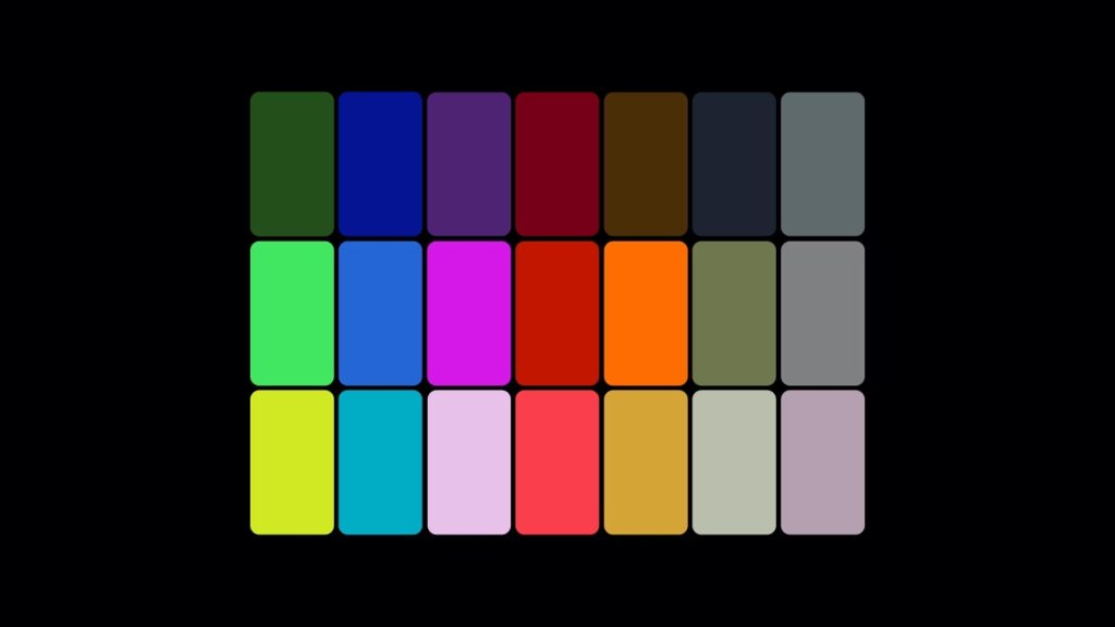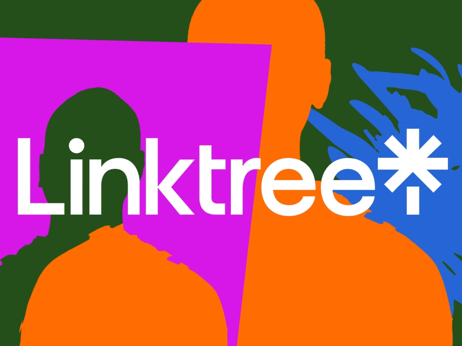

Link Tree is a service created because you can only use one link in your Instagram profile. It acts as a collection of links to various services and aims to be a one-stop shop for musicians based in Australia. Earlier this year, it underwent a rebranding with New York-based design studio Collins. Based on the maximalism visual language, we tried to convey a variety of rich impressions. Animation silhouette processing that deals with two-dimensional elements in 3D space conveys a sense of depth, Link Sans Exclusive fonts can be used anytime, anywhere. It's also amazing that every color combination in the palette meets AA standards.
However, the colors, fonts, and key visuals remind me of Spotify. It is difficult to read the message you want to convey by changing the clear expression of trees and arrows to a metaphor that looks like fireworks. Even if you try to read it as a tree, it is difficult to figure out what shape it is because the pillars and leaves are broken. Every change has its awkwardness. After all, your impressions will change depending on your future actions. In what direction can the link tree grow from a simple landing page?