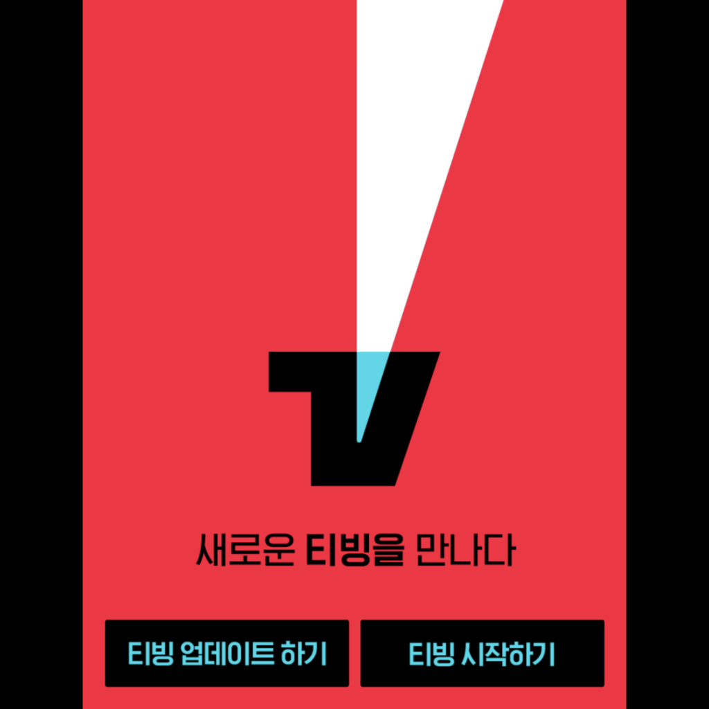
Teabing introduced a new BI. Teabing used a logo that mixed white letters and purple shadows on a red background. It delivered a bouncing feeling unlike the various OTT services using a black background. In this update, the motif has changed from shadow to light. I use black letters and mint light on a red background. Using the effect of the three primary colors of light, it conveys the feeling of turning on an intense spot light on the red carpet. It is a visual strategy that stands out among the numerous OTT services.