
The duo 'okdal', who have been loved for their music that fills the sweetness of everyday life, collaborated with Sparks Edition to create a new brand identity. Just like their music that conveys melodies that soothe emotions and affectionate messages, their visual language also contains warm emotions.
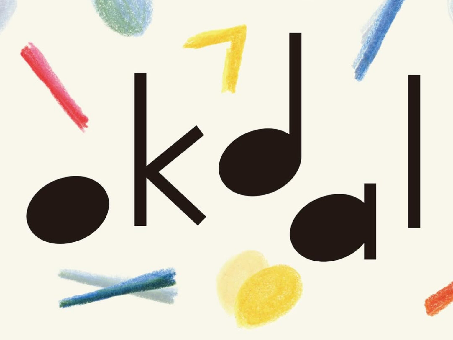
This renewal starts from the concept of 'dancing dots and lines'. When the alphabet 'okdal' is interpreted in a formative way, three dots (circles) and three lines (straight lines) are revealed. When these elements are combined, three 'notes', the basic unit of music, are naturally created. These notes move as if dancing on a staff, forming a melody, and that melody is connected to the flow of emotions that Oksangdalbit is trying to convey.
Rooftop Moonlight has pursued a warm connection that shares emotions with others through music, beyond simple melody. The dots and lines that symbolize musical notes are the waveforms of emotions, and the process of them coming together to form a song resembles the journey of people understanding and comforting each other.
We added wit to the symbol design. Instead of the three dots and lines derived from the existing formative language, we placed a graphic element utilizing a quarter rest, which means a one-beat pause in a musical note. This reminds us of the moment of catching our breath in everyday music, and symbolically expresses the affectionate attitude that Oksang Moonlight has consistently conveyed.


