
Lamborghini has refreshed the brand's visual identity for the first time in 20 years. The changes are to reflect a decarbonization strategy for sustainability called ‘Towards the Heart of Taurus’ (Direzione Cor Tauri), which targets electrification. We plan to launch a pure electric vehicle in late 2020 while maintaining Lamborghini's DNA of being brave, unpredictable and authentic.
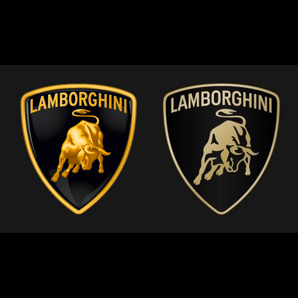
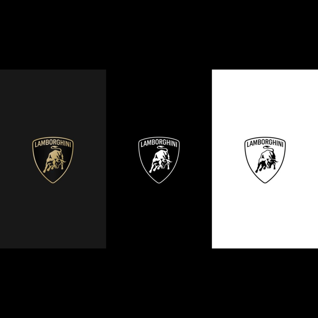
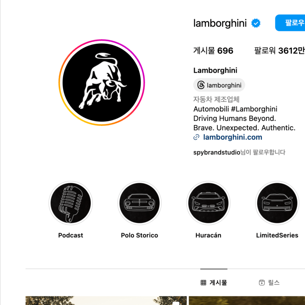
The overall silhouette of the bull used since the 1960s was maintained, but changed to a minimalist expression. The thickness did not disappear completely, but was expressed as if it was slightly protruding. The expression of sparkling light has been reduced and the shading depicting the bull has been simplified. Black and white are used as the basic colors, and gold and yellow are used as accent colors. In the digital environment, the bull leaps out of the shield. When used with a wordmark, it is included in a shield, but as a digital touch point, the bull is used alone.
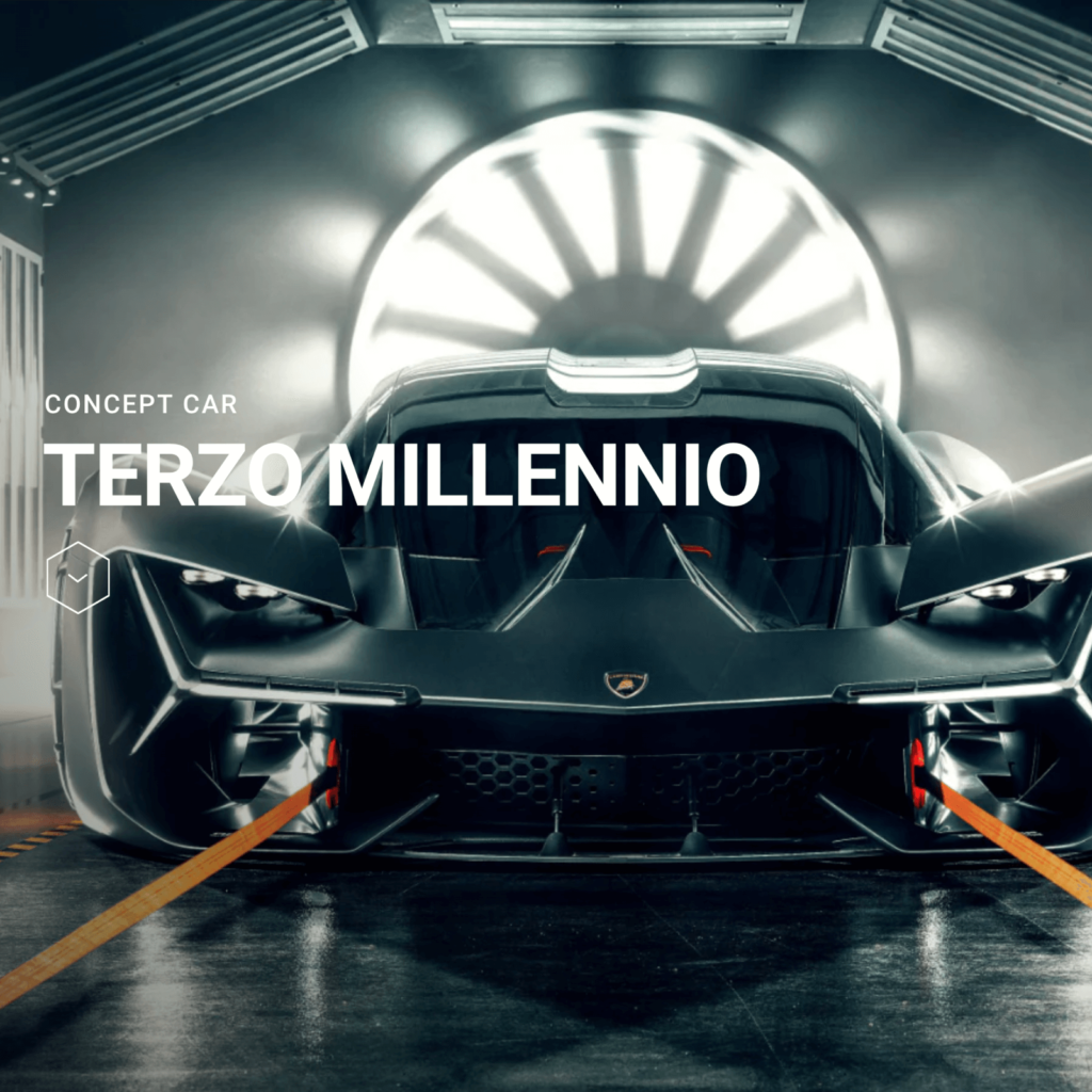
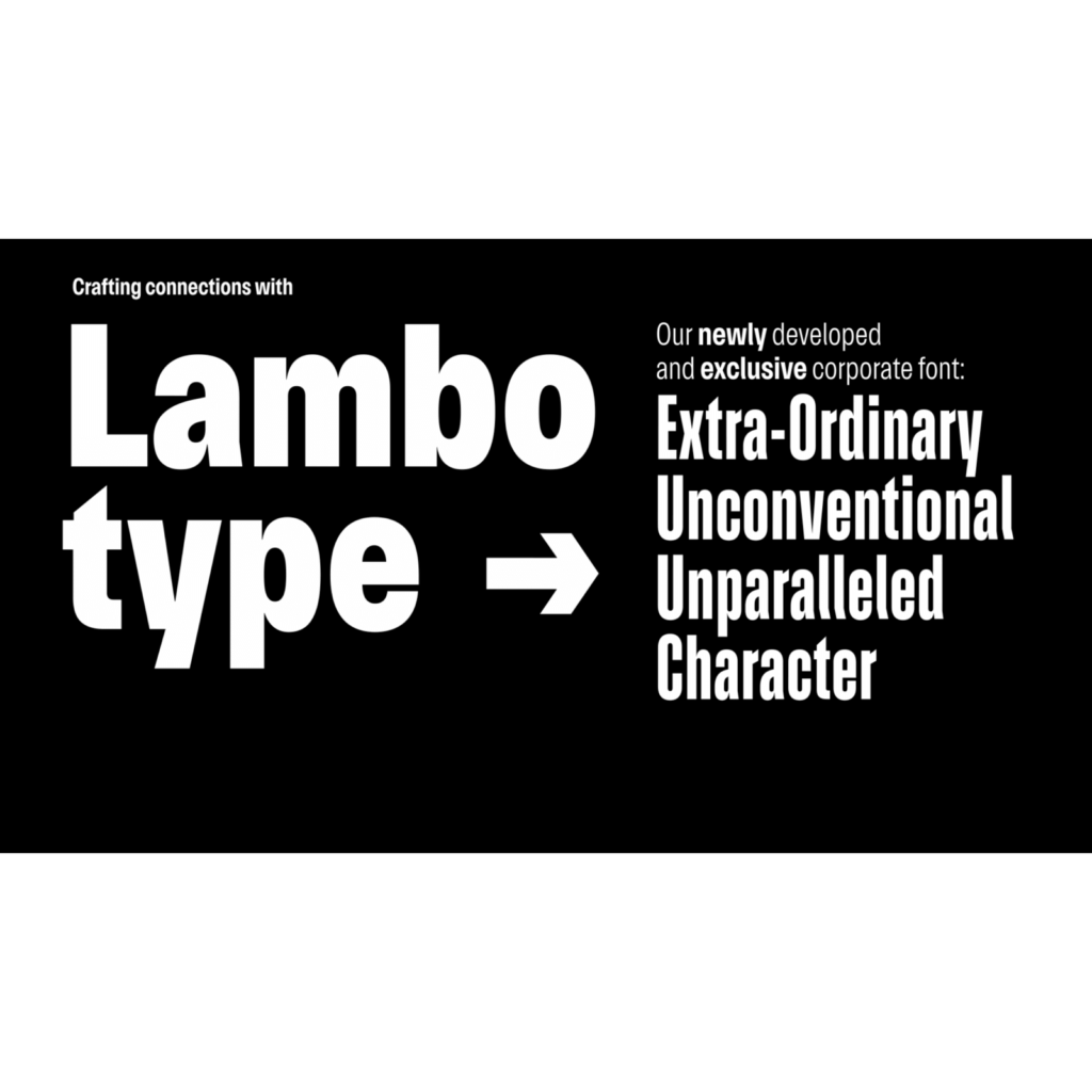
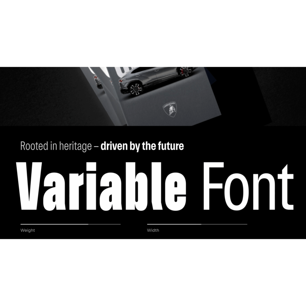
We also created a dedicated typeface, 'Automobili Lamborghini', inspired by the lines and angles of cars. It is a tall sans serif. The ends of the top and bottom strokes of some letters are uniquely cut, giving a strong sense of pride and speed. The curve was expressed closer to a round rectangle than a garden or oval. We also developed an icon set in collaboration with Lamborghini Centro Stile. The hexagonal buttons and icons used on the web and in apps are impressive. The new font and icon will be used across all of the company's official channels and will also be applied to cars in the future.
We are adapting to future changes while maintaining our heritage. It seems like the golden bull that everyone remembers has been brought to life well. However, there is also the impression that change is overdue at a time when many automobile companies are already rapidly moving toward electrification. Looking at this thought and the stronger shade contrast, the bull looks a little depressed.

I wonder if the unique ligature-style cursive used on the vehicle will also change. Lamborghini's vehicle design has a lot of geometric shapes, so it has a sharp and clear feel, but it would be nice if the free-feeling wordmark continues to be a focal point in the future.