Decathlon has rebranded in collaboration with brand consulting firm Wolff Olins. Decathlon is a French sports retailer with over 2,000 branches and is sometimes called the IKEA of the outdoor world. Since our founding in 1976, we have been making sports equipment for beginners and experts for 48 years. In keeping with its massive size as the world's third largest brand, we have created a new brand identity to increase our influence on sports culture and new customer bases.
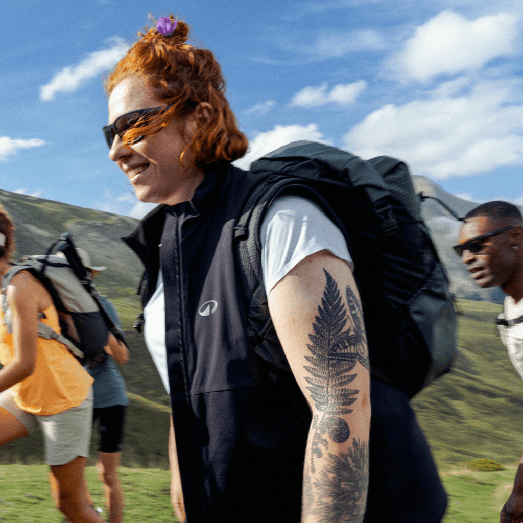
Decathlon focused on the enjoyment of the sport itself that anyone can experience rather than the victories of the elite. Our goal is to help everyone experience the joy and wonder of sport at a level appropriate to their level and ability. We integrated our complex portfolio of 85 brands into one brand and developed a new symbol.

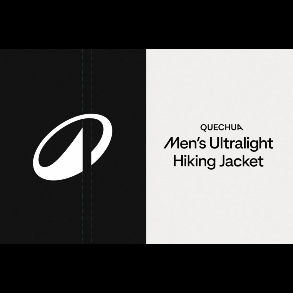
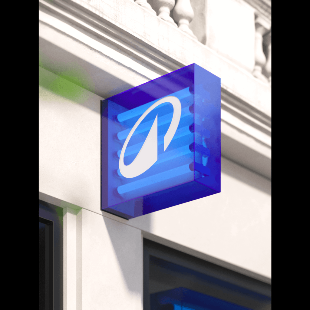
Inspired by the bold and heavy wordmark heritage, we created a dynamic new symbol, 'L'Orbit'. We applied a unique angle of A, as if it were leaning on one side. The slanted oval with a cheerful rhythm appropriately expresses the movement of outdoor sports. The slightly extending arrow feels like a mountain. The light color, which was close to green, changed to a color closer to a deeper, darker blue. It's like looking at the sky on a sunny day.

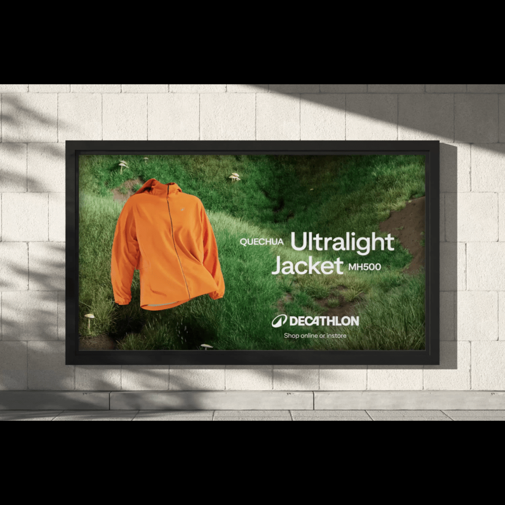
The wordmark has been fine-tuned to make it easier to read. The width of the letters themselves and the spacing between letters have been expanded. The unique connection between C and A was maintained, but DE and ON were separated. ‘Decathlon Sans’, a unique font derived from the wordmark, was produced by ‘Grilli Type’ in Switzerland.
Provides an alternative character set to represent unique slopes that mimic Futura's sense of speed. The overall impression of the writing is attractive when the angle of O used in the middle of the letter and the angle applied to the first and last letters are applied.