
Herman Miller has rebranded in collaboration with Brooklyn design agency Order. This is a change just one year after the 100th anniversary of Herman Miller.
“What we needed was a complete design system that allowed the brand to evolve and move fluidly from phone screens to physical spaces and anywhere in the world,” said Kelsey Keith, brand creative director. He said.

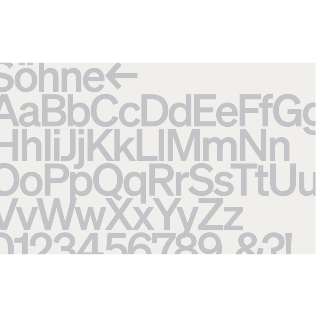
The typography changed from FF Meta, designed by Eric Spiekerman, to Söhne by Klim Type Foundry. Akzidenz-Grotesk and Helvetica come together to represent the atmosphere of the 1960s.
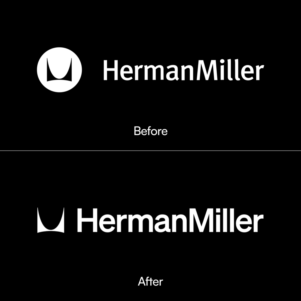
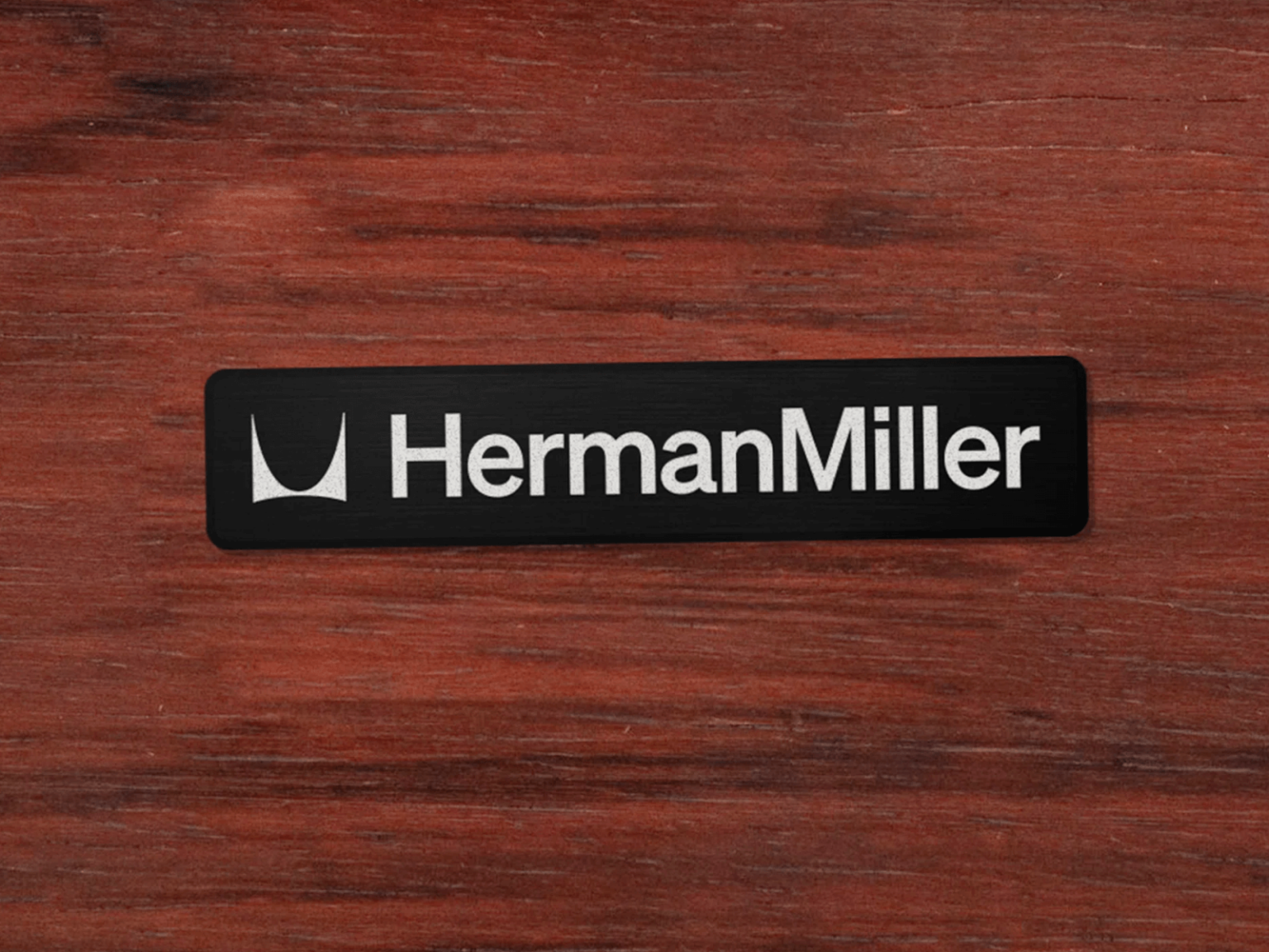
The legendary M symbol designed by Irving Harper in 1946 was retained. The symbol, which Irving Harper, who had no design training, created for free in an instant because he had no photos to use for advertising, has been in use since 1946.
Herman Miller's Brand Standard website, which consists of 21 chapters, has also been released. From abstract concepts such as What we believe, Who we are, and What we do to concrete expressions such as Color, Typography, and Photography, it is carefully included.


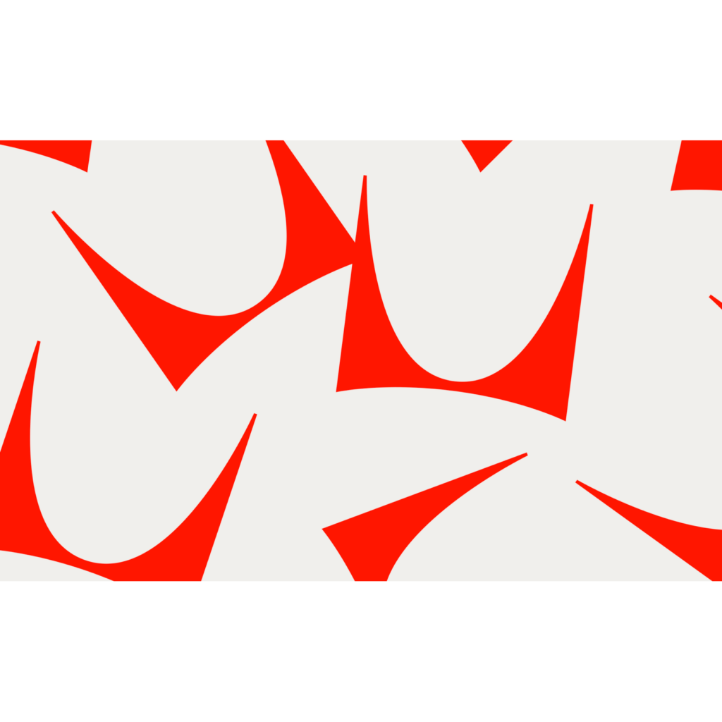
The textbook-like color scheme of white background, black letters, and red points, plus a font with a Helvetica impression, gives it a classic feel. Herman Miller's unique identity is refined and expressed through colorful furniture with a diverse palette.


©Herman Miller


