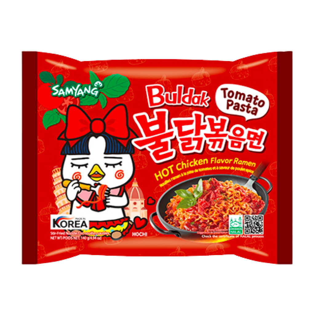
Samyang has rebranded. Samyang created Korea's first ramen, 'Samyang Ramyun', and pioneered foods such as cup ramen and scoopable yogurt. The representative brand, ‘Fildak Bokkeum Ramen’, is so famous that people all over the world know it.
In collaboration with global design agency Pentagram, the group name of Samyang Food Group and the CI of its holding company, Samyang Naturals, were changed to ‘Samyang Round Square.’ This is a strategy to strengthen our identity as a company pioneering the field that combines food and science. It contains 60 years of heritage and a vision for moving forward for the next 100 years.
In 2012, our identity changed significantly for the first time in 50 years. At that time, the calligraphy and Delicious Orange color, which expressed the shape of people and nature in harmony in a wide grassland, changed to a closer look to modernity.

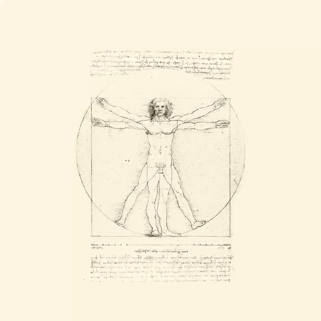
The symbol of Samyang Round Square adopts Leonardo da Vinci's 'Vitruvian Man' as a motif and uses squares and circles to express the golden ratio. It is said that the circle represents science that squares culture. Samyang, the corporate philosophy, is a combination of a circle, which fills the hunger of the mind and body and connects people, and a square, which stands for science that improves life through innovation and order.
The wordmark is quite unique. Samyang has a horizontal line at the top and a mix of right angles and rounds. I'm confused about where to hold the Roundsquare horizontally, above or below. Hangul is also a mix of right angles and curves. This impression is most noticeable in the ‘ㄹ’ of ‘la’. I feel that it is more appropriate when used on a product than when used as two lines in a group name. It's great for identifying CI on product packaging that uses a variety of eye-catching and complex visual techniques. However, the phrase ‘geometric form is technology’ seems to be frequently used recently when expressing the visual identity of many brands, but it does not seem that geometric shapes symbolize technological trust.