

Facebook, used by more than 2 billion people every day, has refreshed its brand identity.
In this refresh, Facebook has strengthened the elements that symbolize its brand. We integrated the Facebook brand from products to marketing and created a new palette centered around the color blue, which symbolizes Facebook.
“We wanted the new logo to feel familiar yet dynamic, sophisticated and elegant. “With subtle but important changes, we were able to achieve the impression and optical balance we were after.”
Design Director Dave N said:

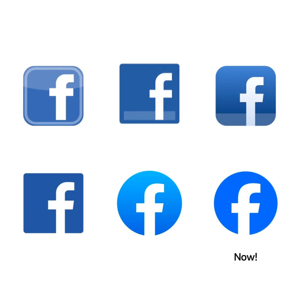
The 'f' symbol symbolizing Facebook has changed. We changed the wordmark and logo to a custom font, Facebook Sans. The pillar of f was changed to be solid and the entire decoration was changed to move to the right. The ascender has become slightly longer and the decorative elements protruding to the right have been reduced in width. The ends of the strokes of the font have a slight angle.
The blue color has become deeper and richer. It is a balanced palette that uses appropriate color changes that are closer to the real world, but makes the original blue color that symbolizes Facebook more attractive.

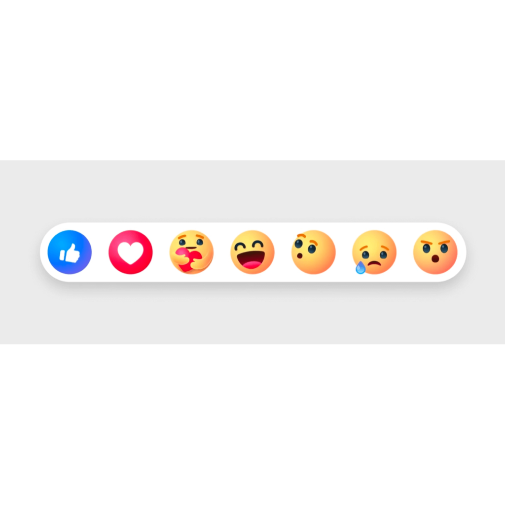
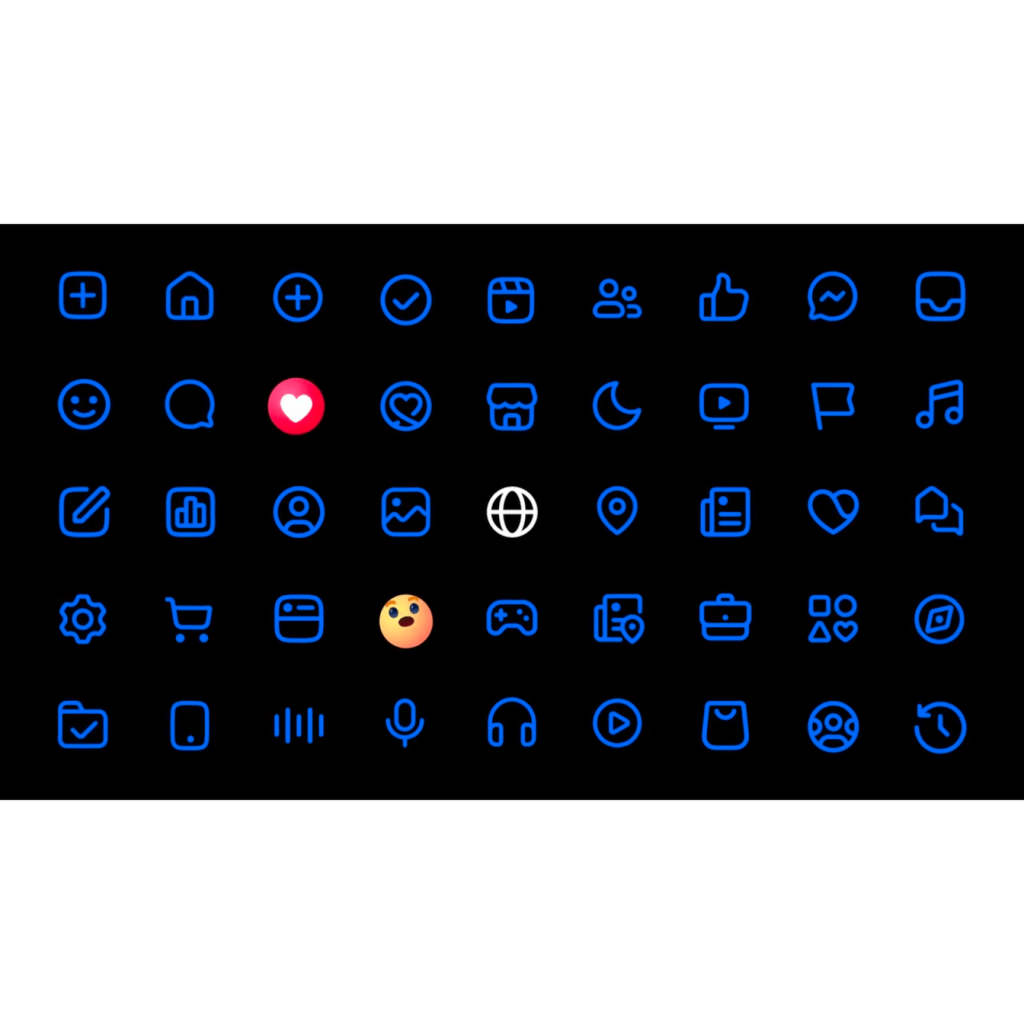
The 'Like' button, which symbolizes Facebook, has been expanded into the 'Reactions' button. The Reaction update is being tested and is expected to be released within the next few months. The entire icon system has also been overhauled to be both functional and expressive. All of these changes have been made to the app design, with fine-grained spacing adjusted as well.

Following Meta and Instagram, Facebook also reorganized its design. As a brand that has developed over a long period of time, we have created much higher quality designs while maintaining our original strengths.
The visual experience has improved, but it doesn't seem to have freshened up the impression that Facebook had. In certain countries, it is used as a national SNS, but in other countries, it is evaluated as being outdated. It's a great design, but I think it would be nice to add some fun expressions that would improve people's thoughts about Facebook.
It reminds me of the time when Facebook, which only had 'Likes', designed its own emoticons and released fresh and enjoyable 'Reactions' for the first time.


