

MLS (Major League Soccer) has teamed up with the brand studio Athletics to create MLS Go, a program for kids. MLS and Athletics reunited almost a decade after MLS rebranded in 2014.
MLS GO helps boys and girls ages 4 to 14 have an affordable local football experience. When the season begins, learn, play and play the game with your friends in the league wearing your MLS club uniform. We plan to operate in 18 markets (MLS, MLS NEXT, etc.).

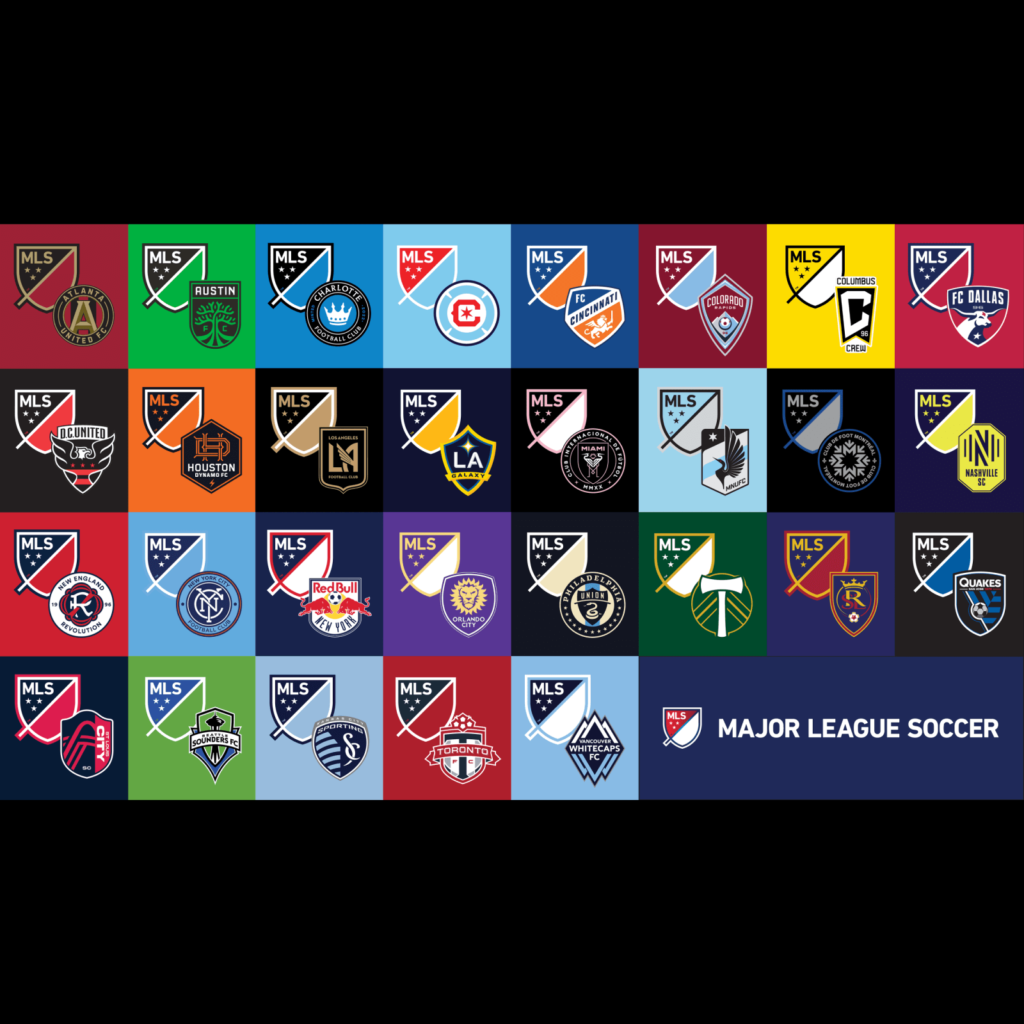
The MLS is the top professional soccer league in the United States and Canada and consists of 24 teams from the United States and 3 teams from Canada. Several community-based clubs participate, including Miami, Los Angeles and Washington DC.
There are various symbols representing the league itself and the clubs in each region. The MLS symbol is simple and uses a diagonal line to distinguish it from other national flags or corporate emblems. The club's symbol is expressed in a unique shape and palette to express one's own individuality.
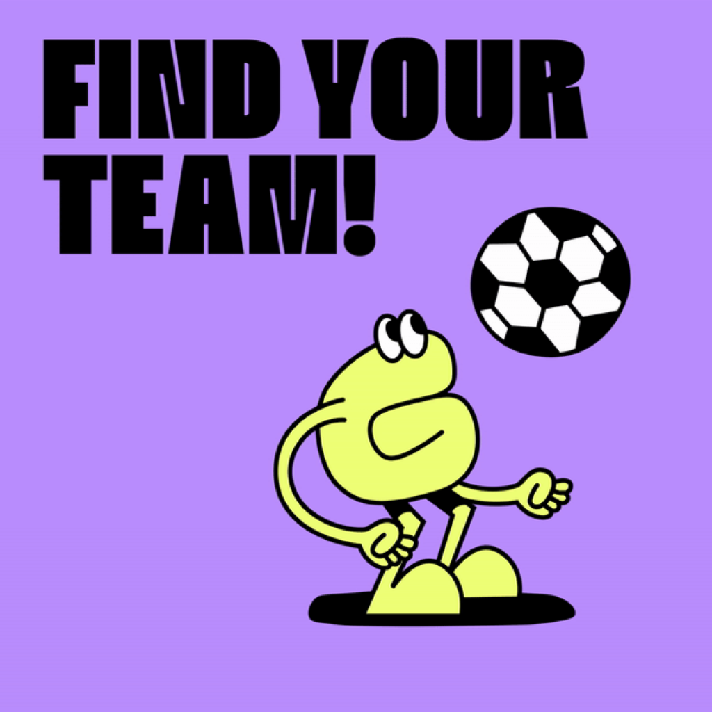
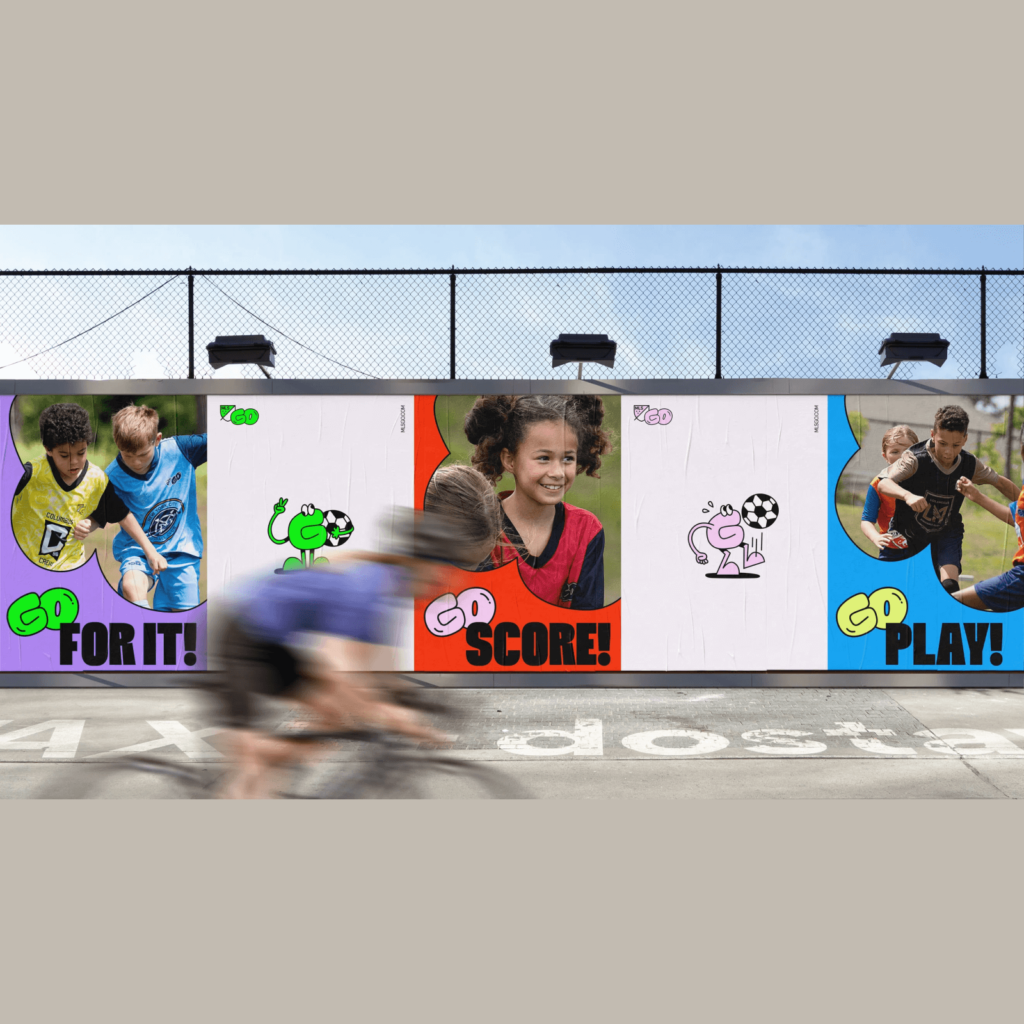
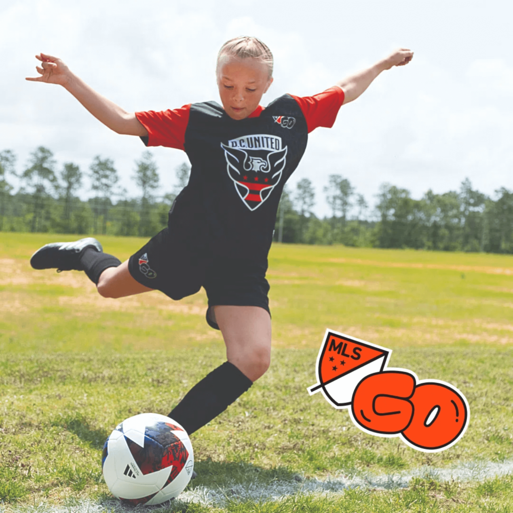
MLS Go is designed with a bouncy impression unlike the cool and energetic club symbol. It's cute to see the G character who looks like a ball of clay dribbling and cheerleading as a soccer player. The bright colors and cartoonish effects express well the children's soccer game on the weekend morning. The program brand is delivered with a focus on lively characters, and elements that represent the club's sense of belonging, such as the uniform, inherit the club's brand.
It seems like a good example of emphasizing the message of the sub-brand while preserving the identity of the parent brand. A balance that is not too different from the identity of the original MLS club is good, expressing the activities of children who move their bodies in a non-childish way. And I like that it was expressed using a value-neutral word mark. Regardless of gender, skin color, background, etc., only the joy of young children enjoying soccer melted well.


