

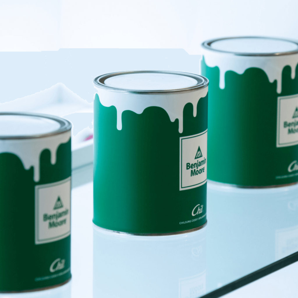
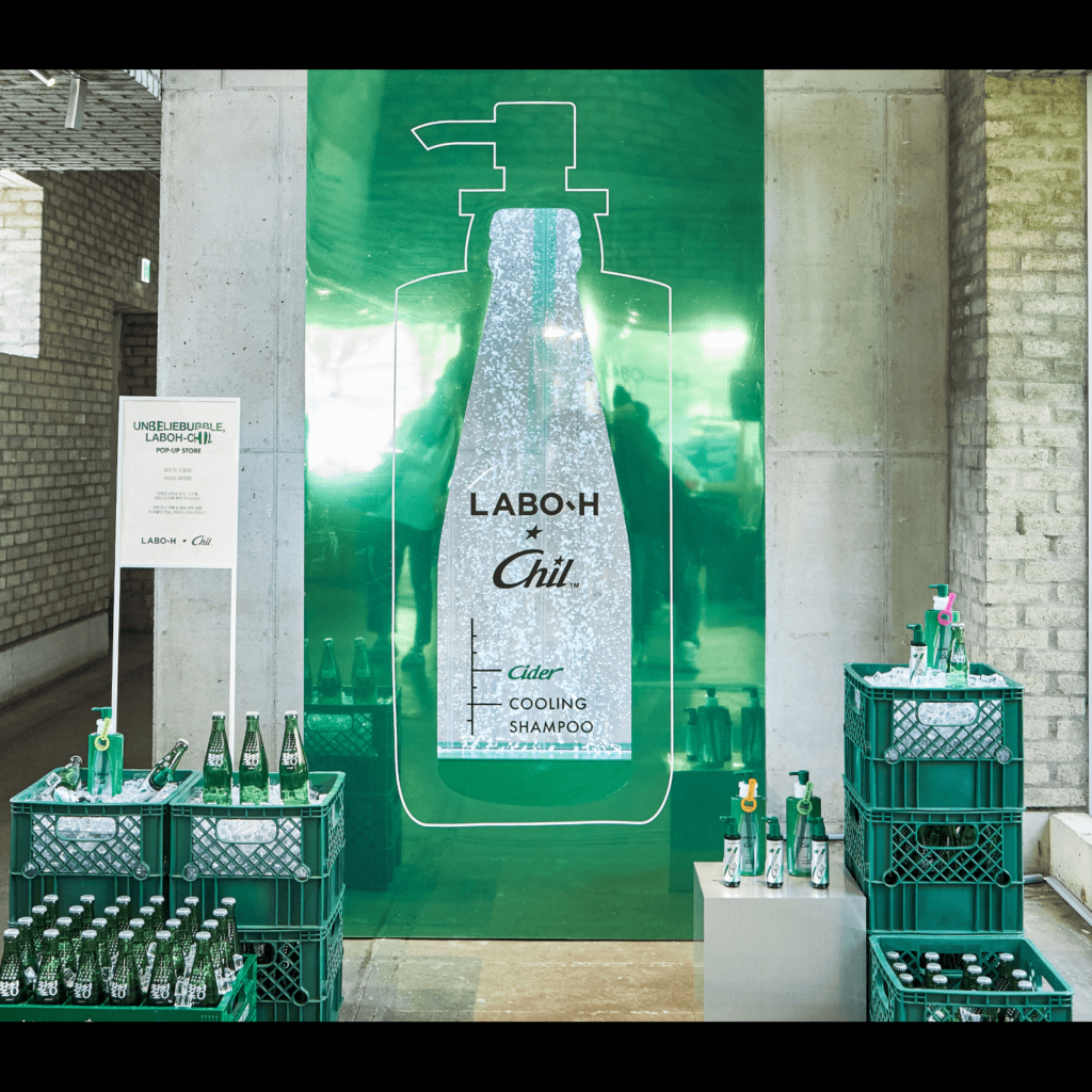
Project Chil is a brand created in collaboration with Chilsung and Studio Sawol. We connected 'chil', the first letter of CHILSUNG, with 'chill', which is used in various meanings such as playing and relaxing. We have collaborated with various brands and artists to introduce collaboration results such as pop-ups, goods, videos, and music. Starting with the collaboration with Benjamin Moore, we are presenting collaborations with Tamiya and LABO-H.

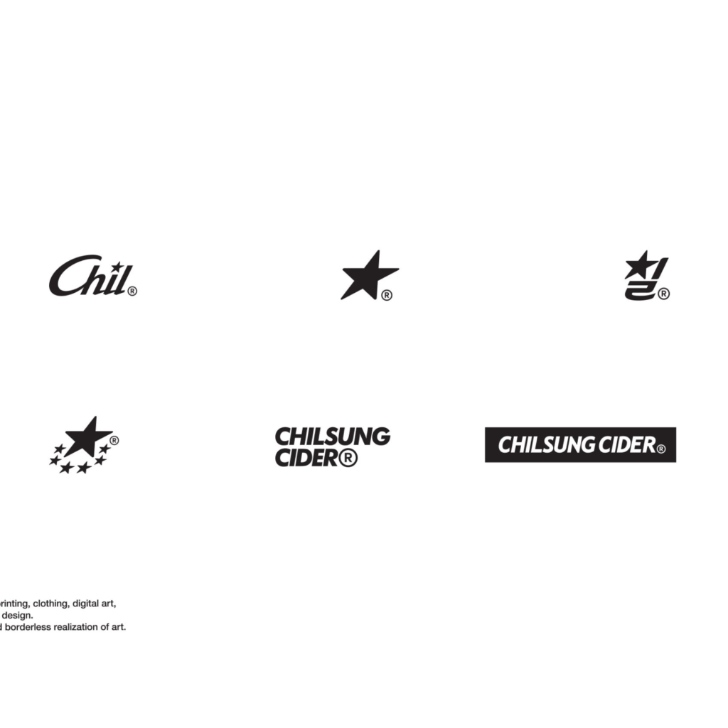
Chilsung Cider's identity is contained and the stylishly conveyed word mark is impressive. The Korean and Latin word marks and symbols based on the graphic motif of 'star' are attractive. Usually, the R mark, which means a registered trademark, is used in a very small way, but it is also memorable that it was expressed as if it were part of the logo.

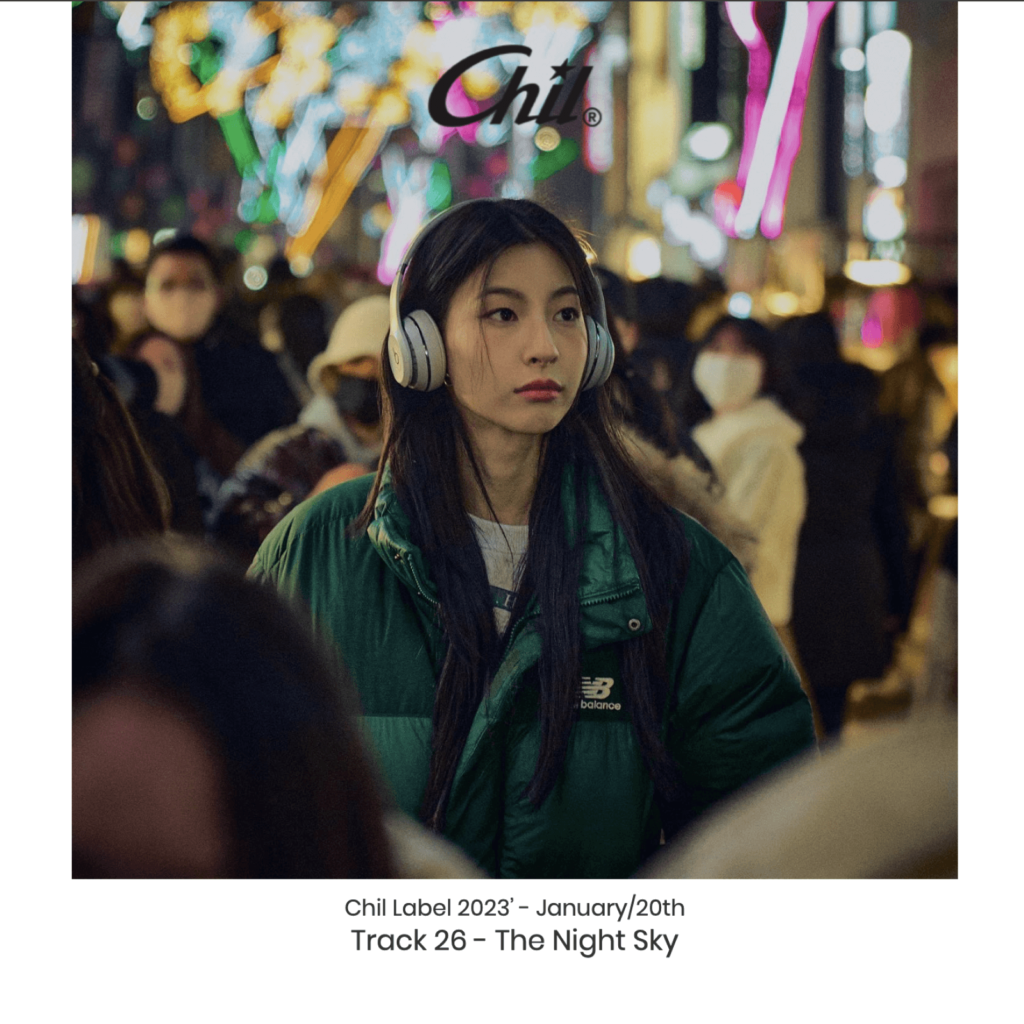
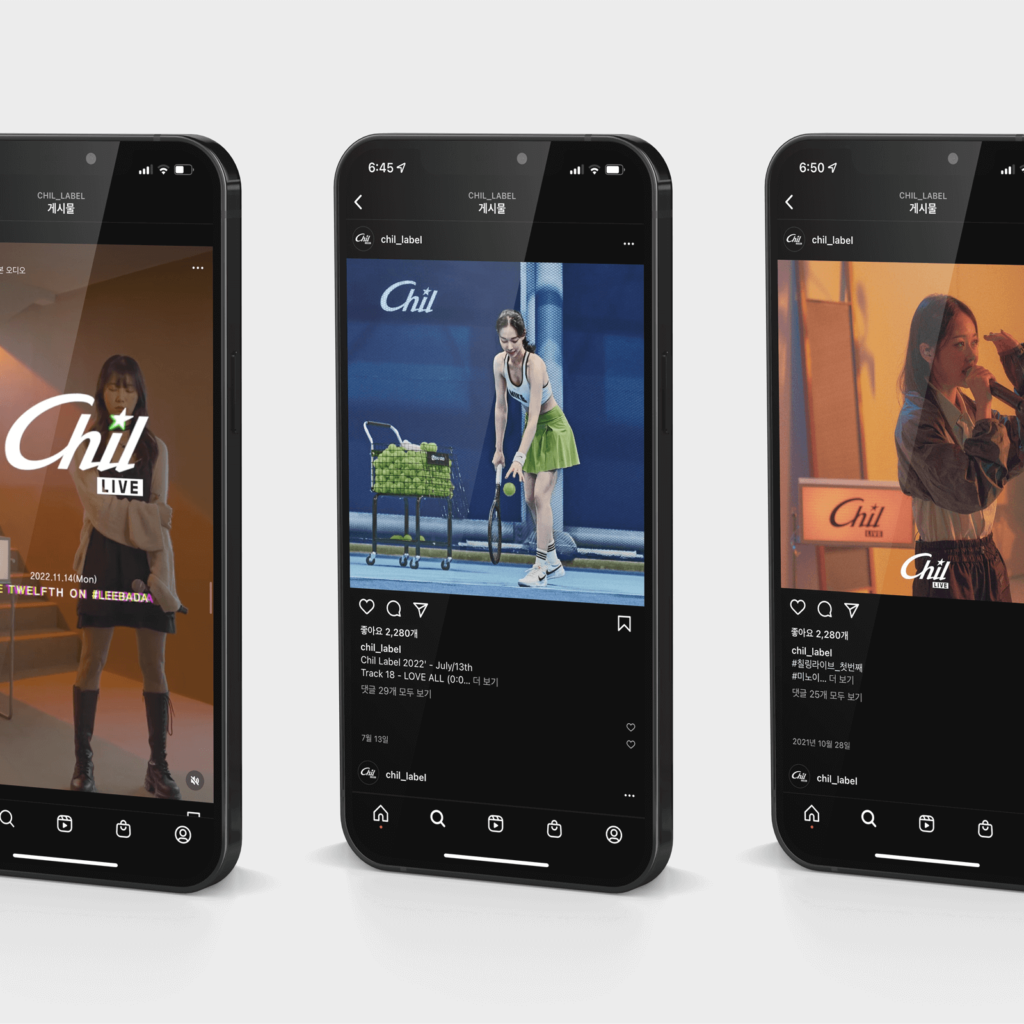
Chil Label, Chil live
Since 2021, we have been steadily making and releasing music and videos with various artists. 29 tracks were released along with a short music video, and various types of brand songs are continuously being released. Still cut images and graphic techniques are full of retro sensibility. The grainy film camera texture and the decorative typeface and sticker feel go well together.
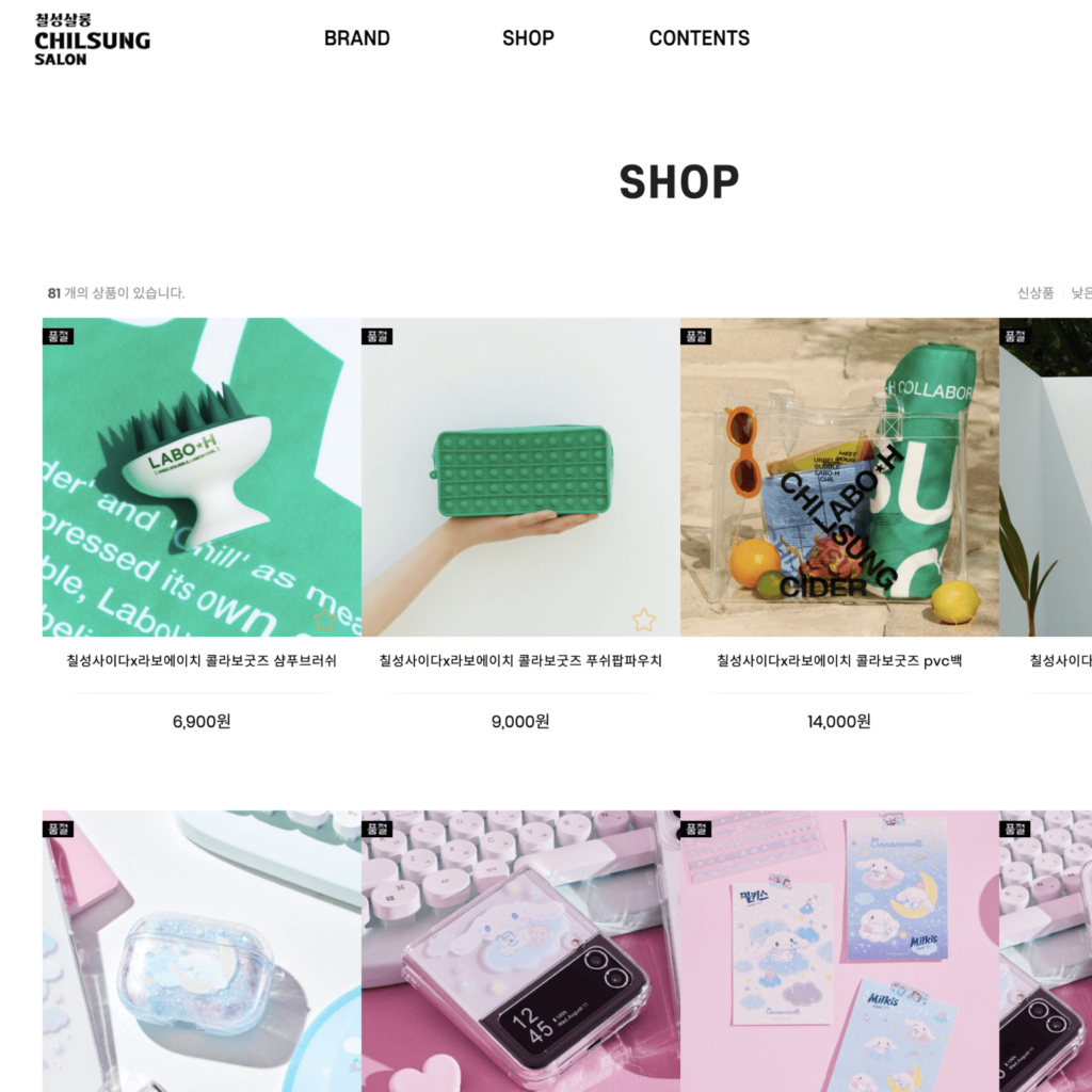
CHILSUNG SALON
In addition to Chilsung Cider, you can purchase brand collaboration products of Lotte Chilsung's beverage brands such as Milkis, Del Monte, and Cloud. You can look at the history of various brands. There are many brands with a long history, so it's fun to see old advertising posters and videos. I see a lot of amazing collaborations that I can't imagine the taste of.
Chilsung Cider immediately brings to mind a green bottle and a white star. In Project Chill, I think these two key points were well pointed out and expressed. It is strange that the slanted, slightly slanted typeface gives the impression that it has been there for some reason since the first time I saw Chilsung Cider. The Korean mark 'Chil' combined with the slightly rounded star shape also feels strangely familiar.


