

Global co-working space WeWork refreshed its brand with creative brand agency Franklyn. The logo, colors, illustrations, and typography have been changed. Instead of completely changing the brand, we decided to update it in order to maintain the strong identity established in the coworking space space.
“As a WeWork member, the WeWork space was magical,” said Franklyn co-founder Patrick Richardson. Wework blurs the lines between art and science, sensibility and intellect. This duality inspired the visual identity.” said.
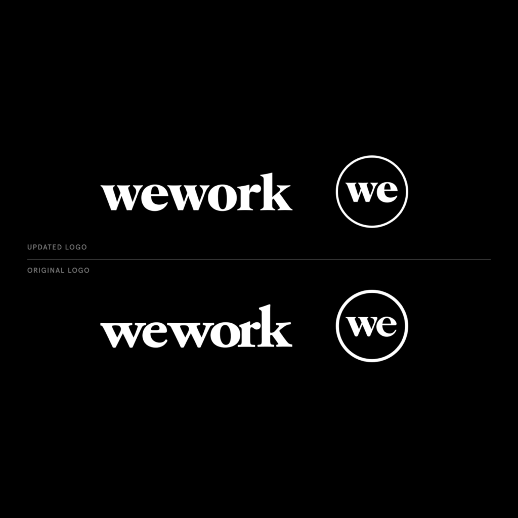
The old logo was a serif that looked like it had smeared ink. The bends and ends of the strokes have been changed to be sharper. The lines above and below the X-height have been emphasized to make it easier to read.
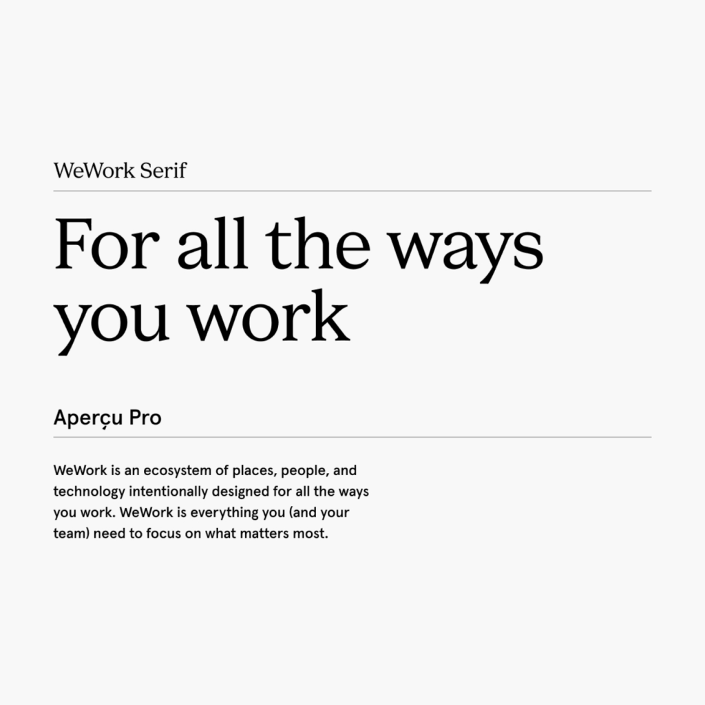
'WeWork Serif', created in collaboration between A+ and Franklyn, is a typeface consistent with the logo. It's not as pointed and bold as the logo, but the character has melted. I use Aperçu Pro as a secondary typeface for body text.
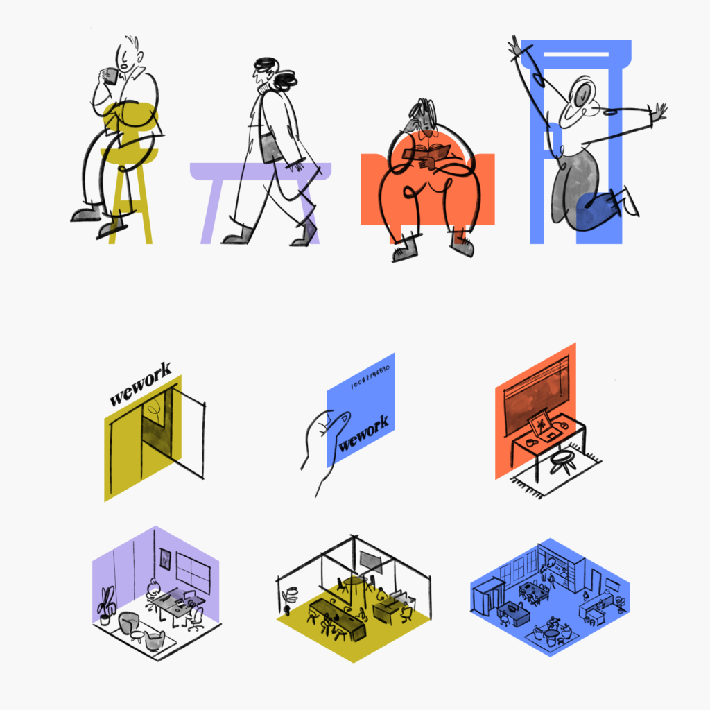
As for the palette, I chose the method of using black on a medium-saturated color that is currently in vogue. Among the pastel tones, the saturation and brightness were adjusted to arrange blue, mustard, coral, and lilac that are clearly distinguished from the background.
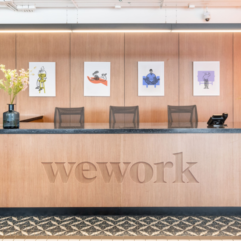
I use the free pen drawing type of illustration as a human element. The duality of diversity and freedom, sensibility and intellect is expressed in neat colors and free forms.

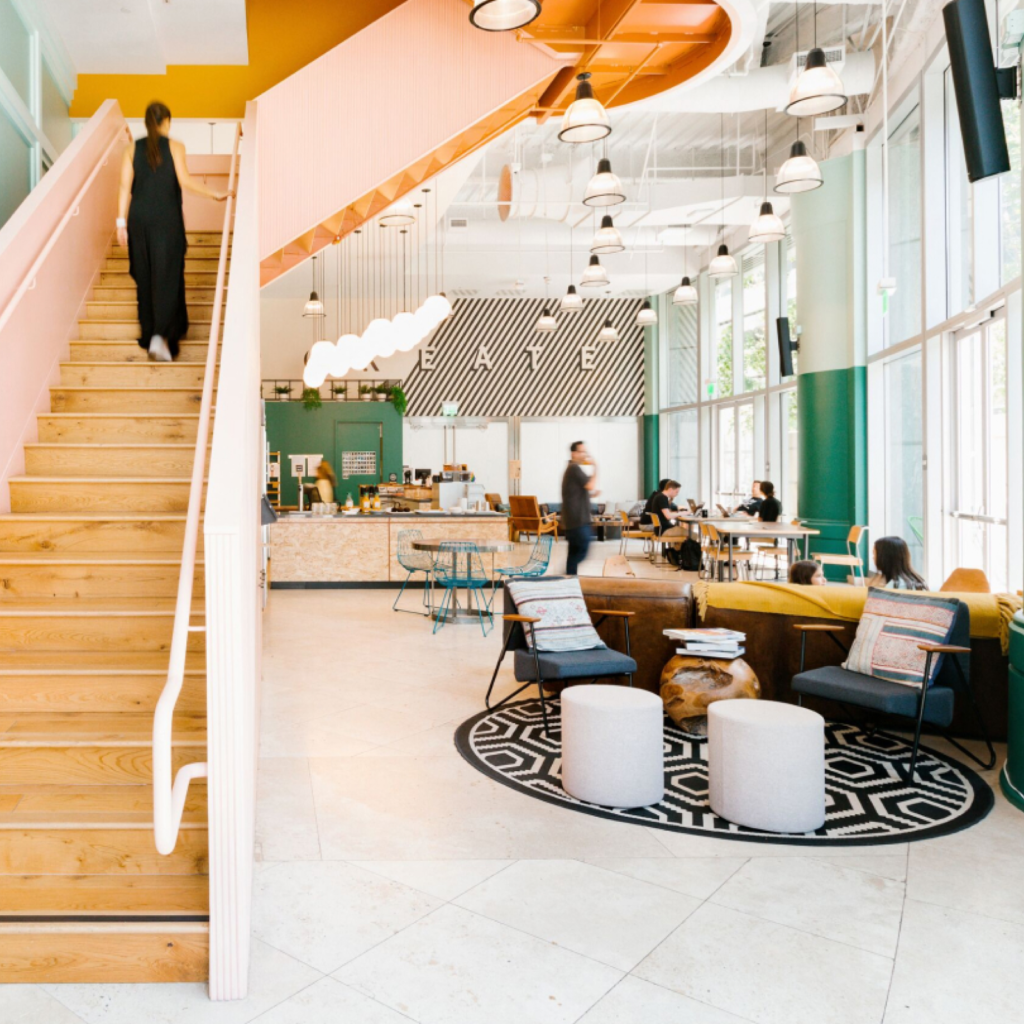
This is a new change for WeWork, which has been noisy for so long. But what really made WeWork special was the space they created. It's unfortunate that there aren't many stories about the interior and photos that express the main character, which is the area where the visual identity will be exposed the most.
It would have been better if these details were also disclosed.


