For the first time in 60 years, Nokia unveiled its new brand identity, including the logo, at Mobile World Congress in Barcelona. I worked with Lippincott, who worked with Nokia for 15 years.
It took on a bold expression to transform itself from a mobile phone company into a B2B technology company. Nokia currently focuses on its business, which includes selling networking equipment and licensing many patents, including mobile manufacturers. Equipment manufactured by Chinese competitor Huawei has been banned, so it is also aggressively pushing into 5G.
Nokia was sold to Microsoft and the Nokia mobile brand was sold to HMD Global, founded by former Nokia employees. In this situation, I think it is a rebranding to emphasize the difference with mobile.
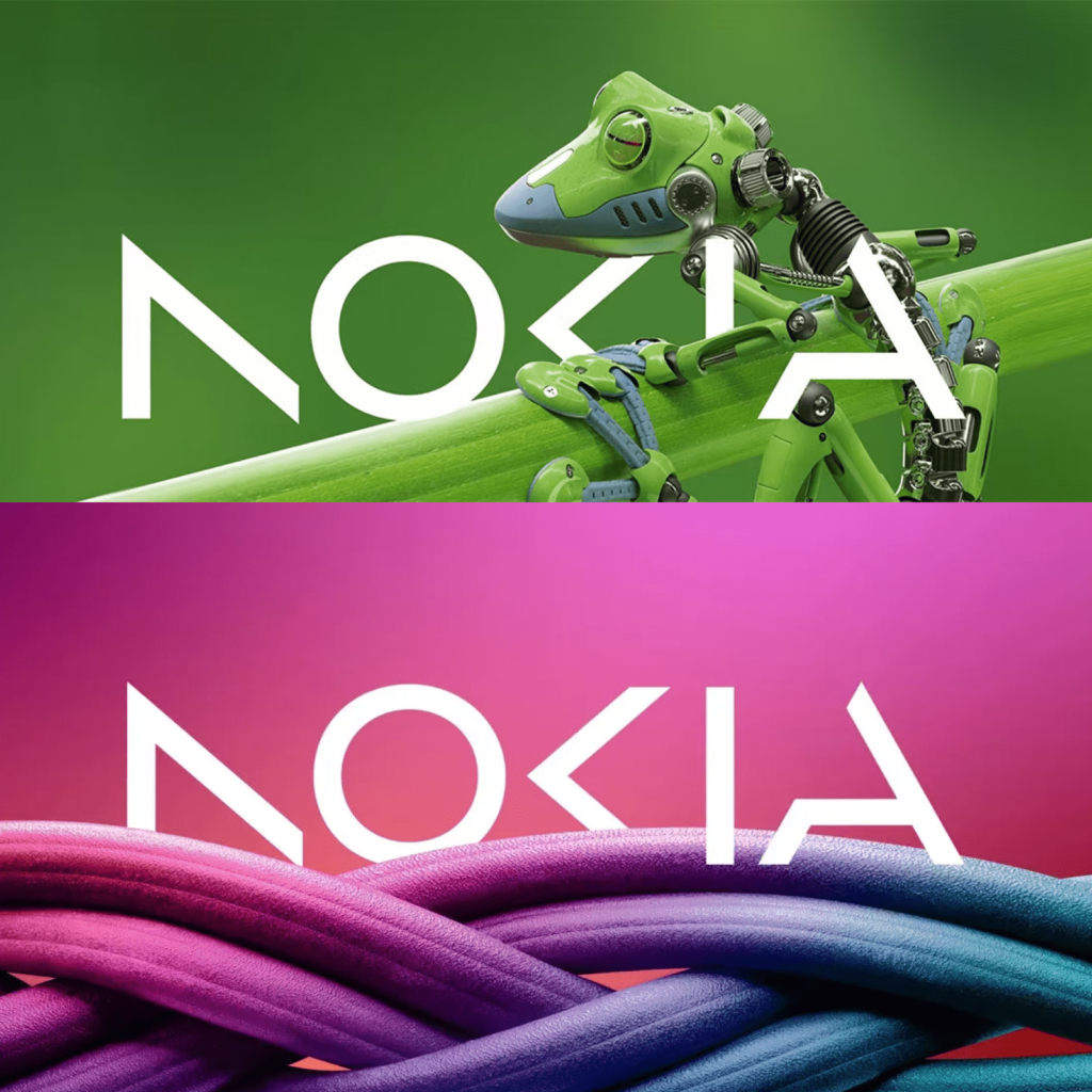
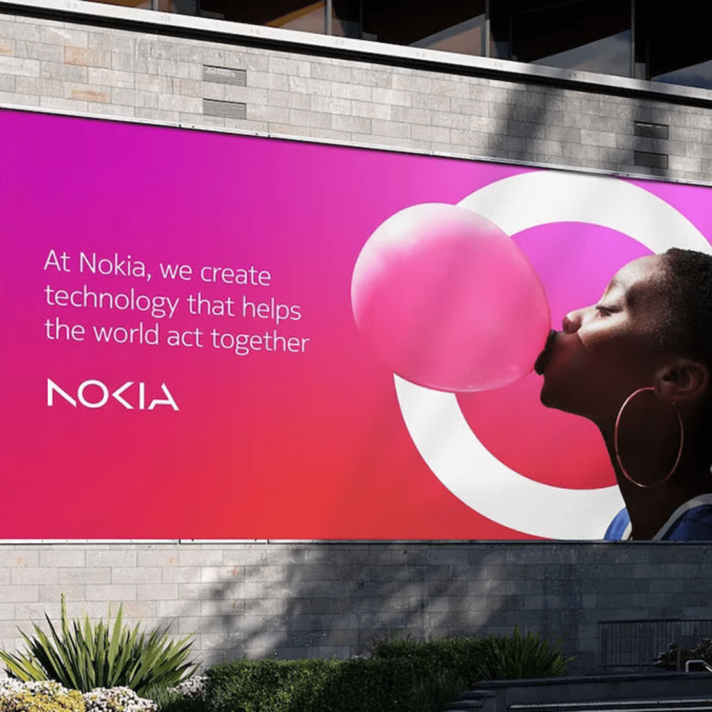
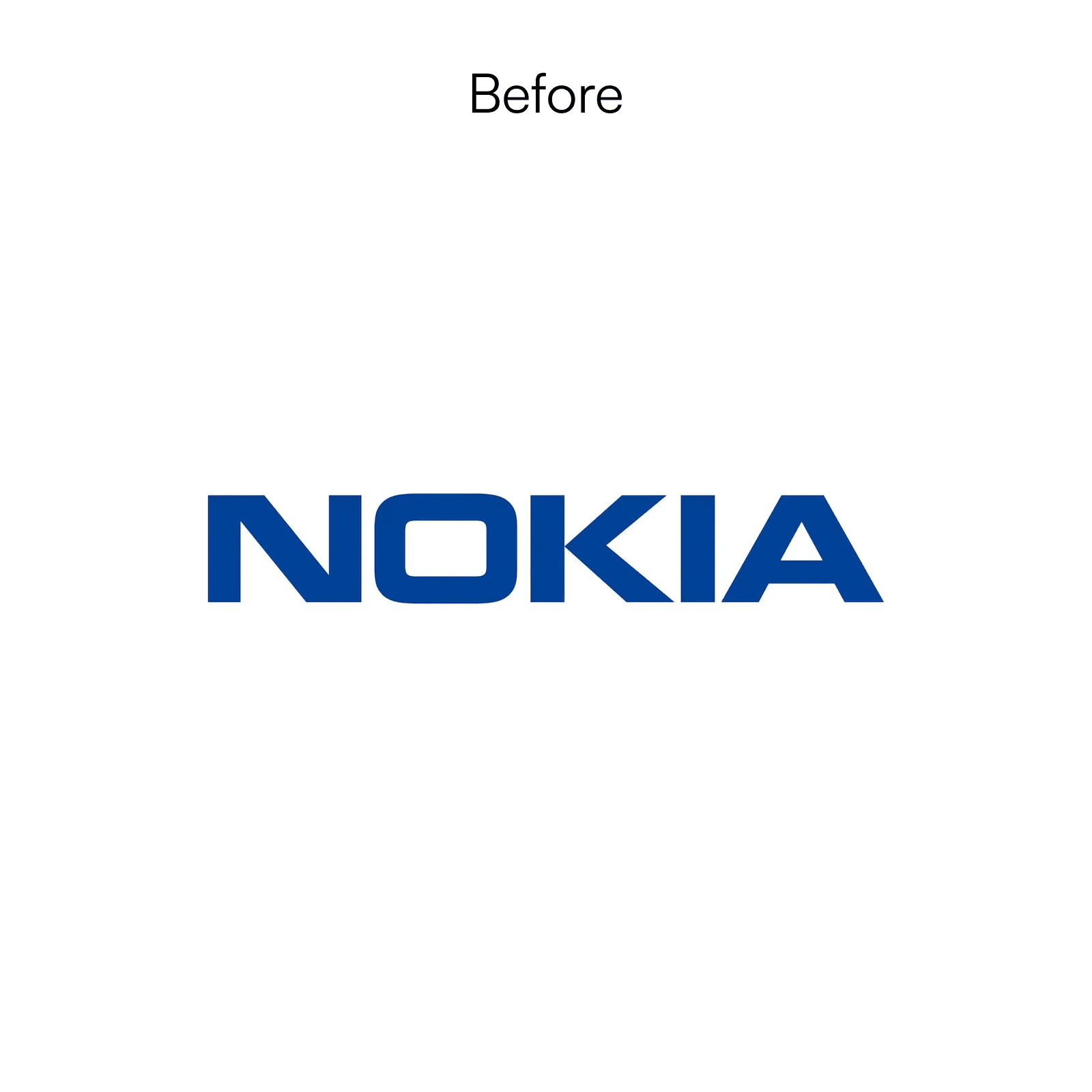
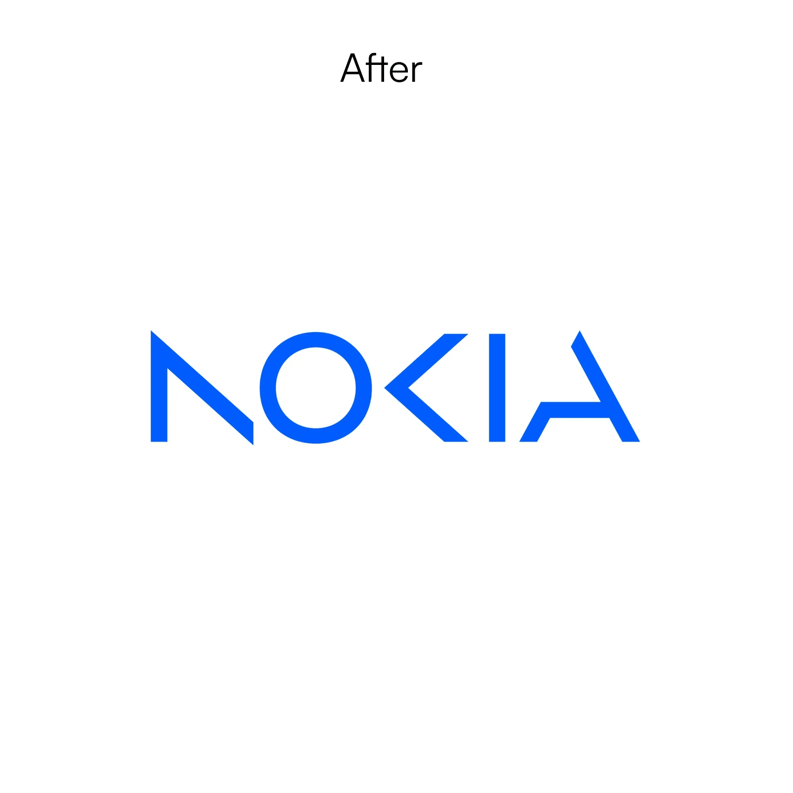
Saying goodbye to the classic Nokia, we expressed our wordmark in a geometric and abstract way. I deconstructed N, O, and K and used them as graphic motifs. The dark blue color was removed and the boring image was replaced with a bright gradation and rich palette.
The letters are fragmented and it is difficult to predict the original roman letters. Due to poor readability, it is read as AODA, not NOKIA. I dismantled the root of the letters, but I can't read what message I'm trying to convey. Many people say they thought of KIA. I'm not sure what effect you were trying to achieve.