

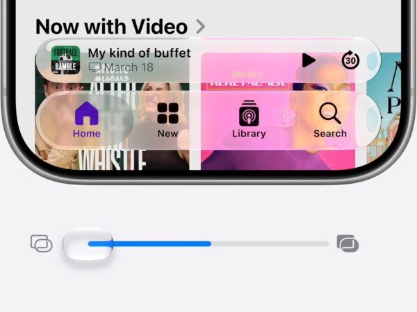
영국의 대표적 언론사 가디언이 웹사이트와 모바일 앱을 전면 개편했습니다. 이번 개편은 지난 10년 동안 유지되던 반응형 웹 기반 구조를 탈피해, 모바일 중심의 UX와 인쇄 신문에서 영감을 받은 시각적 설계를 결합했습니다.
이번 변화는 1년 이상에 걸친 디자인, 개발, 테스트 과정을 거쳐 탄생했으며, 가디언 미디어 그룹의 크리에이티브 디렉터 알렉스 브로이어는 이를 “디지털 디자인의 전환점”이라 평가했습니다. 그는 특히 이번 개편이 단순한 리디자인이 아니라, 종이신문처럼 각 섹션을 구분해 독자가 원하는 콘텐츠를 스스로 탐색할 수 있도록 하는 데 중점을 뒀다고 밝혔습니다.
개편의 중심에는 모바일 사용자의 증가가 있습니다. 현재 가디언 디지털 방문자의 75%는 모바일에서 유입되며, 앱 이용자는 웹 이용자보다 평균 15배 더 많은 페이지를 열람하고 있습니다. 이에 따라 앱은 보다 직관적인 탐색이 가능하도록 전면 재설계되었고, 홈페이지 역시 보다 간결하고 유연한 구성을 갖추게 되었습니다.
새 앱에는 ‘My Guardian’ 기능이 도입돼 관심 있는 주제나 기자를 팔로우할 수 있으며, 팟캐스트 전용 오디오 플레이어, 시각적으로 새로워진 퍼즐 섹션도 포함됐습니다. 이미지와 영상 처리 방식도 진화해, 고정된 가로 이미지 중심에서 탈피하고, 필요시 이미지를 생략하거나 세로형 영상 삽입이 가능해졌습니다.
가디언은 이번 개편을 통해 AI 기반 뉴스 소비 환경에서 독자와의 직접적인 관계를 유지하고 강화하는 것을 목표로 하고 있습니다. 브로이어는 “디자인은 정답이 정해진 것이 아니며, 독자의 피드백에 따라 지속적으로 개선해 나갈 것”이라 밝혔습니다.
새로운 가디언 앱은 현재 iOS와 안드로이드에서 다운로드할 수 있습니다.


