

Hanssem collaborated with design studio CFC to rebrand for the first time in 32 years.
We maintained a visual identity worthy of the name ‘Hanssem,’ which symbolizes endless growth. We combined 'Creative Block', a geometric shape faithful to the basic elements of design, with Hanssem's English name 'HANSSEM'. The simple yet powerful block shape of vertical, horizontal, and diagonal lines was even applied to the word mark. The 'three primary colors', another basic element of design, have become darker and clearer.

The 'H' and 'M' in 'HANSSEM' use breaks that follow the visual characteristics of the blocks. 'H', like a block, would feel isolated if completely separated, so it was expressed by combining the two pillars with 'l' and 'ㅓ'. The three middle blocks of the existing symbol have been reduced to one. It may even look like ‘HIM’.
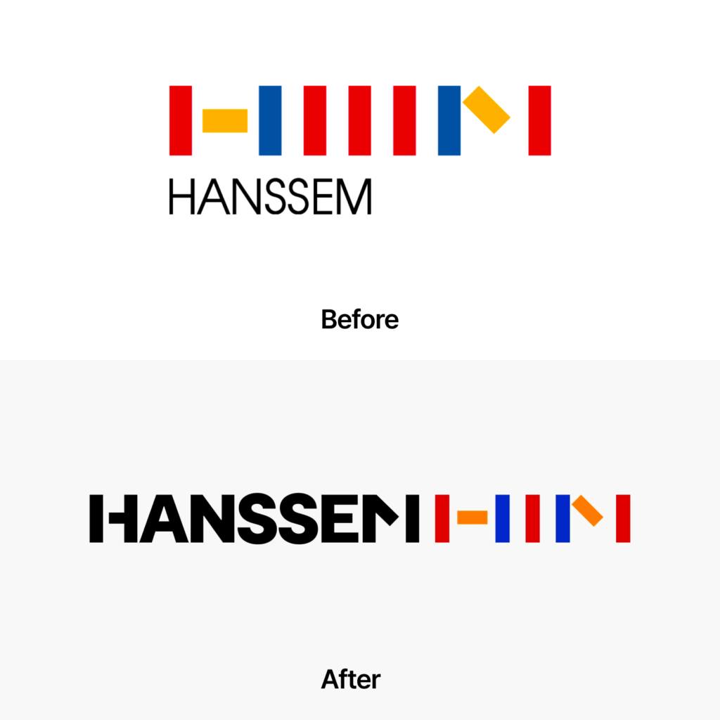
When combining symbols in a unique way, the English wordmark was placed in front and the symbol was placed behind. When the word mark and symbol are side by side, there is little difference in shape and brightness, so it seems to be somewhat difficult to distinguish them. The legibility and legibility have improved compared to the bold Korean font that represented the previous sub-brand.


Hanssem CEO Kim Yu-jin said, “We carried out the renewal to inherit the history we have built over the past 54 years and convey a new image suitable for the current era.”
Founded in the 1970s and celebrating its 54th anniversary, Hanssem has set the standard for kitchens with its standardized kitchen system. Hanssem has grown so much that it is believed to have made half of the apartment kitchens in Korea and has become an unrivaled Korean interior design brand known to the entire nation.
At first, Hanssem expressed its brand identity in various forms, including the shape of a rising sun or a seal written with a brush. As we expanded overseas, we felt the need to refine a consistent identity and collaborated with Japan's PAOS to create the legendary Creative Block logo in 1992. PAOS also created the identity of Korea's CheilJedang.


