Naver renewed the icons of 189 services. It took 468 days. How did you achieve the difficult mission of maintaining your identity while being trendy? The code name 'Duck Up Match', which claims to be a professional 'duck' branding, shared the detailed process.
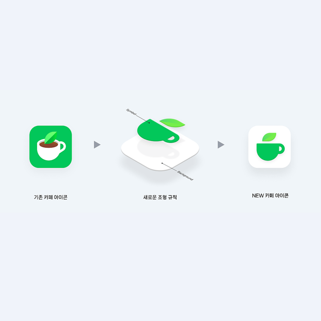
You can read graphic trends just by looking at the changing icons of Naver's representative service, Intellectuals. The green color that symbolizes NAVER has also changed subtly. It is said that there was a consensus that the icon should be changed according to the trend from 2021. We decided to redefine the visual representation while maintaining the metaphor representing the service.
As a rule for expressing symbolized metaphors on a white background, it can be used in various environments by separating the background and metaphors. It is now possible to distinguish information without unnecessary differences in stimuli. It also reduced the fragmentation that can only occur in large services.


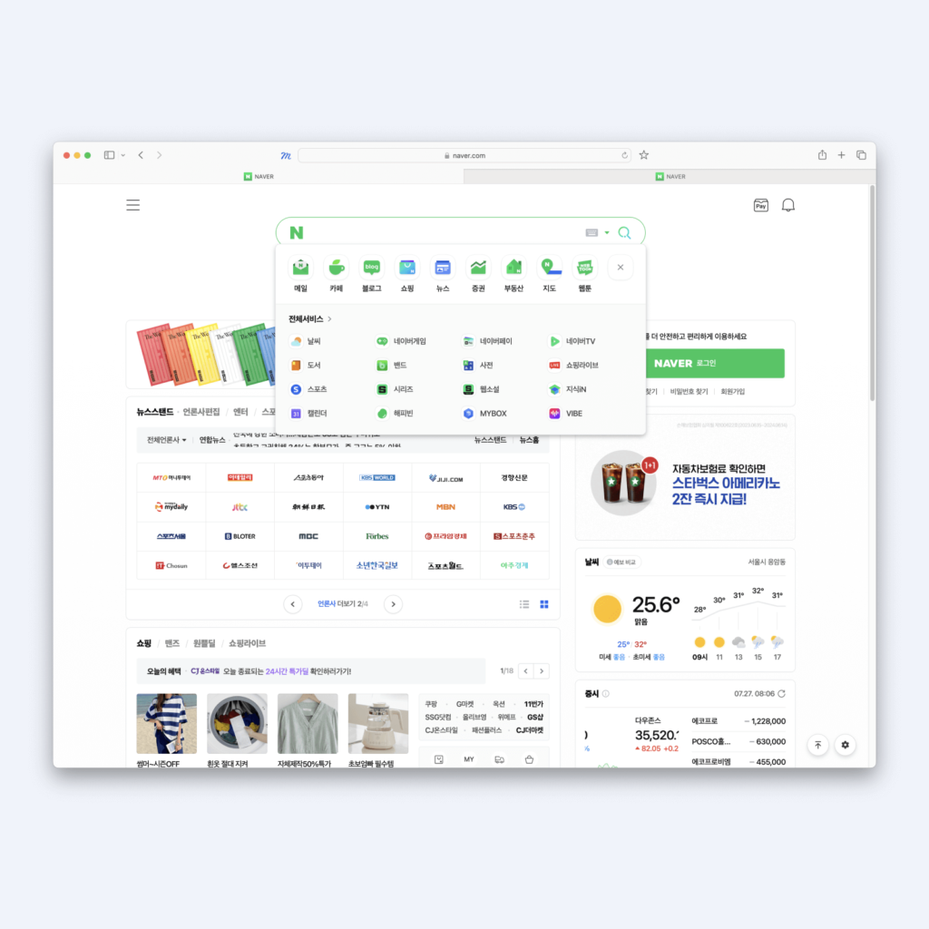
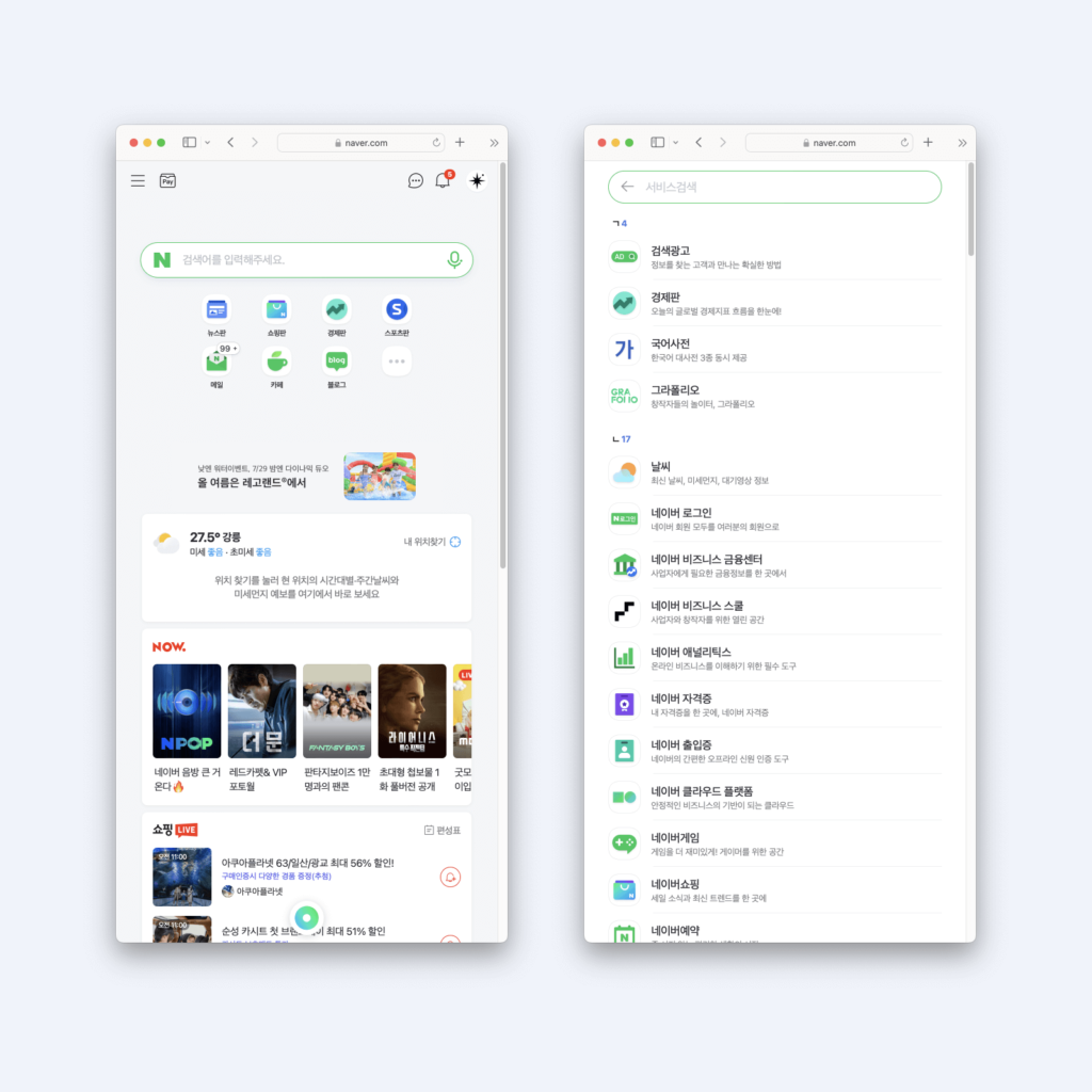
The color palette, where green can be attractive, is also well organized. To give a similar level of stimulation to a white background, the tonal differences must be finely tuned. In particular, colors that have little contrast with white, such as yellow, or high contrast, such as blue, can stand out alone. The palette released by Naver is a wonderful palette that does not stand out too much in green and harmonizes with the whole.
The strange 2.5D sense of space also conveys a different impression from other icons. There were many icons where the shadow inside the metaphor symbol looked like a smudge with blurry contrast, but now we use colors and shadows that have a clear contrast and make it easy to understand the structure of the object.


Renewing just one app icon isn't easy, but 189! Just thinking about it reminds me of a long journey. I don't think it was easy to have a meeting to communicate with stakeholders on how far to apply icons as well as to determine the grammar of graphic design. There must have been a lot of feedback, but it's cool that it was convincingly organized into one style.
