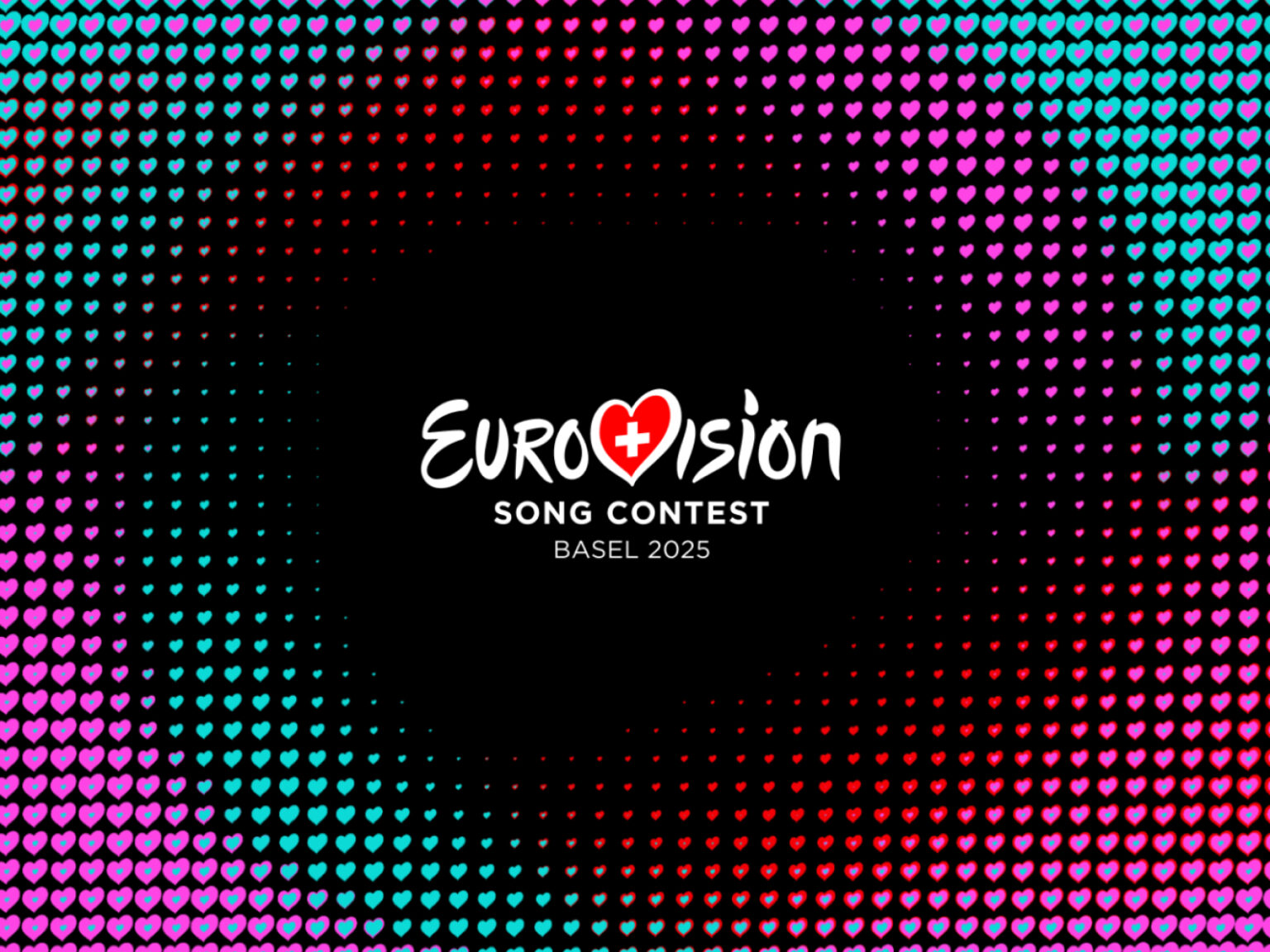

2025년 유로비전 송 콘테스트가 5월 스위스 바젤에서 개최를 앞두고 브랜드 아이덴티티가 공개됐습니다. 이번 디자인은 런던 기반 광고 에이전시 ‘NOT 위든+케네디’가 맡았으며 스위스 디자인의 정수를 반영했습니다.
디자인의 핵심은 ‘그리드’입니다. 스위스 그래픽 디자인의 상징이자 체계성과 질서를 중시하는 스타일에서 영감을 받아, 팀은 하트 모양으로 이루어진 독창적인 그리드 시스템을 개발했습니다. 하트는 유로비전 브랜드의 핵심 요소로 자리 잡은 만큼, 이를 바탕으로 패턴과 플래그, 영상 그래픽, 타이포그래피 등 다양한 시각 요소가 제작될 예정입니다.
이번 프로젝트를 총괄한 아담 릭스 크리에이티브 디렉터는 “최근 유로비전은 매년 개별 로고를 제작하기보다는 브랜드 자산을 축적하는 방향으로 전략을 바꿨습니다. 바젤만의 특색을 담으면서도 유로비전이라는 브랜드 전체의 일관성을 높이는 것이 핵심 과제였습니다”라고 설명했습니다.
타이포그래피는 스위스 타입 스튜디오 ‘Newglyph’의 이안 파티가 맡았습니다. 그는 최근 스위스 여권 서체 디자인으로도 주목받은 바 있으며, 유로비전 2025의 서체 역시 간결하면서도 국제적인 느낌을 살렸습니다.
또한 이번 대회에 맞춰 공개된 공식 마스코트 ‘루모(Lumo)’도 화제입니다. 루모는 바젤 예술디자인대학(FHNW)의 린 브루너 학생이 디자인한 캐릭터로 음악의 에너지와 다양성을 형상화했습니다. 불꽃처럼 솟은 곱슬머리와 밝은 색상, 노래를 부를 듯한 표정으로 음악의 열정과 연대를 상징합니다. 성별이 없는 중립적 존재인 루모는 5월부터 바젤 시내 곳곳에서 시민과 만날 예정입니다.