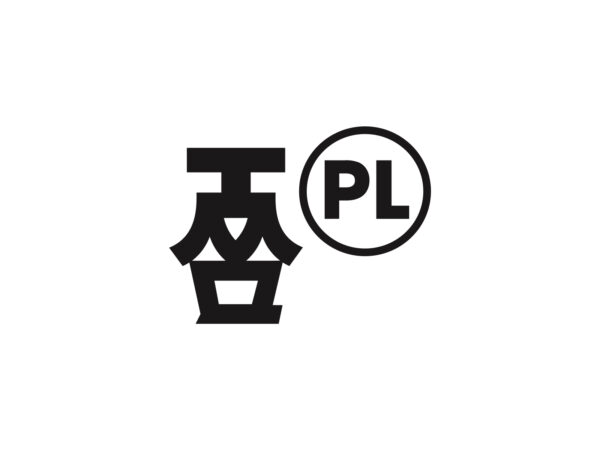
오픈AI가 브랜드 리뉴얼을 단행하며 새로운 로고와 전용 폰트 ‘OpenAI Sans’를 공개했습니다.
헤드 오브 디자인 Veit Moeller와 디자인 디렉터 Shannon Jager가 이끄는 팀이 베를린 기반의 글꼴 주조소 ABC Dinamo와 로테르담에 있는 모션 파트너 Studio Dumbar와 협력하여 사내에서 개발한 이 새로운 정체성에는 모호함이 없습니다 .
이번 리브랜딩은 오픈AI의 내부 디자인팀이 주도했으며, ‘더 유기적이고 인간적인’ 정체성을 구현하는 것을 목표로 진행되었습니다. 기존 로고와 비교하면 중심부 공간이 넓어지고 선이 더 정리된 형태로 변경되었습니다.
오픈AI는 브랜드 정체성을 강화하기 위해 새로운 전용 폰트를 개발했습니다. ‘OpenAI Sans’는 기하학적 정밀함과 기능성을 갖추면서도 부드러운 형태를 강조한 것이 특징입니다. 오픈AI의 워드마크에 사용된 ‘O’는 외형적으로 완벽한 원형을 유지하면서도 내부 구조는 일부 불완전한 디자인을 적용해 지나치게 기계적인 느낌을 피하도록 했습니다.
이번 디자인 과정에서 AI 기술의 활용 여부도 관심을 모았습니다. 오픈AI의 디자인팀은 자체 AI 도구를 활용했지만, 디자인 작업 전반이 AI에 의해 이루어진 것은 아니라고 밝혔습니다. 특히 폰트의 굵기 계산 등 일부 작업에만 ChatGPT가 사용되었습니다.
디자인팀은 “우리는 사진, 타이포그래피, 모션, 공간 디자인 등의 분야에서 최고의 전문가들과 협업하면서도 DALL·E, ChatGPT, Sora 같은 AI 도구를 창의적 파트너로 활용한다”라고 설명했습니다. 또한 “인간의 직관과 AI의 생성 능력이 결합될 때 혁신적이면서도 인간적인 브랜드를 만들어낼 수 있다”라고 덧붙였습니다.
새로운 디자인은 오픈AI 공식 웹사이트와 ChatGPT 인터페이스 등 다양한 제품과 플랫폼에 적용될 예정입니다.