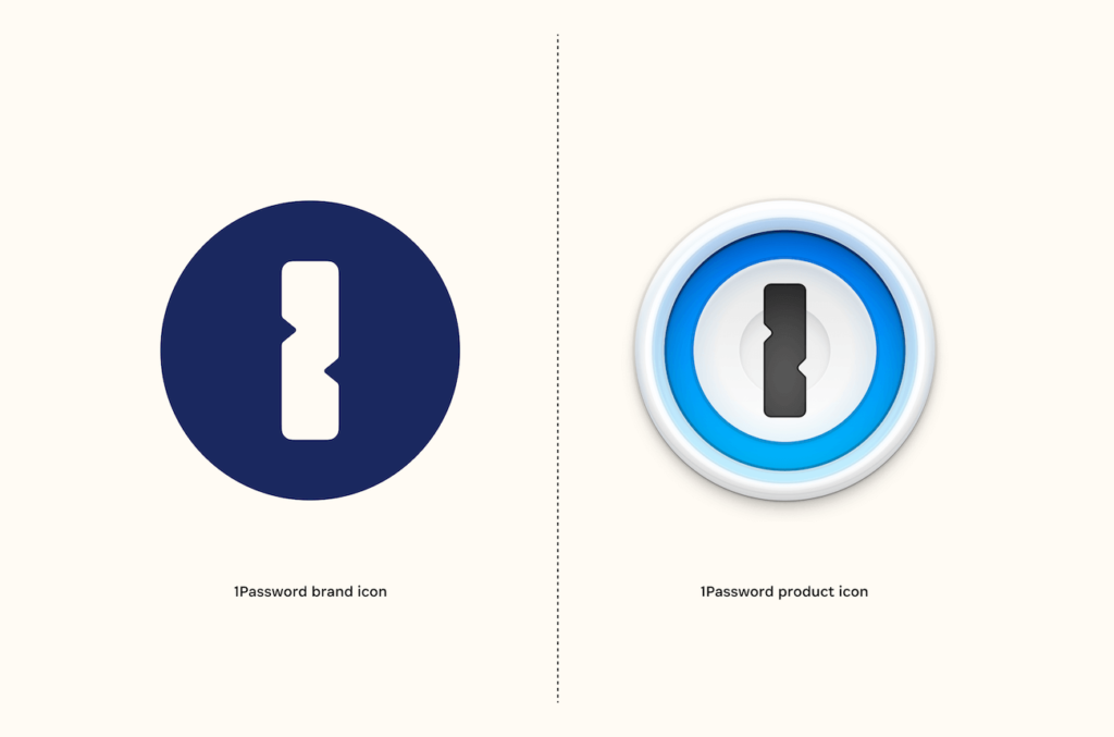
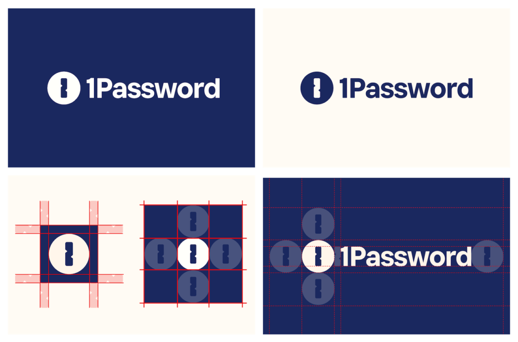
1Password 원 패스워드가 회사 로고를 리프레쉬했습니다. 앱 아이콘은 그대로 유지한다고 합니다.
1Password는 캐나다의 Agilebits Inc.가 개발한 비밀번호 관리 서비스입니다. 전 세계 수백만 명의 개인과 수십만개 이상의 기업이 사용하고 있습니다. 특히 애플 제품 사용자 사이에서 유명한 서비스입니다. ‘보관함’을 만들어 그 안에 다양한 비밀번호, 신용카드 정보, 라이선스 등 다양한 것을 저장할 수 있습니다.
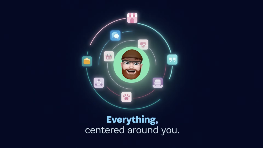
이번 리브랜딩에서 1Password는 기존 보안 관련 회사의 시각 문법에 대한 질문으로 출발했습니다. 큰일이 나지 않기 위해 서비스를 쓰라고 설득하거나 우리가 가진 기술이 너무 뛰어나니 곡 쓰라고 설득하지 않습니다. 대신 비밀번호를 관리하는 행동에 집중하기보다 그 이후에 얻을 수 있는 것을 보여주기로 했습니다.
서비스를 사용할 때의 감정을 링 애니메이션으로 표현합니다. 단단한 벽이나 금속으로 신뢰를 표현하기보다 마치 가상의 포탈의 문을 자물쇠를 통해 여는 것 처럼 표현했습니다.
회사를 표현하는 심볼이 플랫하게 변했습니다. 아이콘은 기존의 형태를 유지합니다. 브랜드와 제품을 살짝 분리해 새로운 서비스의 가능성을 품으면서 제품에 대한 신뢰를 지키기 위한 전략이 아닐까 생각이 듭니다.


1Password는 오랜기간 꾸준히 인기가 있었던 서비스로 많은 사람들의 사랑을 받았습니다. 기존 키워드를 통상적으로 표현하는 방식을 넘어서 새로운 도전을 하는 관점이 멋지다는 생각이 듭니다. 그렇다고 신뢰를 잃어버릴 정도로 팝하게 표현하거나 헤리티지라고 할 수 있는 제품의 앱 아이콘을 바꿔버리지 않은 것도 좋은 선택이라는 생각이 드네요.