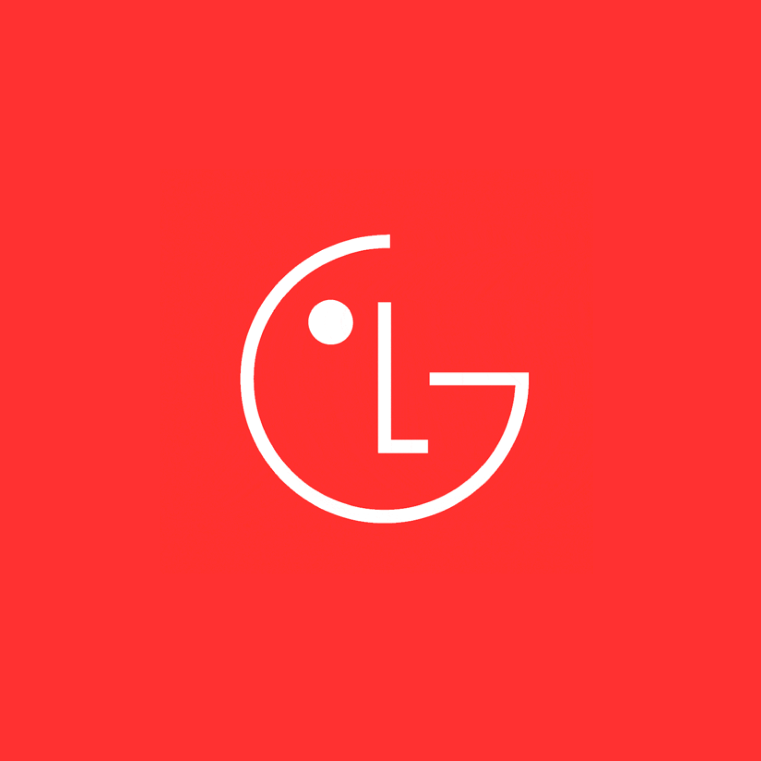

LG가 애니메이션으로 8가지 동작을 하는 새로운 브랜드 아이덴티티를 공개했습니다. Life is Good이라는 가치를 드러내기 위한 새로운 브랜드 방향성과 시각 정체성을 공유했습니다.
‘인간 중심의 혁신’ ‘미소를 만드는 따뜻함’ 등으로 대표되는 LG의 핵심 가치를 품으면서 Gen-Z를 비롯해 국가를 넘어 사랑받기 위해 새롭게 도전합니다. 기존 브랜드의 따뜻함과 함께의 가치를 재해석했습니다. ‘L’과 ‘G’로 구성된 사람 얼굴 심볼이 다양한 위트 있는 표정을 보여줍니다.
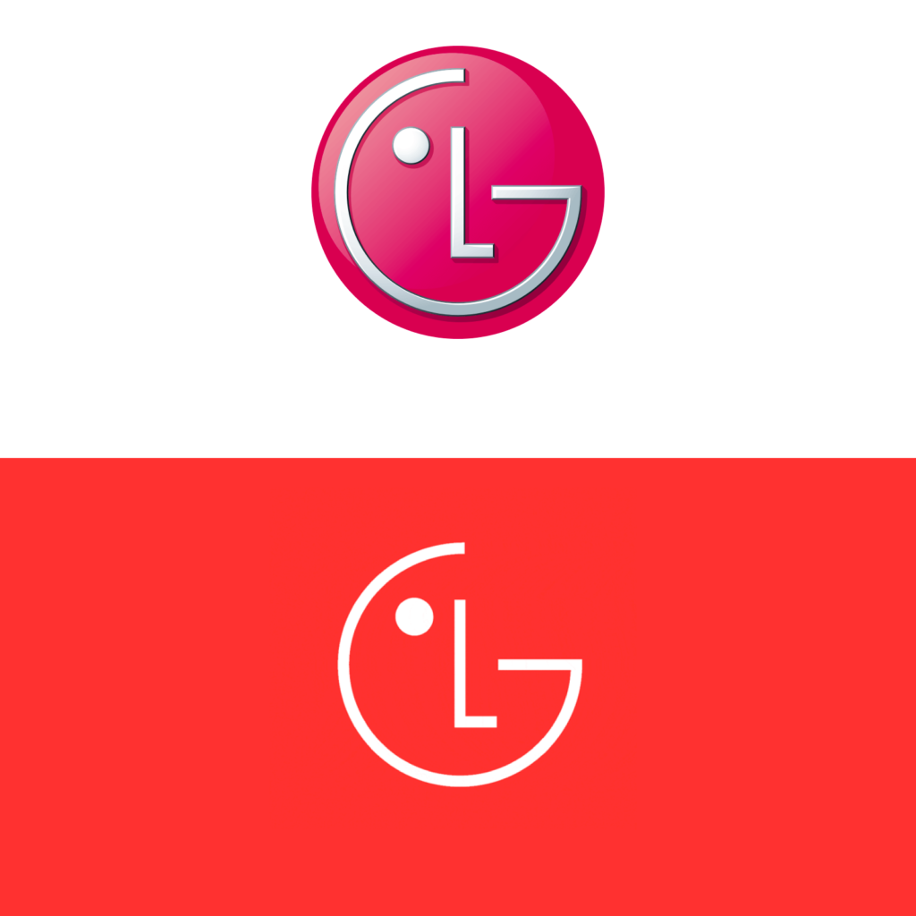
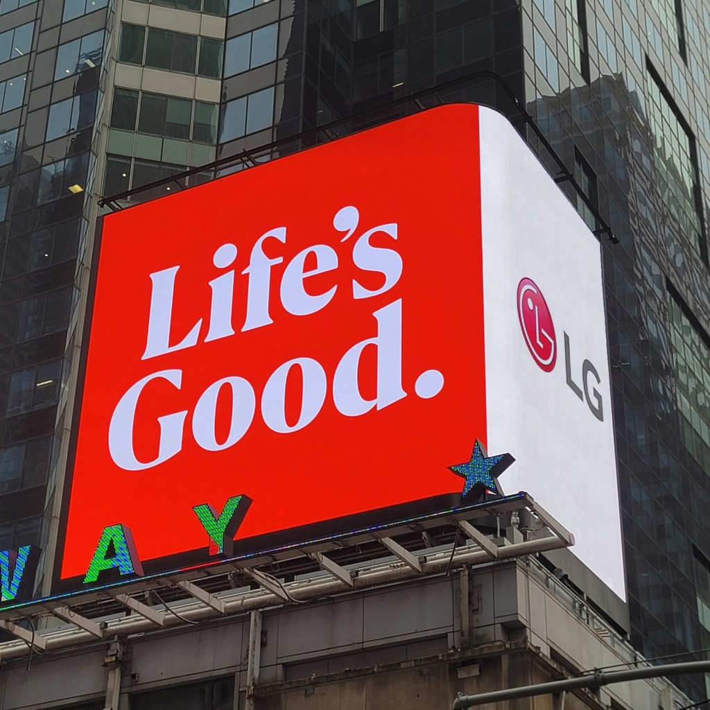
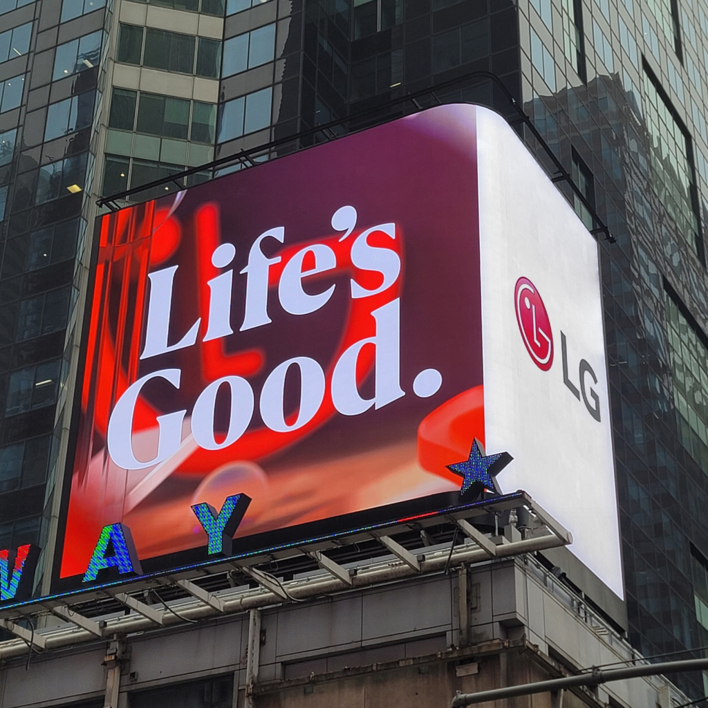
그동안 LG를 대표했던 진지한 느낌의 ‘LG 레드’와 더불어 에너지가 넘치는 ‘LG 액티브 레드’도 적용할 예정입니다. 또한 Life’s Good 슬로건에 걸맞는 새로운 서체도 디자인했습니다.
즐거운 애니메이션은 It’s Nice That의 활기찬 애니메이션이 떠오릅니다. 전통적인 느낌을 주는 심볼이 플랫하게 변했습니다. 일각에서는 왜 이모티콘 같은 컨셉을 유지하느냐는 반응도 있는데 랜도 어소시에이츠와 협업해 신라의 수막새에서 모티브를 딴 전설적인 ‘미래의 얼굴’를 지키는 것이 멋지네요.
다만 새로운 색과 서체가 헤리티지와는 차이가 많이 납니다. 메인 컬러는 같은 군이라고 보기에는 자주색보다 진한 주황색에 가깝습니다. 서체 역시 진지하고 단단한 인상의 서체보다는 세련된 잡지에나 쓰일 법한 장식적인 서체를 사용합니다. 다소 도전적인 표현이지만 앞으로 고객에게 이전보다 더 ‘재미있는’ 경험을 제안한다면 어울릴 수 있겠습니다.