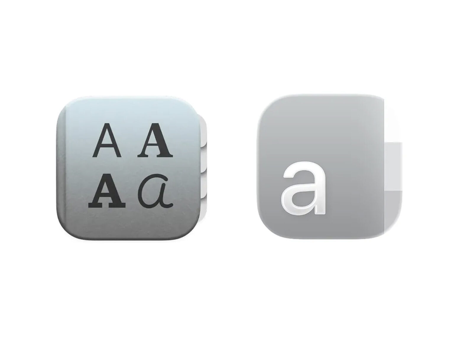
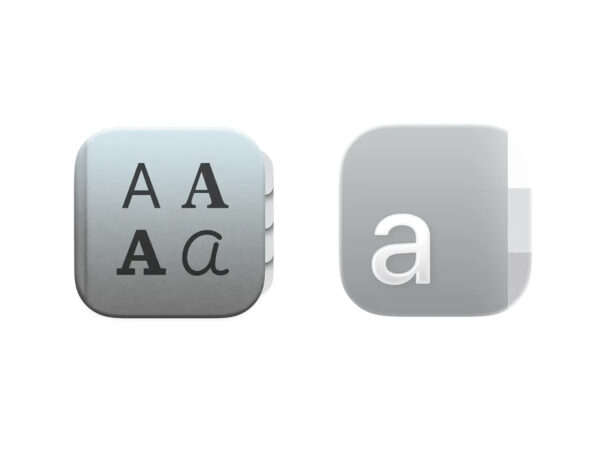
Apple Fontbook Icon Design Controversy

Apple's new FontBook icon, unveiled in macOS 15 Sequoia, is facing growing criticism from the design industry. Critics are saying the icon's completeness and the system's design language are lacking in harmony, raising questions about Apple's overall UI direction.

The new icon breaks away from the traditional three-dimensional book image, reimagining it with a simple, toy-like book motif and a vibrant color scheme. It's hard to recall the refined graphic density and textures that macOS has always maintained. The design community is quickly responding with comments like, "It doesn't look like a stock Apple app" and "It doesn't fit with the system icon set.".

Despite its specialized role as a font manager, many have criticized the lack of professionalism in its icon graphics. Some designers have described it as "a third-party app-level expression," analyzing it as an extension of the visual confusion seen across macOS, not just an icon issue.

There's also controversy surrounding the glass-effect visuals introduced in macOS 15, the new tab structure, and the interface changes that mix flat and three-dimensional elements. The FontBook icon is cited as a case in point, symbolizing this unstable UI trend. Brand experts say that the stable image that system utilities should have is weakened, creating cracks in macOS's integrated brand experience. From a UX perspective, some argue that the icon doesn't intuitively represent the font management function, making it difficult for users to infer its function based on the icon alone.

See more and sources

Open KakaoTalk room without ads
Plus
26. 01. 14
Plus
26. 01. 12
Plus
26. 01. 09

DesignCompass Newsletter

Design for Business. We deliver daily news about AI, Products, Brands

By submitting your email, you are deemed to have agreed to our Terms of Use and Privacy Policy .
Design for Business