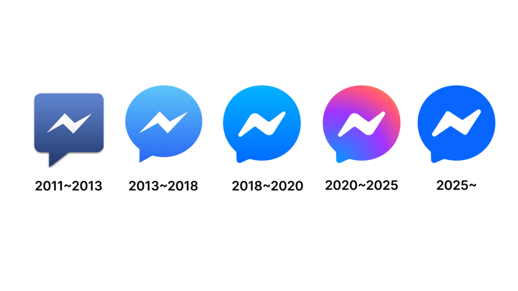

메타는 2020년 페이스북 메신저 로고의 전통적인 파란색 디자인을 보라색과 분홍색 그라데이션이 가미된 형태로 변경했습니다. 4년이 지난 지금 다시 이전의 파란색 로고로 돌아가면서 이용자들의 혼란을 야기하고 있습니다. 메타는 이에 대한 공식적인 설명을 내놓지 않았으나 많은 이용자가 이 변화를 정치적 맥락에서 해석하고 있습니다.
올해 1월 마크 저커버그는 페이스북의 사실 확인 기능을 폐지하고 커뮤니티 노트로 대체하겠다고 발표했습니다. 이 결정은 정치적 편향성과 관련해 논란을 불러왔습니다. 이에 따라 메신저 로고 변경 또한 보수적인 흐름에 맞춘 조치라는 해석이 나오고 있습니다.
일부 이용자는 새로운 로고가 기존 그라데이션 디자인보다 덜 포용적인 의미를 담고 있다고 주장하고 있습니다. 특히 이전 로고가 트랜스젠더 프라이드 깃발의 색상을 연상시킨다는 점에서 이번 변경이 특정 집단과의 거리 두기 의도를 반영한 것이라는 의견도 있습니다.
또한 이번 변화가 저커버그의 “남성적 에너지” 발언과도 연결된다는 시각이 있습니다. 저커버그는 기업 문화에서 보다 강한 리더십이 필요하다고 언급한 바 있으며 이에 따라 메타가 보다 보수적인 이미지로 회귀하고 있다는 분석이 나오고 있습니다.
반면 단순한 기능적 이유 때문이라는 의견도 있습니다. 메신저 로고는 2020년 인스타그램 다이렉트 메시지와의 통합을 강조하기 위해 변경되었으나 메타는 2023년 말 이 통합 계획을 중단했습니다. 이에 따라 메신저와 인스타그램의 브랜드 아이덴티티를 다시 분리하는 과정에서 기존의 파란색 로고로 돌아간 것일 수 있습니다.
그러나 이용자들은 이번 결정이 시대에 뒤처진다는 반응을 보이고 있습니다. “이전 디자인에 익숙해졌는데, 다시 예전 로고로 바뀌니 너무 단조로워 보인다”는 의견이 나오고 있습니다. 일부는 “2016년 디자인을 다시 보는 것 같다”고도 평가하고 있습니다.