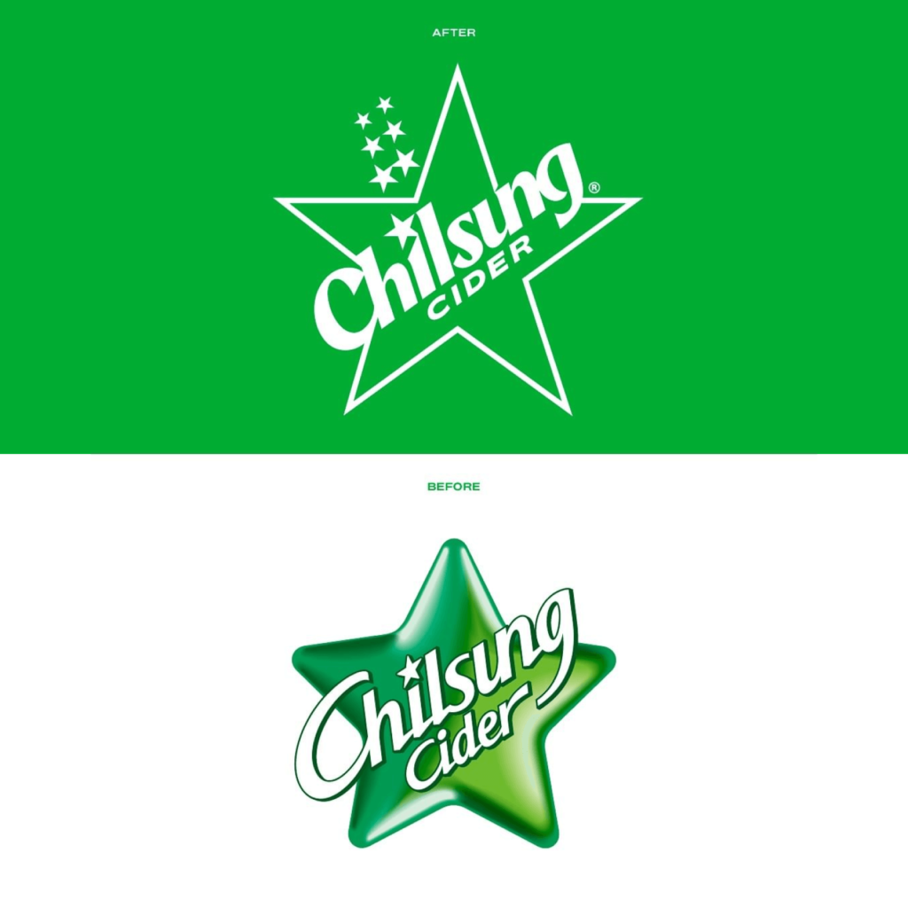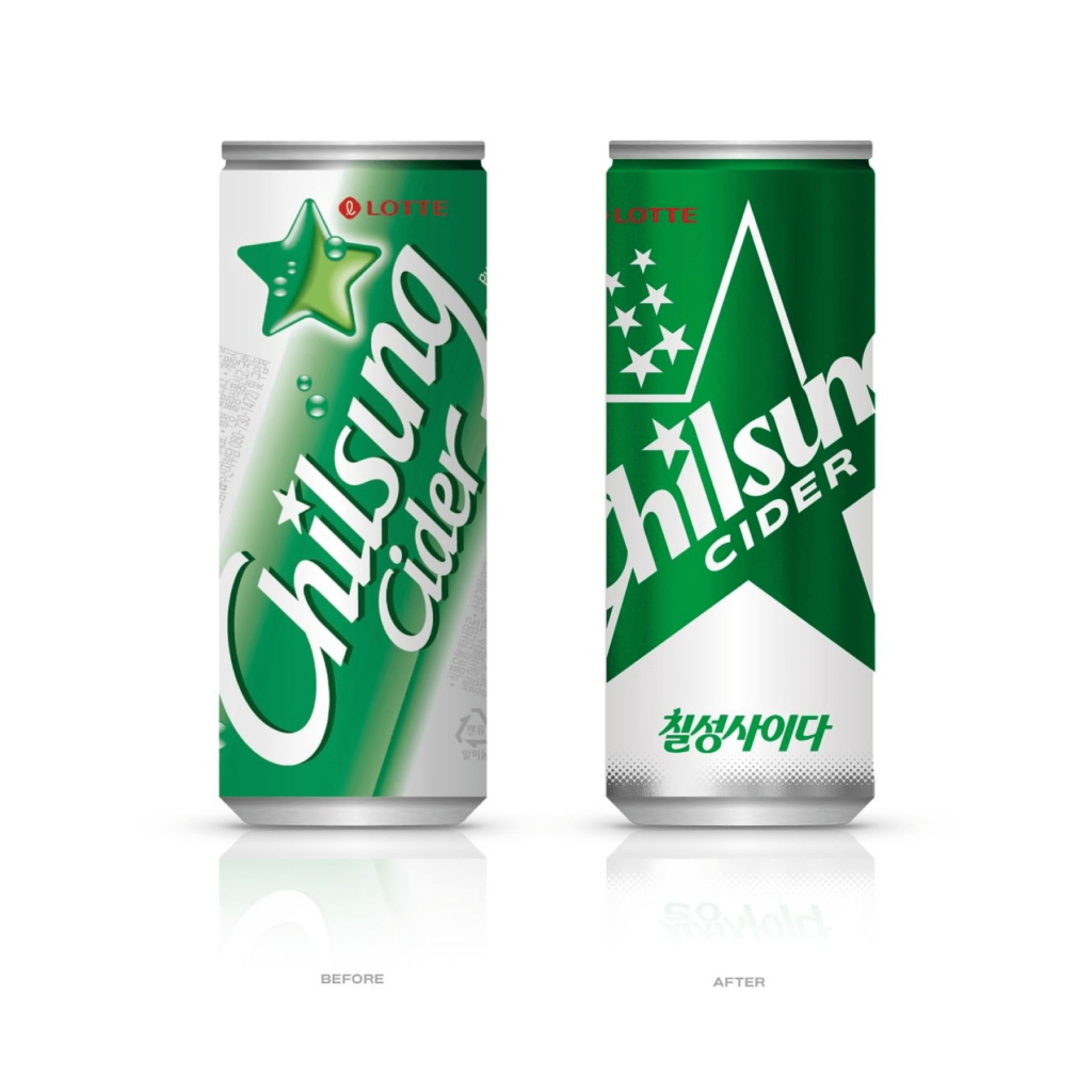

Chilsung Cider has been redesigned for the first time in 24 years. The visual identity of the brand logo and packaging, which were changed in 2000 to commemorate the 50th anniversary, has been modernized.
The Lotte Chilsung marketing team, Clay, CFC, and Vcode collaborated to rebrand. Clay created the brand concept called 'Sense of Joy', and CFC was in charge of the brand identity and package design. The motion graphics were created by Vcode.
The round gradient stars have become pointed and contain seven stars, just like the name 'Chilsung'. The thin font has become thicker and the angles have increased. The shape where the strokes start out thick and then suddenly become thinner is attractive. The English Chilsung Cider is written with different rules as Chilsung and CIDER. The background color of the can, green, has become much darker, making the star shape and wordmark stand out.
A Lotte Chilsung Beverage official explained, “This brand logo change is intended to strengthen product influence and differentiate the brand by emphasizing the star, which is the symbol of Chilsung Cider.”


