우버가 글로벌 크리에이티브 에이전시 jkr과 협업해 새로운 브랜드 아키텍쳐를 설계했습니다. 우버는 ‘배달’을 넘어 ‘이동’을 대표하는 브랜드가 되기 위해 더 광범위하게 사용할 수 있으면서 유연하게 대응할 수 있는 시각 정체성이 필요했습니다. jkr은 Wolff Olins와 2018년 디자인한 흑백 로고에 음식 배달, 화물 운송까지 AI로 확장하려는 우버의 모빌리티 브랜드를 더했습니다.
jkr의 최고 크리에이티브 책임자인 Tosh Hall는 “로고를 변경할 필요가 없을 때가 있습니다. Uber가 이에 대한 완벽한 예죠. 2018년 리브랜딩은 당시 비즈니스에 필요한 설계였습니다. 오늘날 우리의 임무는 Uber의 본격적인 모빌리티 브랜드로서의 위치를 담은 브랜드 아키텍처를 구축하는 것이었습니다.”라고 밝혔습니다.
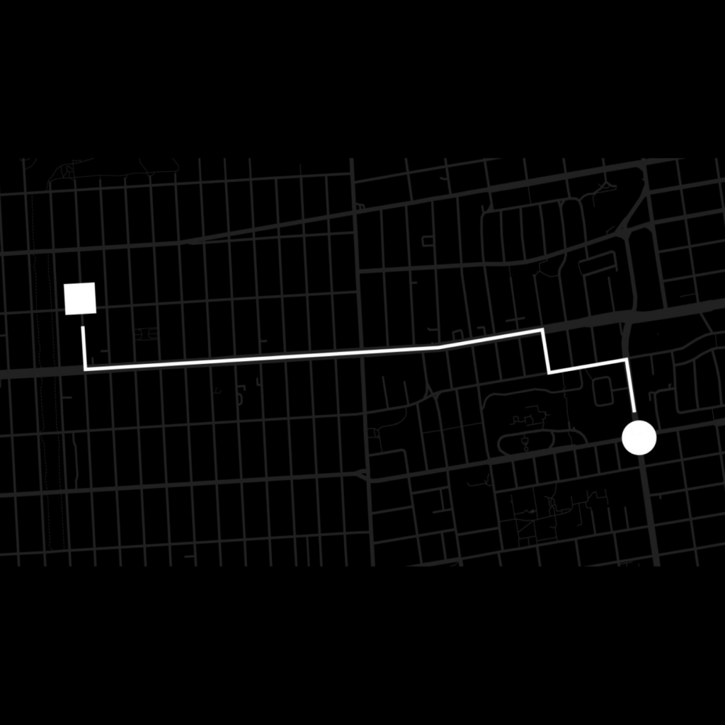
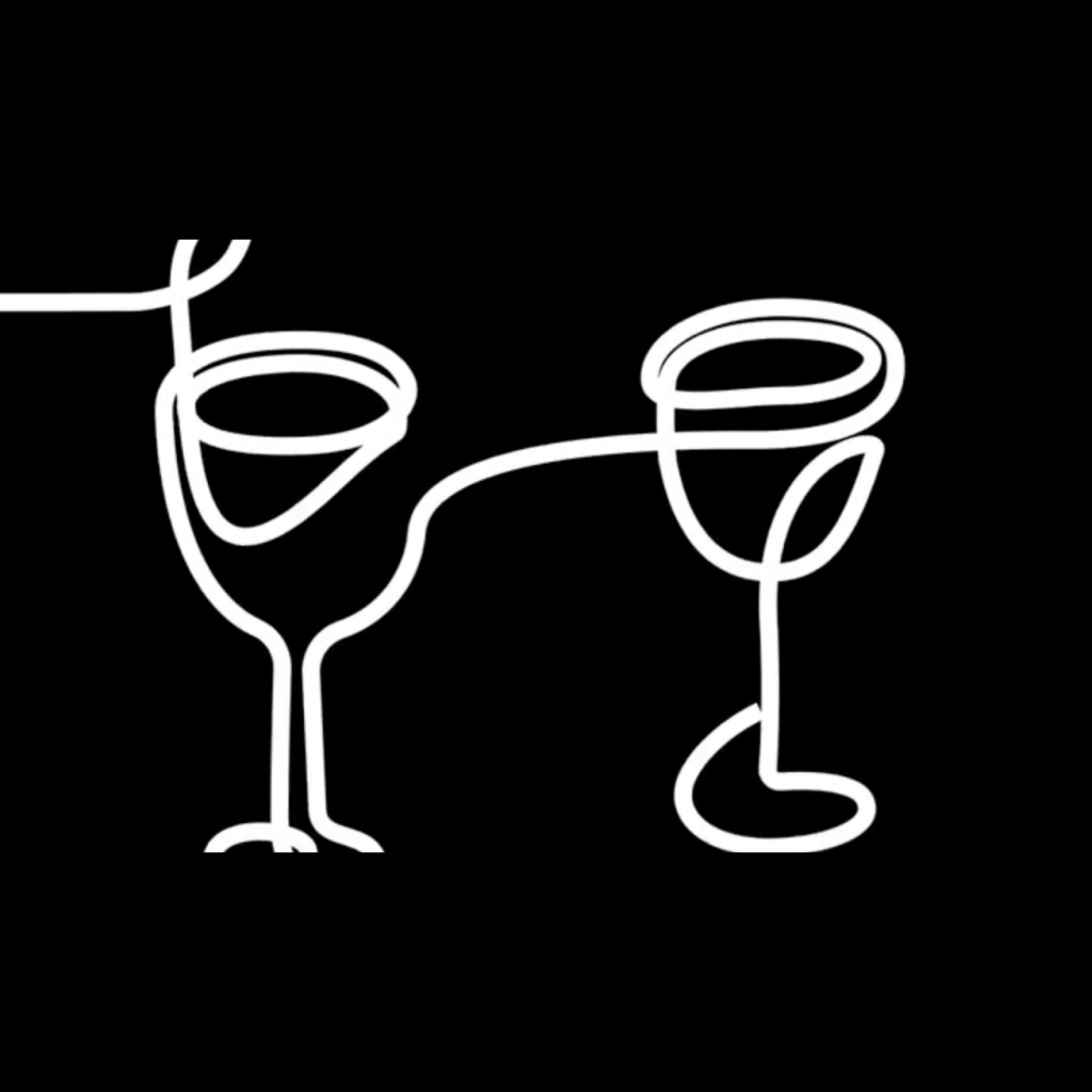
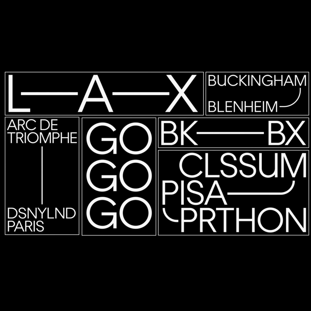
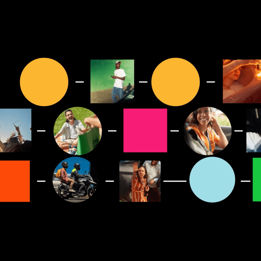
새로운 우버는 원, 선, 사각형을 이용해 ‘이동’을 표현했습니다. 출발의 주체인 사람은 원으로 표현했고 목적지인 공간은 사각형으로 표현했습니다. A 지점에서 B 지점으로 이동하는 것 뿐만 아니라 이동하면서 혹은 이동한 뒤 겪을 수 있는 경험도 간결하게 표현했습니다. 정원, 정사각 프레임 안에 사진으로 경험을 표현하거나 끝이 꺾인 굵은 선으로 매력적인 한 붓 그리기 일러스트레이션으로 경험을 표현합니다.

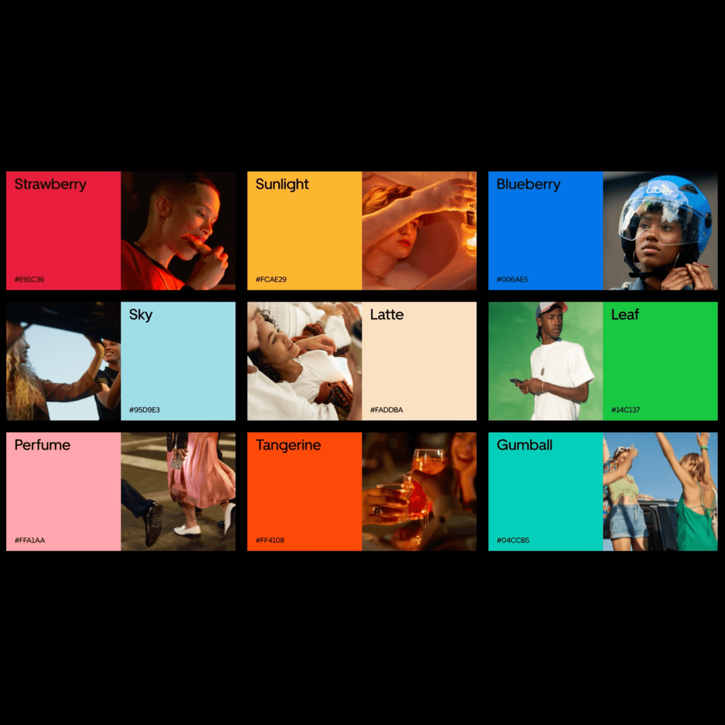
우버는 흑백, 우버 이츠는 녹색으로 정의했듯이 다양한 서비스나 상황에 사용할 수 있는 팔레트도 설계했습니다. 특히 검고 어두운 배경에서 도드라지게 눈에 띄는 색상 구성입니다. 색 사용을 극도로 자제한 우버의 인상에 빨강, 노랑, 파랑과 같은 색이 더해져 기존에서 느끼지 못했던 편안함 혹은 명쾌한 인상을 전합니다.
보통 리브랜딩을 하면 뭔가 달라졌다는 것을 보여주기 위해 시각 정체성을 처음부터 다시 만드는 경우가 많습니다. 목적에 따라 기존에 사람들에게 제공하는 가치가 완전히 뒤바뀔 경우에는 필요한 전략이죠. 다만 서비스의 태도나 가치가 바뀌지 않았는데 시선을 끌기 위해서 새로운 기술로 화려한 표현을 하는 경우도 있습니다. 이번 우버의 브랜드 확장은 단순한 그래픽 요소로 기존의 정체성을 해치지 않으면서 브랜드를 확장한 좋은 사례 같네요. 원과 사각형을 이용한 표현은 한국의 일민 미술관이 떠오르기도 합니다.