‘아이리시 인디펜던트 Irish Independent’가 Mark Porter Associates와 협업해 리브랜딩했습니다. 아이리시 인디펜던트는 1905년부터 발간된 아일랜드 로컬 매거진입니다. 10년 넘게 The Guardian에서 크리에이티브 디렉터로 일한 Mark Porter가 프로젝트를 이끌었습니다.
하프는 60년 이상 동안 아이리시 인디펜던트의 상징이었습니다. 하지만 아일랜드의 여러 브랜드가 하프를 상징으로 사용합니다. 아일랜드를 나타내는 것은 무엇인가? 질문하고 신석기 시대부터 60년대, 70년대 아일랜드 디자인에 이르기까지 광범위하게 탐색했다고 합니다.
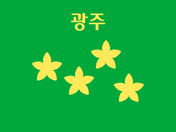
스튜디오는 아일랜드를 한 눈에 알아볼 수 있는 하프와 녹색을 핵심 요소로 정의했습니다. 아일랜드의 전통 하프인 Cláirseach (셀틱 하프)를 핵심 상징으로 다듬었습니다. 워낙 하프를 사용하는 곳이 많다보니 고유한 인상을 부여하기 위해 아이리시 인디펜던트의 정체성인 잡지와 하프를 결합해 심볼로 표현했습니다.
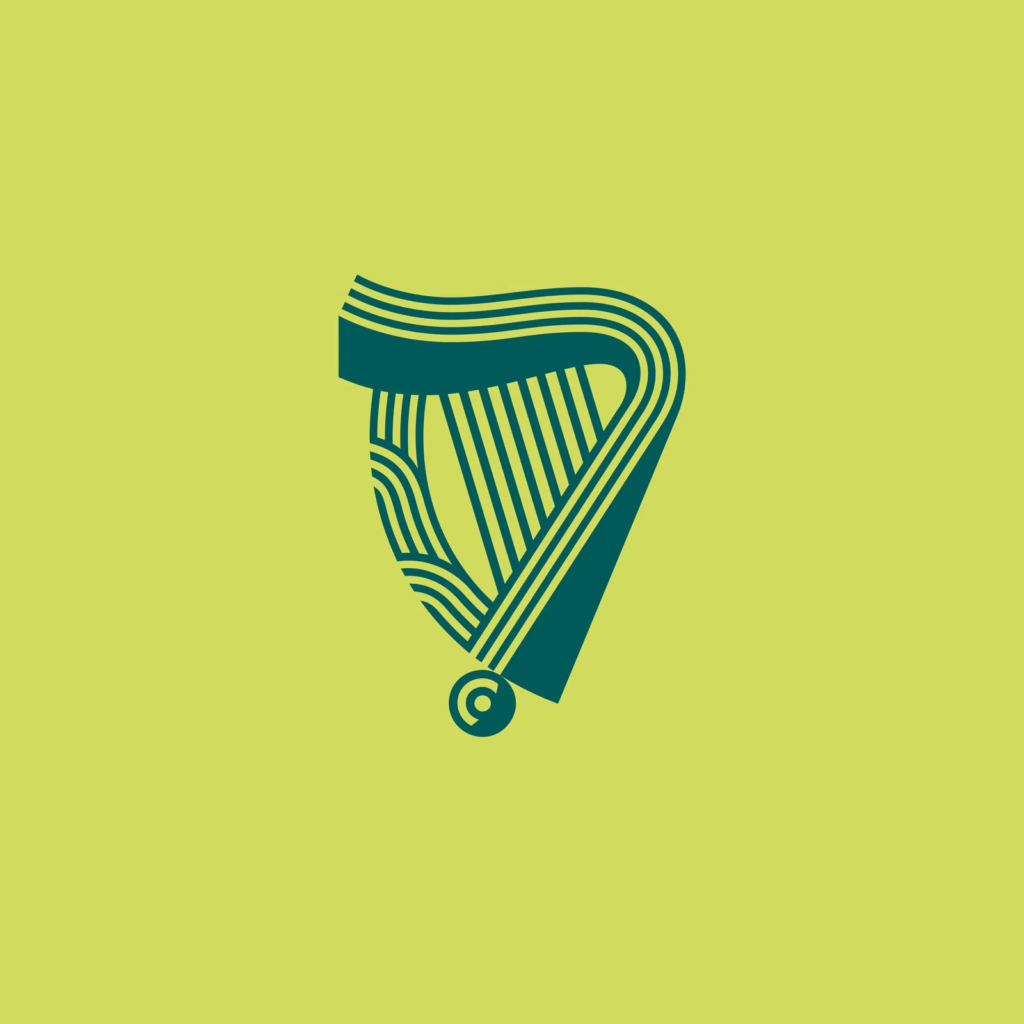
서체는 Max Philips가 제작했습니다. 아일랜드에서 사용했던 게일어에 어울리는 셀틱 스타일의 서체가 매력적입니다. 마치 손으나 도구로 돌이나 나무에 깍아 쓴듯한 느낌이 거친 에너지가 느껴집니다. 그렇다고 너무 흩어지지 않아 현대적이며 세련되게 다듬어졌습니다.
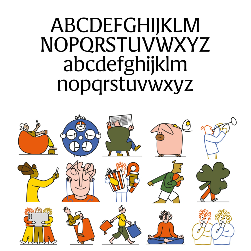
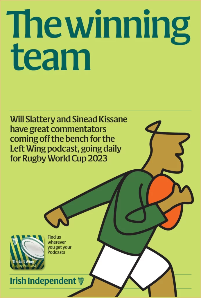
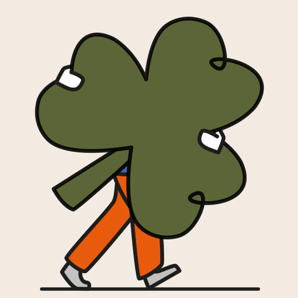
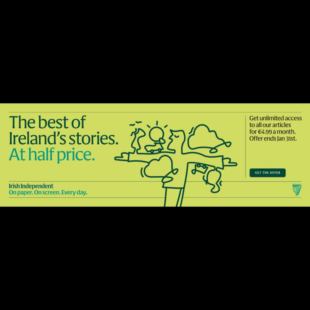
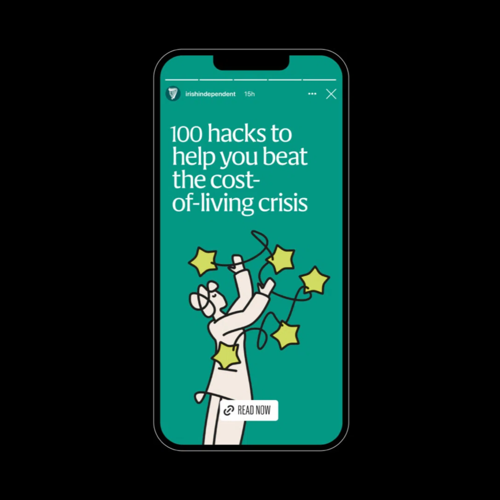
앤드 굿맨의 일러스트레이션이 살아있는 에너지를 더 크게 전합니다. 과거 인쇄 매거진에서 자주 사용되던 팔레트를 사용해 종이에 잉크가 스며든 느낌이 듭니다. 아일랜드의 녹색이 주색으로 너무 드러나지 않으면서 다양한 색감이 녹색 톤으로 조화를 이룹니다.

심볼, 색, 서체는 전통적인 인상을 유지하면서 개성 넘치는 일러스트레이션으로 현대적인 느낌을 전달한 리브랜딩입니다. 디지털 환경에서도 인쇄물의 느낌을 느낄 수 있네요. 이번 아이리시 인디펜던트의 리브랜딩은 단순히 시각 요소를 반복하지 않으면서 전체가 하나의 톤으로 느껴지게 정돈한 좋은 사례 같습니다.