영국 최대의 반려 동물 케어 대기업 Pets at Home이 디자인 스튜디오 Nomad와 함께 그룹 전체의 다양한 서비스를 리브랜딩했습니다.
영국을 중심으로 다양한 반려동물 관련 사업을 하는 Pet’s at Home은 다양한 사업을 엮어 정체성 강화가 필요했습니다. 그룹 전체의 아이덴티티부터 수의사, 재단, 그루밍 등 다양한 사업을 Pets라는 키워드를 중심으로 정비했습니다.
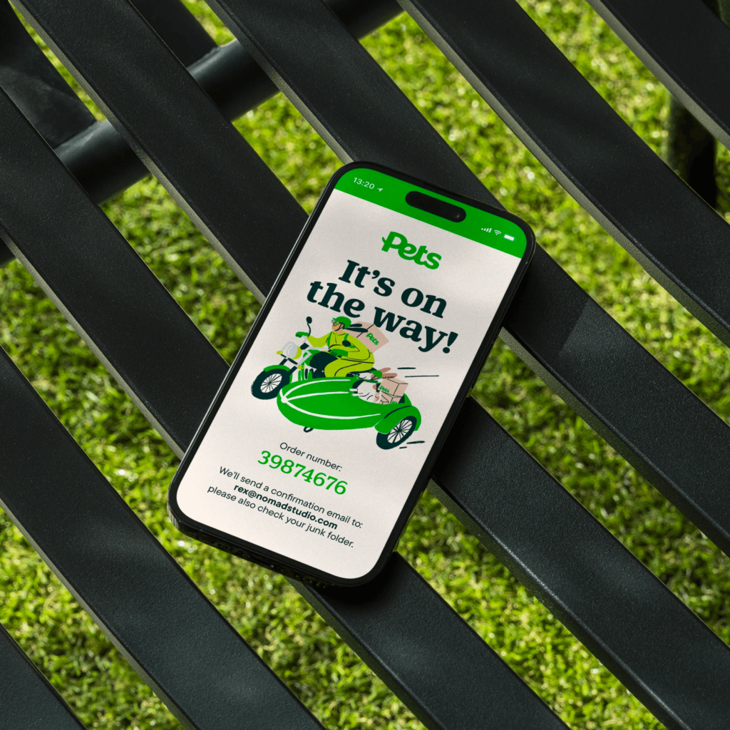
Nomad 스튜디오의 크리에이티브 디렉터 Ash Watkins는 프로젝트가 진행되면서 자연스럽게 확장되었다고 합니다. 언어,시각적 정체성부터 온오프라인 공간까지 모든 접점을 설계했습니다.
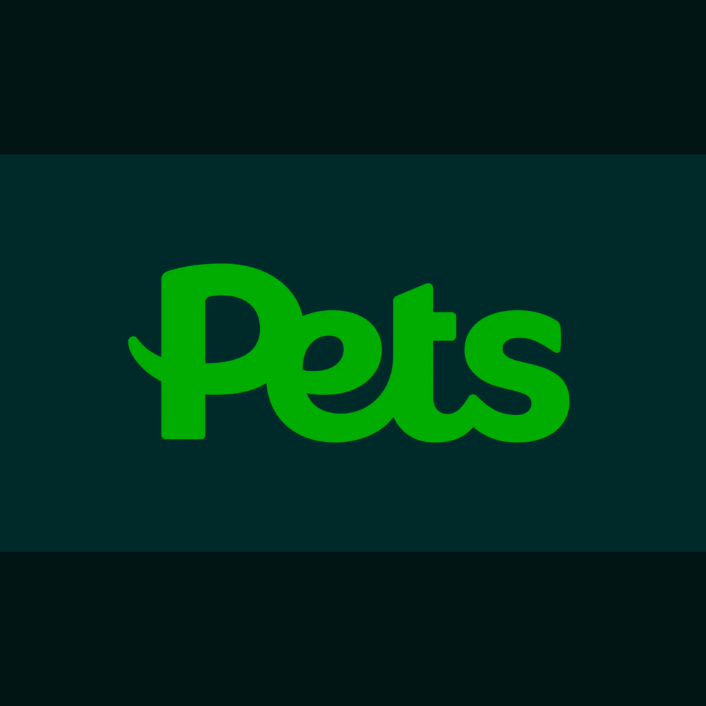
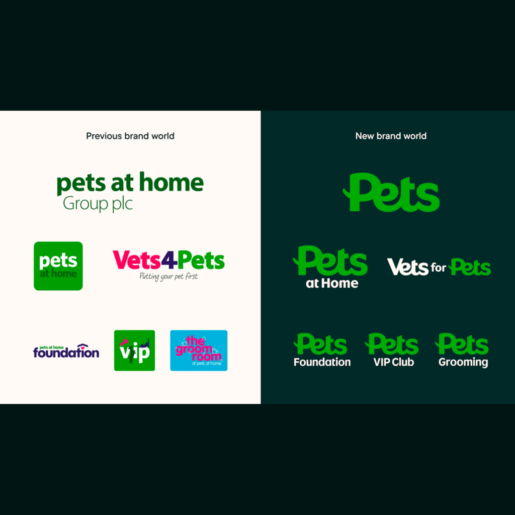
Nomad는 발자국과 지문에서 영감을 받은 모양을 그렸습니다. 아이덴티티 전체에 녹아들어 반려 동물과 반려인의 관계를 표현했습니다. 상징적인 녹색은 조금 더 밝고 신선하게 변경했고 어두운 녹색 배경에 사용할 수 있게 변경했습니다.
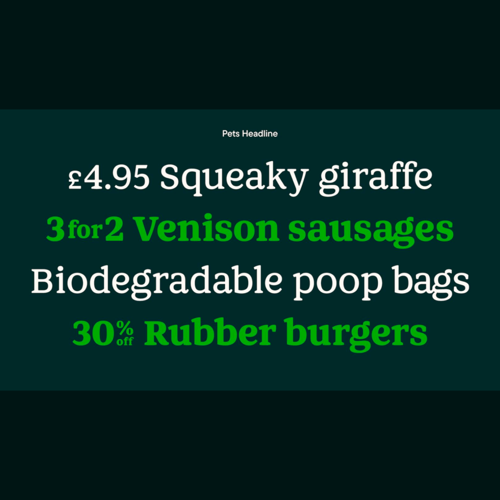
Nomad와 Colophon이 함께 개발한 Pets Headline이 매력적입니다. 그루밍부터 수의사까지 모든 채널에서 쓰일 용도로 개발되었습니다. 즐거움과 신뢰를 표현할 수 있는 고유한 특성이 있는 둥근 세리프 스타일을 선택했다고 합니다.

두 번째 서체는 Pets Sub Brand로 워드마크와 함께 하위 브랜드를 표시할 때만 사용합니다. 꼬리 모양의 디센더와 경사진 어센더를 특징으로 하위 브랜드를 강조하면서 로고와 동일한 특성을 갖도록 디자인했습니다.
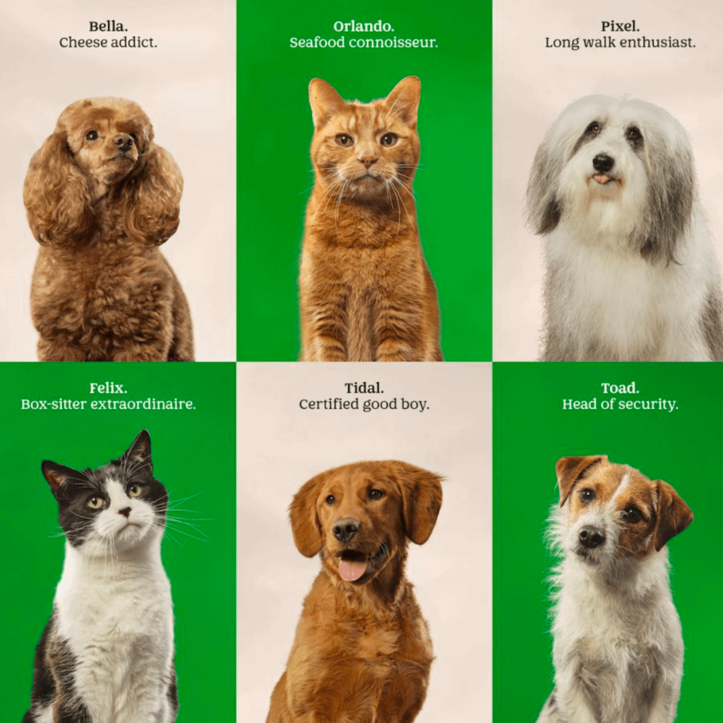
Nomad는 단순한 공간을 채우기 위한 스톡 이미지가 아니라 브랜드의 이야기를 표현할 수 있는 이미지도 만들었습니다. Hannah Warren에게 예기치 않은 유머러스한 상황을 묘사하는 일러스트레이션을 의뢰했고 Liz Seabrook과 각 반려 동물의 개성을 끌어올리는 초상화를 촬영하기도 했습니다.
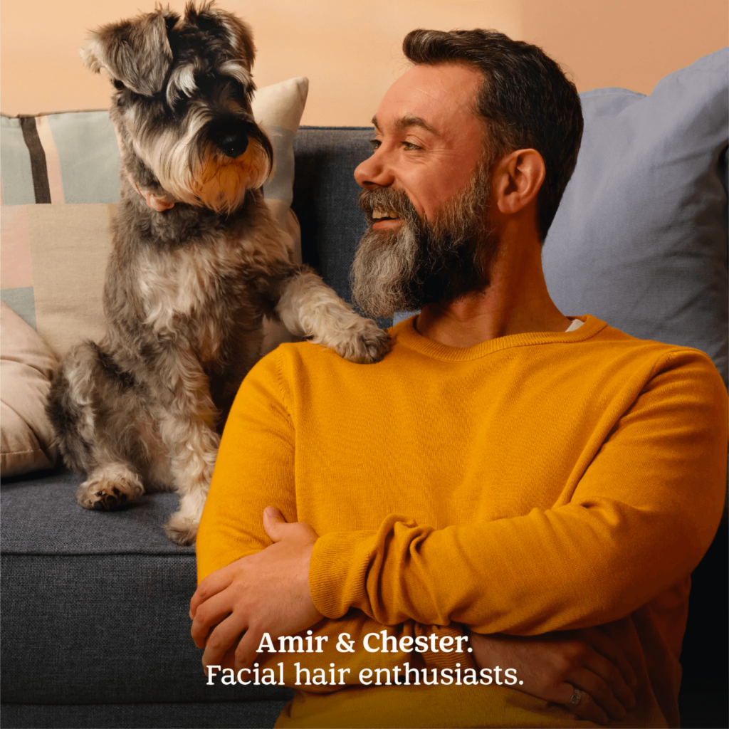
어찌보면 한국의 공공기관의 아이덴티티를 변경햇을 때처럼 각 하위 브랜드의 성격이 사라지는 것은 아닌가 싶었는데 오히려 모든 행동의 중심에 있는 반려 동물과 반려인의 관계가 강하게 드러나는 디자인이 더 매력적으로 느껴집니다.
그리고 단순히 다른 회사들이 많이 하기 때문에 따라가기 위해 여러 디자인 요소를 만드는 것이 아니라 회사와 서비스의 생각을 더 또렷하게 전달하기 위해 만들어낸 디자인 결과물들이 설득력 있습니다. 가볍게 흔들리는 듯한 워드마크도 정말 매력적이네요.