Little Finder Guy, Apple's New Character

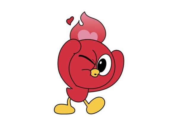
Apple created an unexpected protagonist in the process of promoting the MacBook Neo. It is a small character that users call the "Lil Finder Guy." This character appeared only briefly in a corner of an Apple TikTok video, yet it immediately drew an online reaction. With its round body and limbs, it looks like a three-dimensional version of the Finder icon, the symbol of the Mac. Its appearance also fit well with current internet conventions. On one occasion, the MacBook Neo specifications [… ]

Getty Rebranding, Mosaic G Frame

The Getty, a leading American institution of culture and the arts, has unveiled a new integrated brand identity. Since its establishment in 1953, the J. Paul Getty Trust has operated the Getty Center and Getty Villa in Los Angeles, as well as the Foundation’s Conservation Research Institute. This reorganization is an effort to reunite the scattered images of the institutions under a single name. The core of the new logo is the letter G placed within a square structure. Four pieces interlock to form a single shape, […]

ESPN, Dynamic Horizon Motif

Sports media outlet ESPN has unveiled a new brand system. This project is reported to have been carried out by global branding studio Dixon Boxy in collaboration with the ESPN brand team. Dixon Boxy explained that ESPN has gone beyond being a channel that has broadcast sports for over 30 years to create a way for fans to feel, discuss, celebrate, and remember sports. However, they analyzed that as fan culture changes, fans now desire emotions, individuality, tension, and enjoyment more strongly than simple game information. […]

Yuhan-Kimberly 'Good Feeling' Rebranding

Yuhan Kimberly has carried out a Brand Identity (BI) renewal for its feminine hygiene brand, 'Good Feeling.' As a leading brand that has spearheaded the popularization of the domestic feminine hygiene market, Good Feeling has long presented 'comfort' as its core value. This renewal embodies Yuhan Kimberly's proactive commitment to inheriting the trust and heritage accumulated over the years, while simultaneously responding more deeply to the 'women's wellness' values of a changing era. This project was conducted based on detailed direction and brand design planning by Yuhan Kimberly's internal working-level staff. Yuhan Kimberly [… ]

Snickers Chocolate exclusive font

Chocolate brand Snickers has unveiled a new custom typeface, Snickers Sans. It is characterized by a redesigned letter structure derived from formal clues found in the brand logotype. Inspired by the traditional American Gothic style, it has been reinterpreted with a new tone that adds Snickers' signature thick impression and modern weight. This typeface consists of two families: one for display and one for body text. To ensure a strong presence in large headlines and maintain a continuous reading flow in smaller body text [… ]

Fursys, Square Module System

Fursys, a flagship subsidiary of the Fursys Group and an office furniture brand, has embarked on a rebranding effort. According to industry sources, Fursys has recently initiated internal procedures and plans to overhaul its CI system, which was revamped in 2015, for the first time in 11 years. Fursys stated that it aims to launch the rebranding campaign in the second quarter of 2026. This move is being evaluated as a realignment aligned with the brand's mid-to-long-term vision and changes in the business environment, rather than a one-off message targeting a specific generation. Fursys [… ]

Krafton Unveils New CI Logo

Krafton unveiled its new vision, slogan, and corporate logo on February 26. CEO Kim Chang-han presented organizational alignment and mid-to-long-term growth directions during the internal program, Krafton Live Talk. The new vision consists of a declaration to walk a path no one has taken to realize the dreams of gamers. The slogan is "Pioneer the Undiscovered." Translated into Korean, it means pioneering unknown territories. While focusing on the essence of the game business, the genres and technologies [… ]

1,000 Random Logos for the Pokémon 30th Anniversary

Ahead of its 30th anniversary, Pokémon has unveiled over 1,000 new logos all at once. This is being evaluated as an attempt to showcase the scale of the Pokédex accumulated since the series began in 1996, in the form of logos. Overseas design media reported that the creation of an individual logo for each Pokémon species is symbolic of this reveal. The new main logo features the text "Pokémon Since 1996" prominently alongside the 30 emblem. However, the key point is that [… ] rather than the main logo

GoFundMe, Fundraising Graph-Centric Visual Identity

This is the brand identity developed by the global online fundraising platform GoFundMe in collaboration with Studio Cotto. Following the acquisition of the non-profit fundraising platform Classy in 2024, the need arose to establish a new leadership image as the business scope expanded from peer-to-peer fundraising to supporting professional non-profit organizations. GoFundMe reinforced its identity as a single platform where anyone can give and receive help. The new brand idea is "Help Adds Up." Through the message that help accumulates, community participation [… ]

MachineX, a DeFi exchange for humans and robots

MachineX has unveiled its brand identity, developed in collaboration with Studio Koto, positioning itself as a DeFi exchange that bridges transactions between humans and machines. MachineX promotes a range of assets for trading, including tokenized robots and DeFiN utility tokens, as well as space, time, and energy. Aiming to be a P2P marketplace based on Peak blockchain technology, the company envisions becoming a core marketplace of the so-called machine economy. The project's challenge is to embody the promise of humans and machines working together, while addressing the industry's recurring cold technology [… ]

Void Zero, Open Source Development Tool Branding

London-based creative agency Together has integrated the JavaScript toolchain of open-source company VoidZero into a single brand system. VoidZero has operated widely used tools such as Vite, but user perception had been fragmented due to differing logos and visual languages for each product. Developers used the tools with trust, but it was difficult to feel the connection that they originated from the same source. As VoidZero prepared for the launch of commercial products, this gap [ [was] [unclear] for building brand awareness and future transition to paid services [… ]

Gucci Demna 'La Familia' Campaign Crest

This is Gucci Demna's 'La Familia' campaign. The campaign binds various individuals together as a family and explains their personas through their respective wardrobes, with this knight's coat of arms placed at the starting point. The logo brought to the forefront is not a double G, but an emblem that resembles a coat of arms. The key image is an armored knight standing facing forward inside a shield, holding a suitcase in one hand. This logo draws upon the lineage known as the Gucci Crest. In the materials [… ]

Design for Business