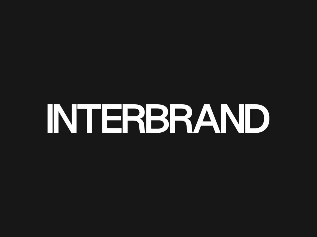
Interbrand has unveiled a new logo and visual identity. This rebranding was carried out by Interbrand's internal team, rather than an external studio.
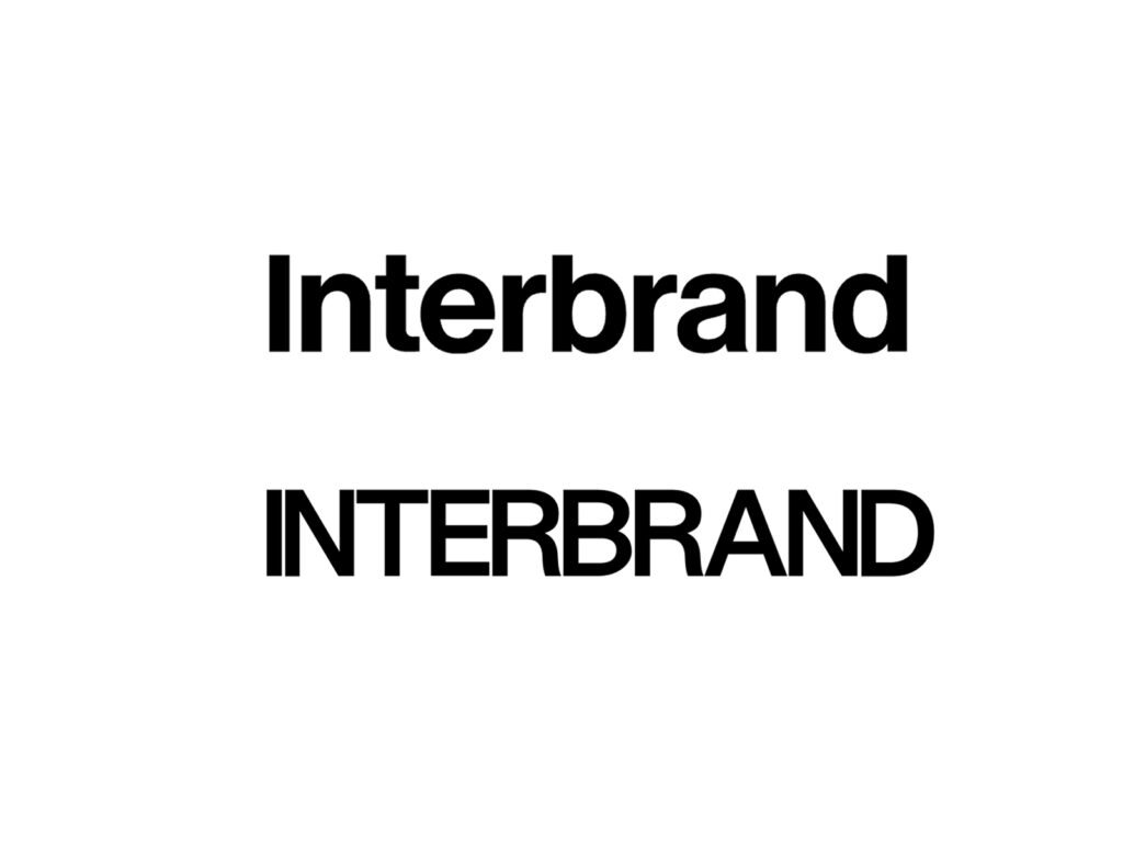
The new logo has changed from lowercase to uppercase, and the kerning has become very narrow. INTERBRANDAs the letters stick together strongly, some combinations are read as a single block.
Kerning is a subtle balance that determines the overall quality of a logo. If the letter spacing is too wide, it looks loose, and if it is too narrow, it looks stifling. The reaction to this Interbrand logo is that it leans closer to the latter. Since it is the logo of a company dealing with brand strategy and design, such details are perceived more prominently.
However, the narrow kerning may be an intentional choice. Interbrand explains on its official website that it creates “Iconic Moves” for the next growth of brands. The tightly spaced wordmark makes it look like a solid and compressed organization rather than a loose consulting firm.
The question is whether that sense of compression is perceived as the power of the brand or as visual discomfort. The smaller a logo is used, the more important the spacing between letters becomes. In small environments, such as app icons, document headers, and social media profiles, narrow kerning can reduce readability.
This rebranding has sparked debate over its execution rather than its direction. Interbrand aims to project an image of a more solid and modern brand consulting firm. However, the overly close spacing of the letters in the new logo is interpreted as a factor that hinders this intention. This is why the brand of a company that evaluates brands is evaluated more rigorously.
More and Sources