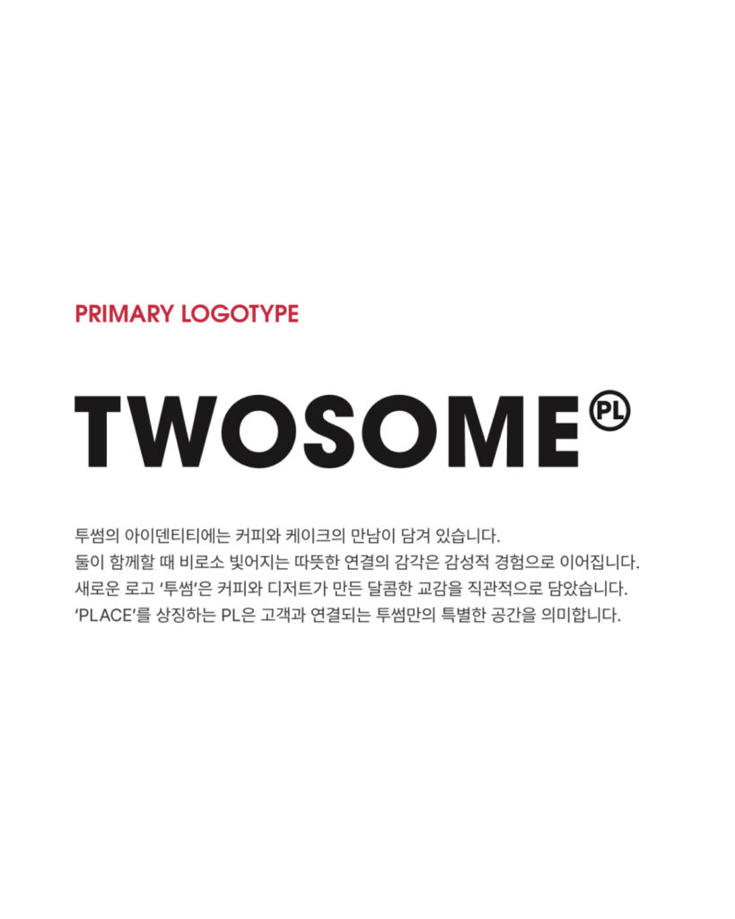
Twosome Place has revamped its brand identity. The key is to prioritize the name "Twosome," which people frequently use, over its long English name. The new BI was designed to capture the name Twosome, the relationship between coffee and dessert, and the impression of a Korean brand.
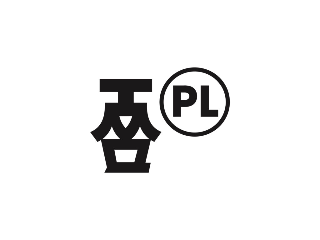
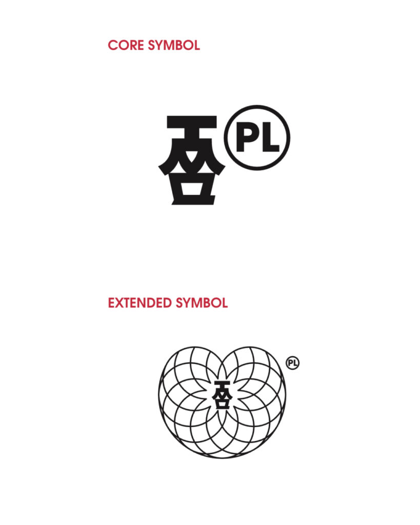
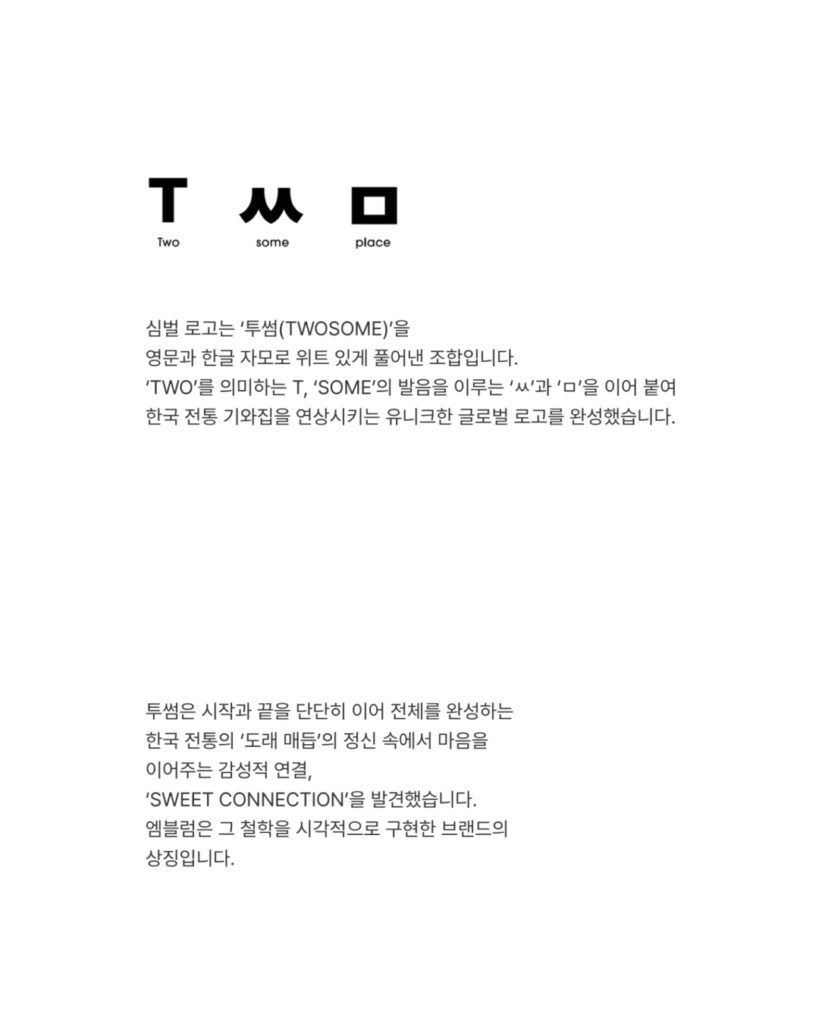
The biggest change is the symbol. According to Twosome Place's official BI explanation, the new symbol is a combination of 'TWOSOME' interpreted using English letters and Korean consonants and vowels. It combines 'T,' representing 'TWO,' with the Korean consonants 'ㅆ' and 'ㅁ,' which form the pronunciation of 'SOME.' Twosome Place describes this structure as a global logo reminiscent of a traditional Korean tiled-roof house.
This symbol does not use direct images such as coffee cups, beans, or cakes. Instead, it utilizes the sound of the brand name and the structure of the Korean alphabet. It transforms the pronunciation of "Twosome" into a visual symbol and imbues it with a Korean impression. What distinguishes it is that the Korean alphabet is not merely attached as a decorative element, but is used as the fundamental material for creating the brand name.
Korean elements are not direct either. Dancheong, Hanbok, and traditional patterns were not used as they are. The shape created by combining 'ㅆ' and 'ㅁ' was designed to resemble the roofline of a tiled-roof house. Therefore, domestic users may find the Korean alphabet familiar, while overseas users may perceive it as an abstract symbol that distinguishes it from other coffee brands.
The new BI is also connected to the spatial experience. Twosome Place opened its next-generation concept store, 'Twosome 2.0 Gangnam,' in September 2025. This store was designed as a space that goes beyond a cafe serving desserts, proposing the value of the moment that is completed when cake and coffee are together.
More and Sources