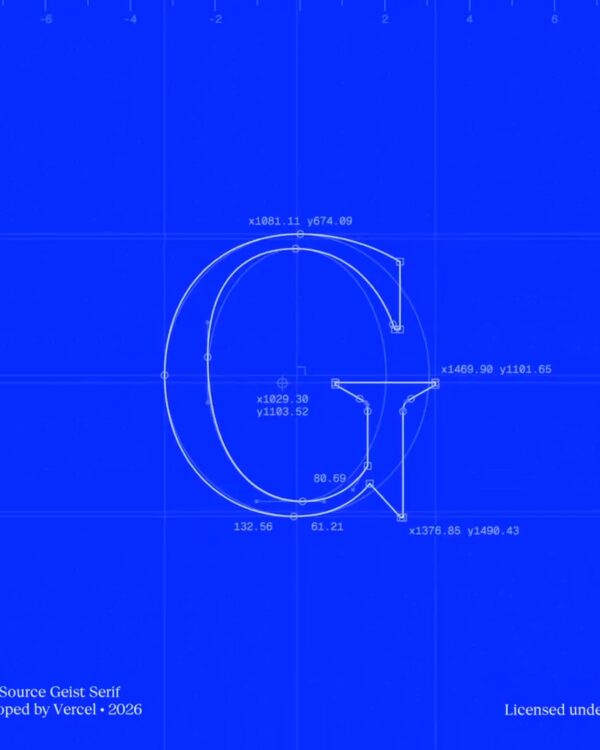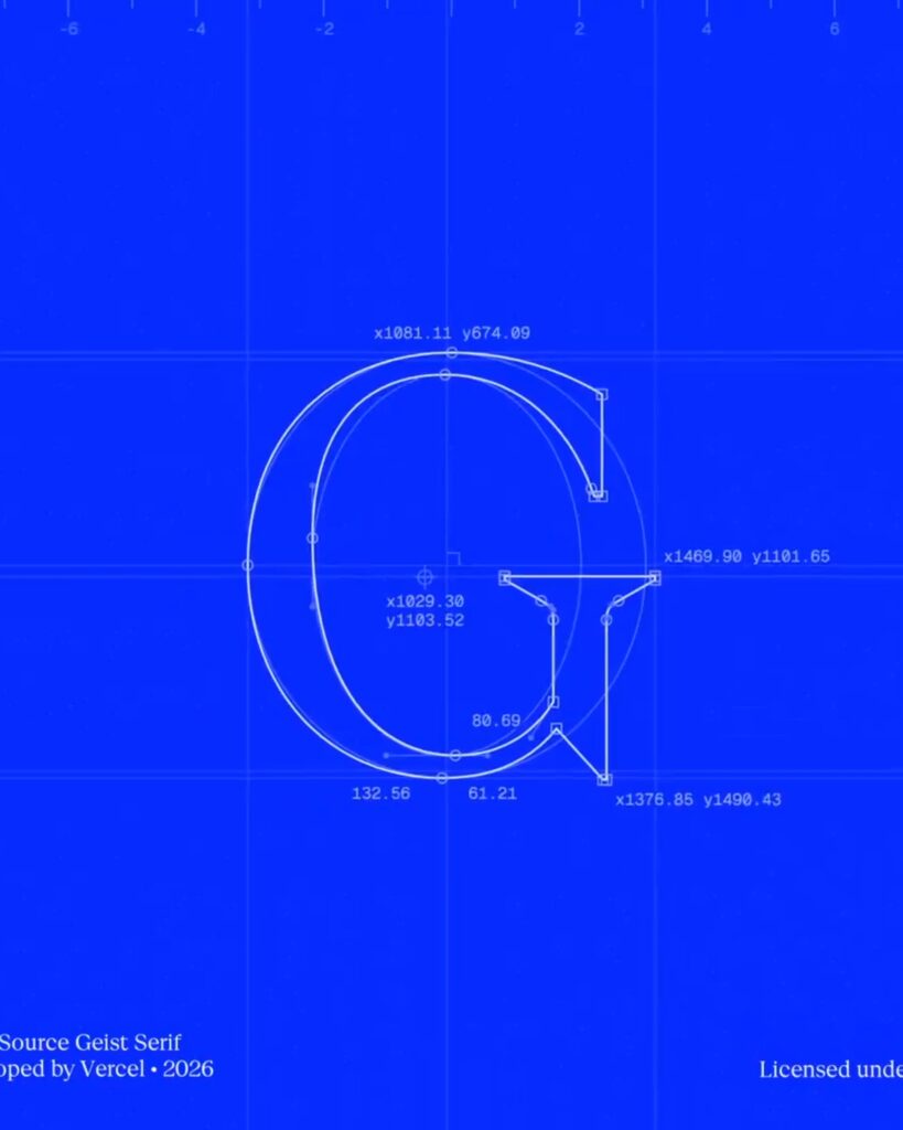
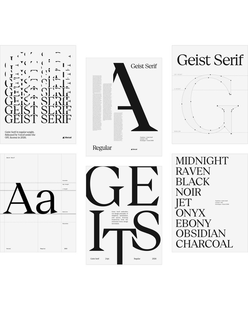
This is the 'Geist Serif' typeface created by Bussell in collaboration with designers Evil Rabbit, Andres Briganti, and Mark Davis. Released on October 30, 2026, it is the newest typeface in the Geist family and was designed for environments where large text is used, such as titles and posters. It adds stroke thickness contrast and pointed serifs to the structure of the existing Geist Sans.
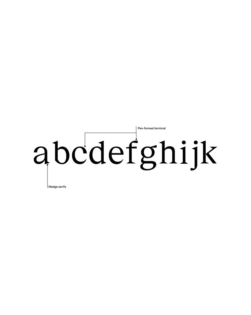
The design's reference point is fashion and magazine typography. Bussell explains that he was inspired by the editorial designers of Rolling Stone and Harper's Bazaar. Fine strokes and sawtooth-like serifs were refined to reveal detailed forms on high-density screens. The serifs are composed of a wedge shape on one side and a curve on the opposite.
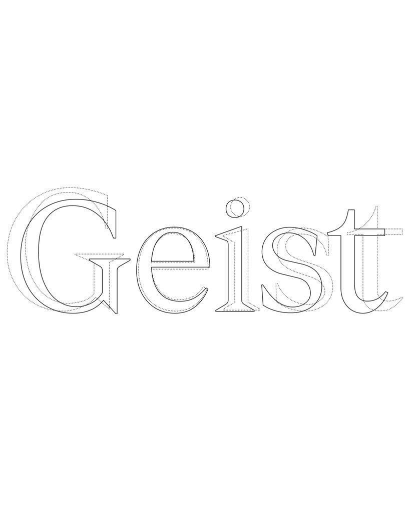
We also maintained standards for use with existing typefaces. It aligns the height of uppercase and lowercase 'x' with Geist Sans, and shares the character width and slant. The design allows the sans used on product screens and the serifs used for titles to be combined within the same system.
We have also added a feature to change the shape of the dots. You can select circular, square, triangular, or heart-shaped dots for characters such as 'i', 'j', and punctuation marks. The triangle shape was taken from the Versell logo. You can change the dot shape within a single font or use each shape as a separate file.
The initial release comes in a single Regular weight and supports 894 glyphs and 352 Latin-based languages. Letter spacing was adjusted by reviewing over 52,000 kerning pairs. Versell is currently developing additional weights, body text, and italics, and you can view the files and character forms on the official font page.
See more and sources
https://vercel.com/blog/introducing-geist-serif
https://vercel.com/font