This is a brand identity design collaboration between Purple Garden and Mother Design. Purple Garden is an online platform that connects users with spiritual counselors. Mother Design was tasked with translating the rapport and sensations felt during counseling onto the screen. They redesigned everything from brand strategy to the logo, images, tone, and motion.
The starting point was an automated drawing workshop with a counselor. Inspired by the painter Hilma af Klint, the team drew intuitively. The forms and textures that emerged from this process served as the foundation for the visual language. The brand's central concept is "A Living Practice," which signifies a "living practice." It expresses spiritual activities carried out in daily life.
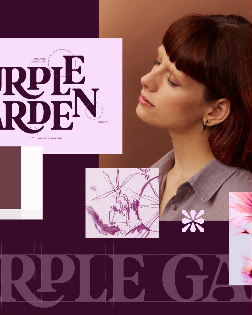
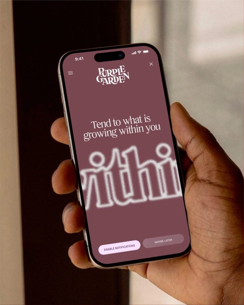
The wordmark takes the form of connecting parts and curves growing like branches extending from a plant. The letters are varied in height and connected to one another by curves. Visual alignment has also been adjusted to ensure readability on digital screens. In small spaces, a separate symbol inspired by plants and crystals is used. The moving text references patterns created by vibrations and atomic structures.
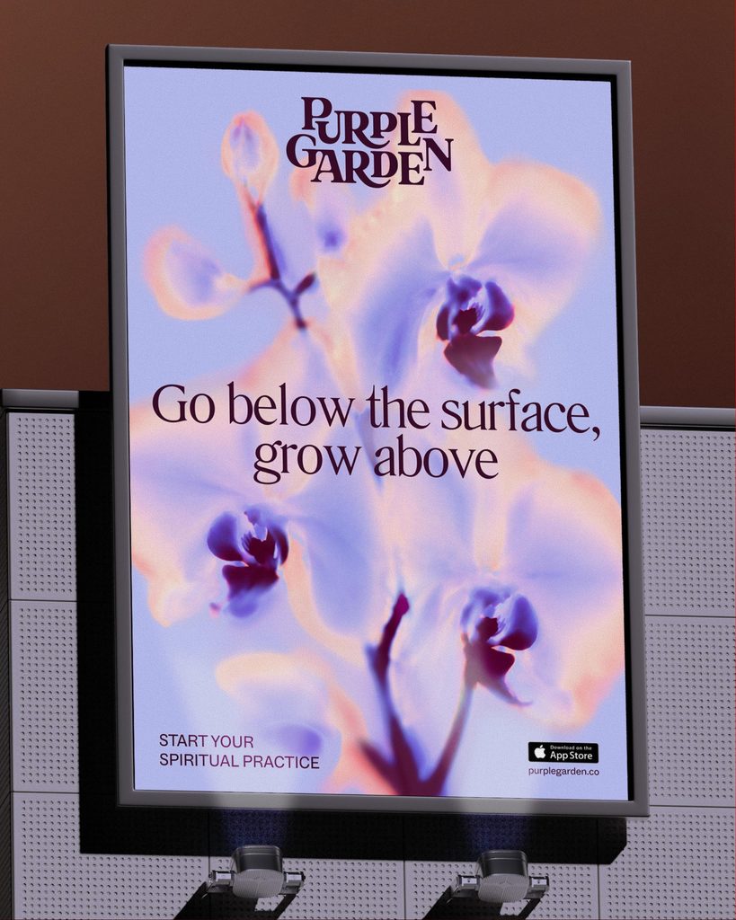
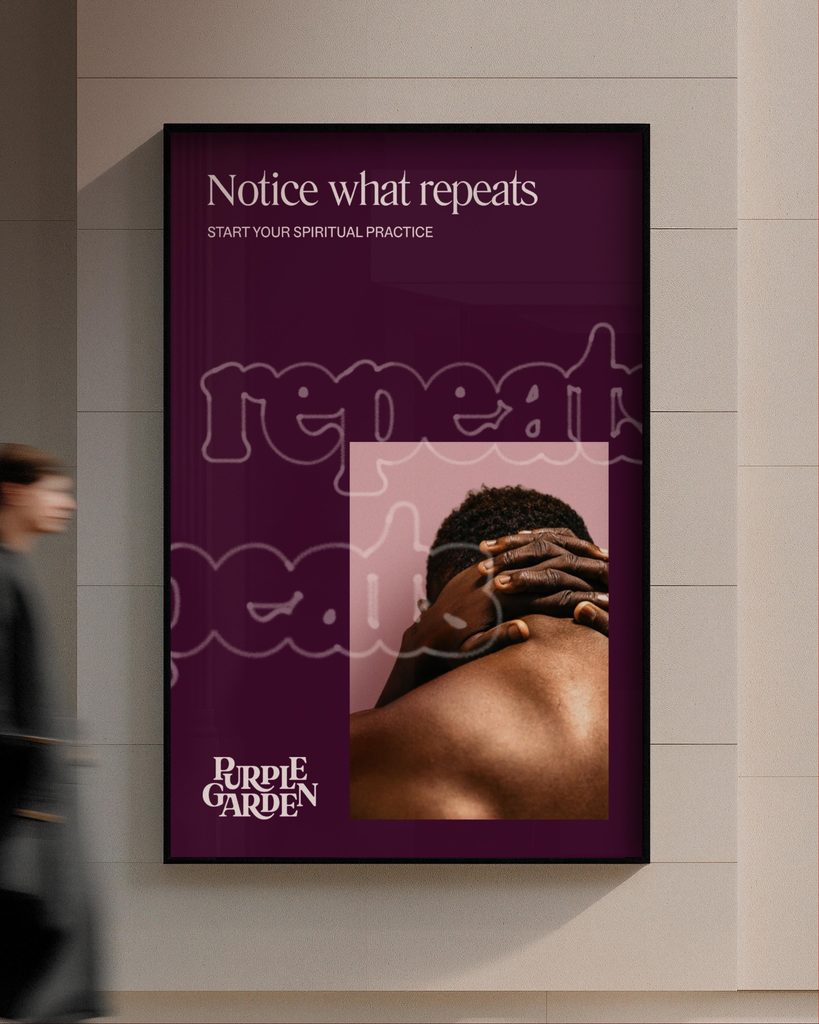
The color scheme is centered around seven warm shades of purple. Secondary colors inspired by dawn, dusk, and the moment of moonrise were added. Light diffusion effects were applied to natural imagery, such as flowers and crystals. Portraits, landscapes, and hand-drawn traces were layered and utilized across various screens and advertisements.
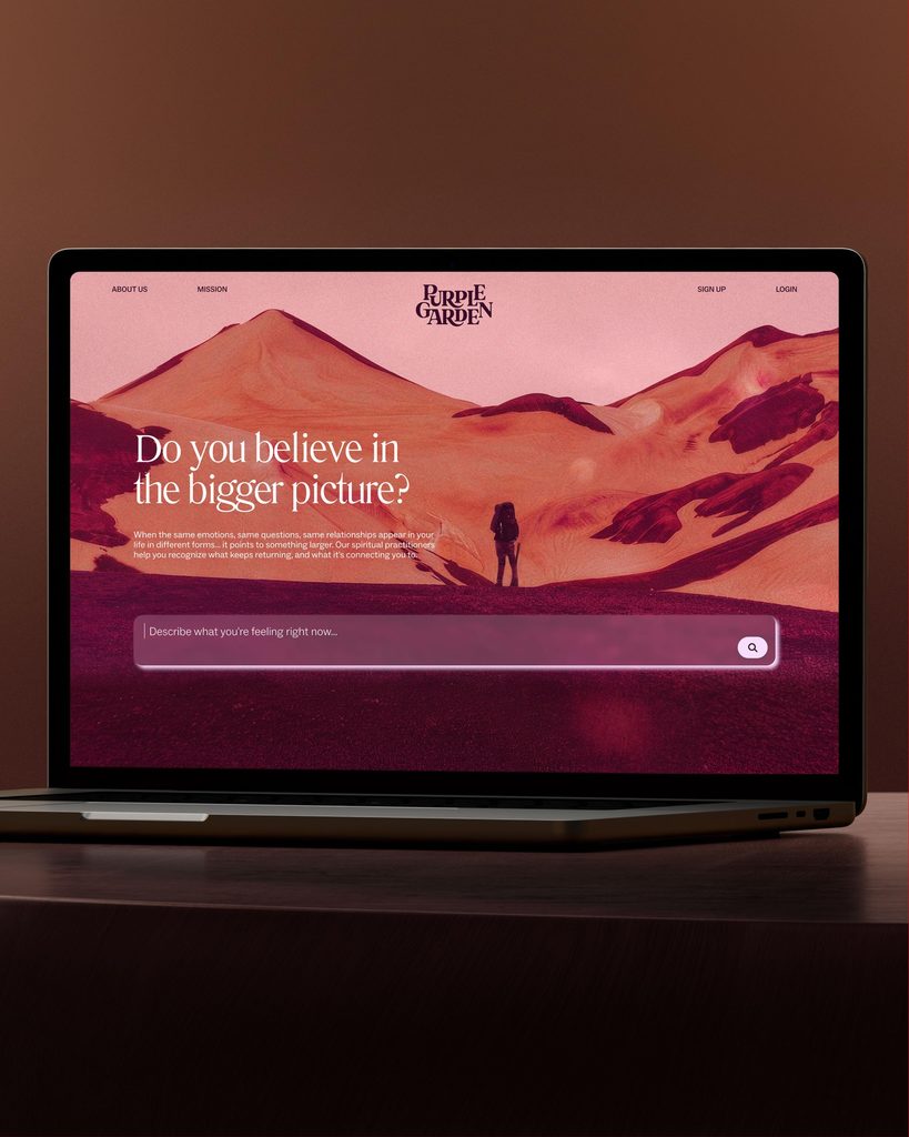
The screen composition organically overlaps images and text while incorporating rules applicable to various media. During the production process, visual transformations were experimented with by alternating between traditional design tools and AI. The text is designed to encourage users to reflect on their experiences, employing both guidance to move forward and expressions that prompt a moment of pause.

See more and sources
https://www.motherdesign.com/work/PurpleGarden