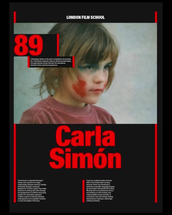
This is a brand identity design project for the London Film School in collaboration with design studio Rabbit Hole. Launched in 2025, the project revamped the logo, typography, website, and marketing materials. It restructured the school's visual language to align with changes including a new curriculum and the relocation to a new space in Covent Garden.
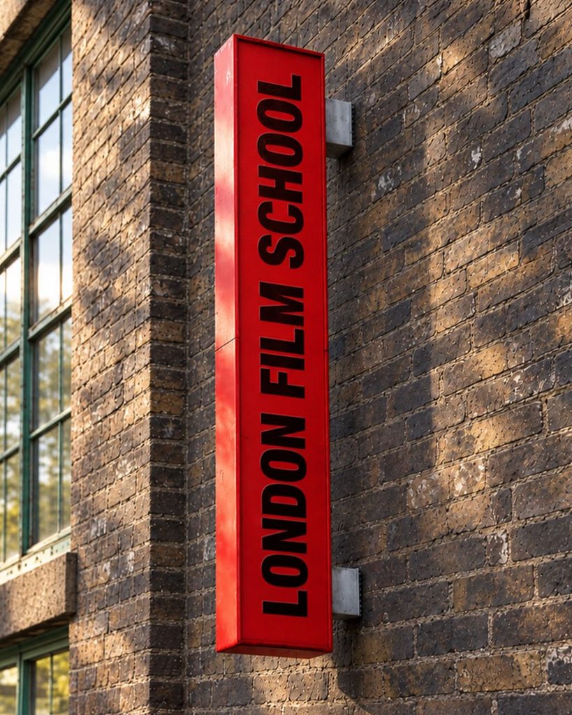
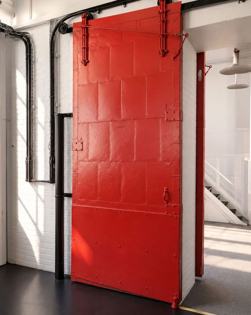
The centerpiece is the red color the school has used since the 1960s. Rabbit Hole retained this color, which is also used on the red doors at the school entrance. Instead of adding a new color, it was adjusted to a brighter hue to suit digital screens. The same color is applied to signage, print materials, and the website to connect the media.
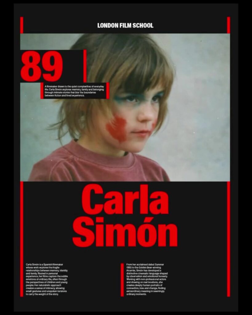
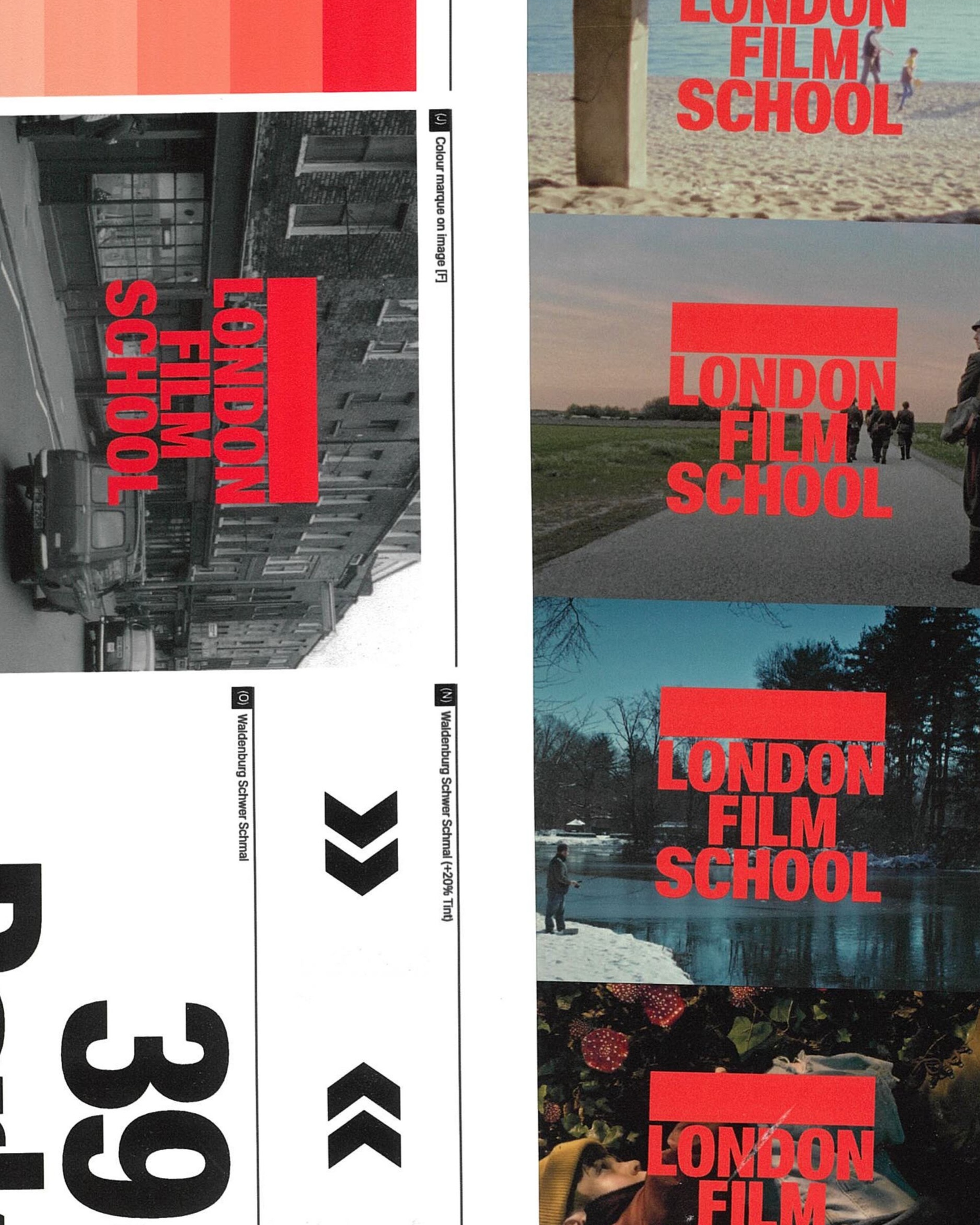
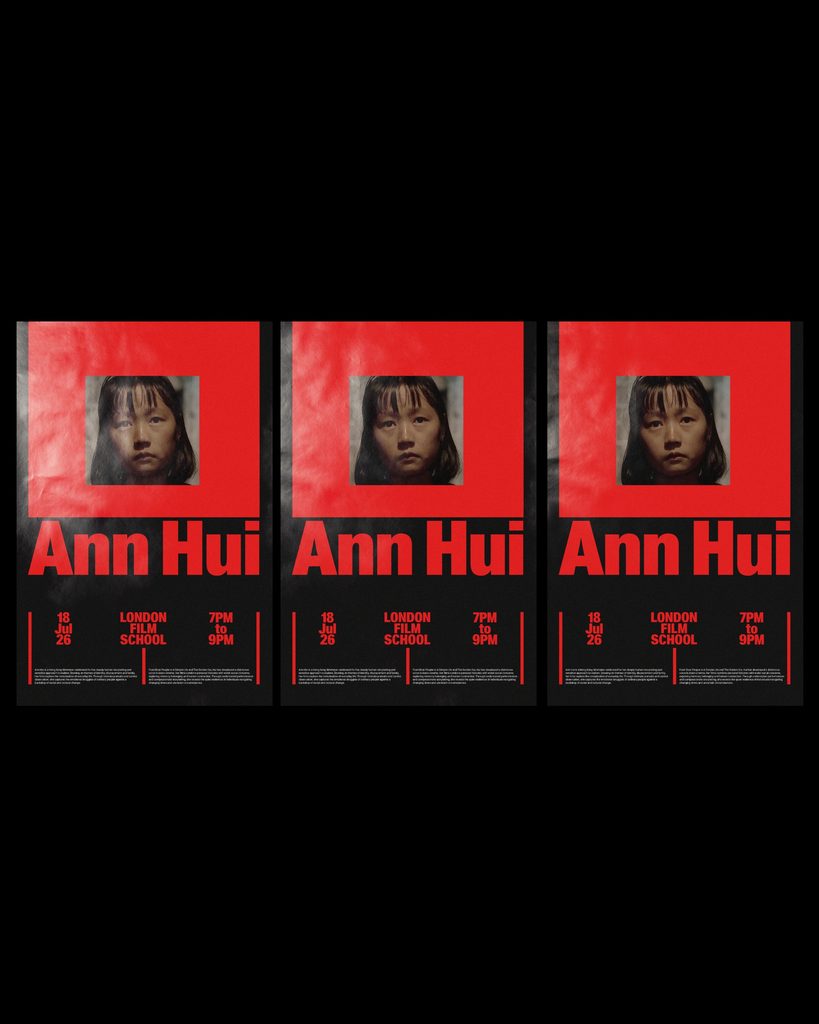
The red frames outside and above the logo reflect the act of defining the screen boundaries in film. The process of deciding what to include and from what perspective to show it has been translated into graphics. This was expanded by overlaying the school name and red areas on top of photos or by surrounding portraits with wide borders.
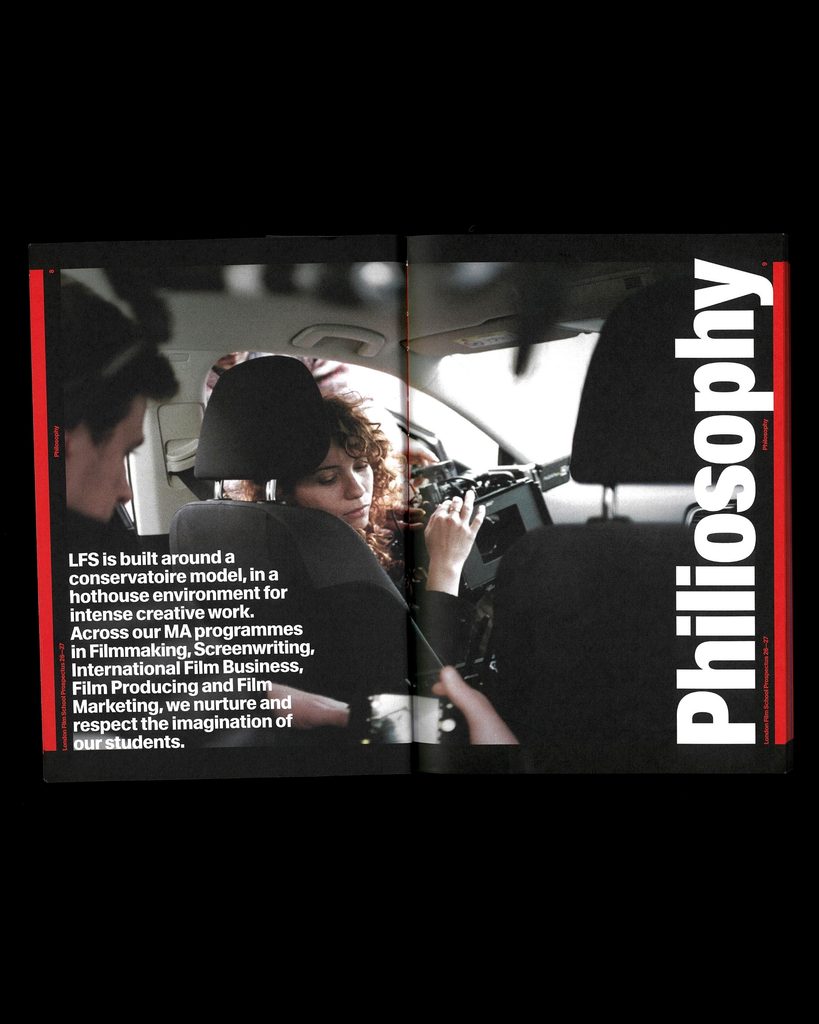
Chimera's Waldenburg typeface was used. Narrow, bold letters were placed in large sizes, and the same typeface system was applied even to small information. In the school introduction booklet, photos from the filming location filled the spread, and the pages were organized with large vertical titles and red lines. The event poster divides information by varying the sizes of photos of people, names, and the schedule.
Rabbit Hole also designed and built the website in-house. It was revamped based on the understanding that it serves as the primary first point of contact for international applicants. With the phrase "Find your voice in film," it conveys the brand message of the process by which students find their voice within movies.
See more and sources
https://rabbithole.co.uk/case-study/london-film-school/