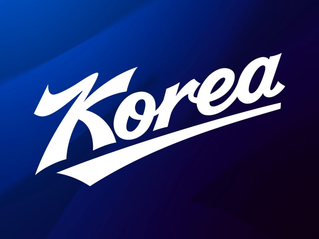
The symbol of the Korean national baseball team has been changed for the first time in 18 years. The Korea Baseball Organization (KBO) and the Korea Baseball Softball Association (KBSA) unveiled the national team's new brand identity (BI) on June 9, 2026. This rebranding was carried out to enhance the team's brand value and status by reinterpreting the existing logo, developed in 2008, in a modern way.
The new BI continues the symbolism built by the existing national team logo while being refined into a more concise and intuitive form. The previous logo was a symbol that accompanied major moments in Korean baseball, including the victory at the 2008 Beijing Olympics. The new design inherits this heritage while being refined to suit use across various media and environments today.
The most striking element is the 'KOREA' wordmark. The line extending toward the top right expresses Korean baseball's challenge and determination for the future. The smoothly flowing cursive form visualizes the flow and rhythm of the game, while the refined strokes create a more modern and sophisticated impression.
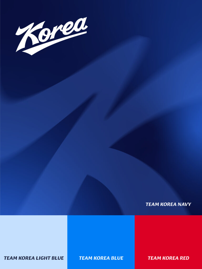
The 'K' lettermark, unveiled alongside it, embodies both the movement of baseball and Korean identity. It was inspired by a pitcher's throwing motion, a batter's swing trajectory, and the 'hansam' (sleeves) of traditional Korean mask dance. The sharp angles express the powerful impact of the moment of contact, while the design, a blend of curves and straight lines, captures the energy of the national team and Korean strength.
The color system retained the national team's existing symbolic color, 'Team Korea Navy'. In addition, 'Team Korea Light Blue', 'Team Korea Blue', and 'Team Korea Red' were included as secondary colors to allow for flexible use across various media, including uniforms, merchandise, and digital content.
More and Sources