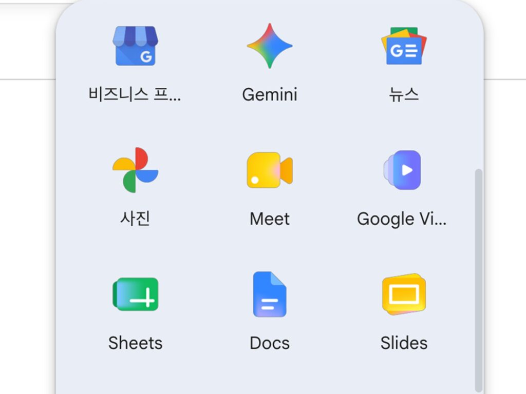
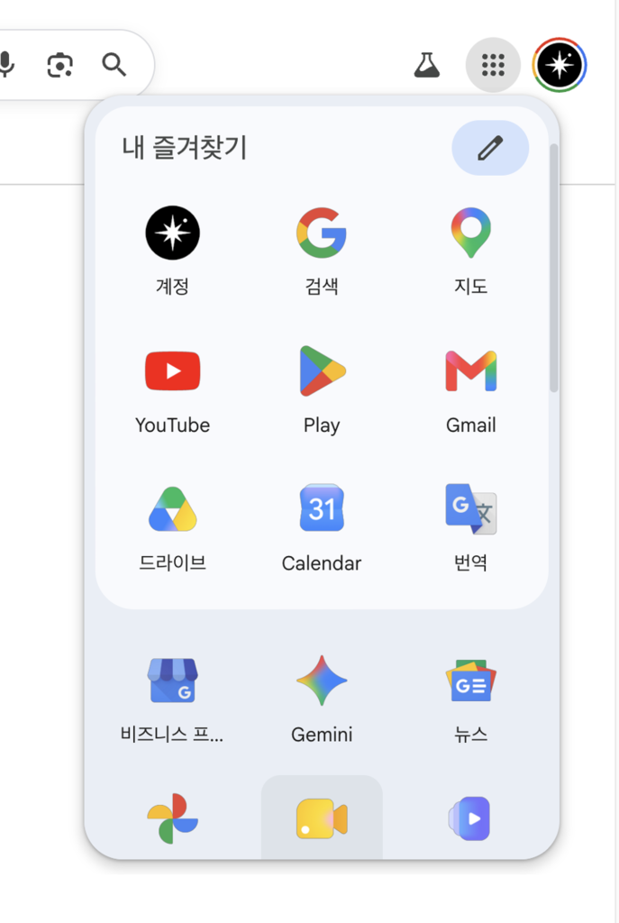
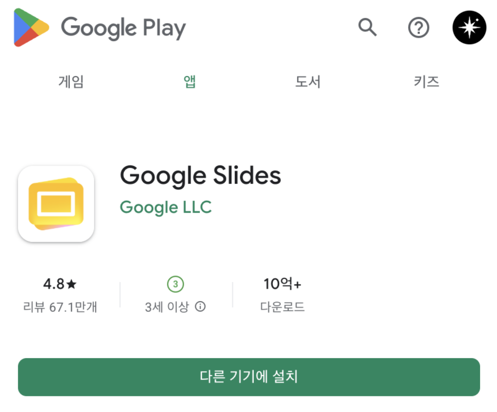
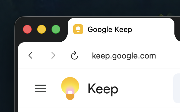
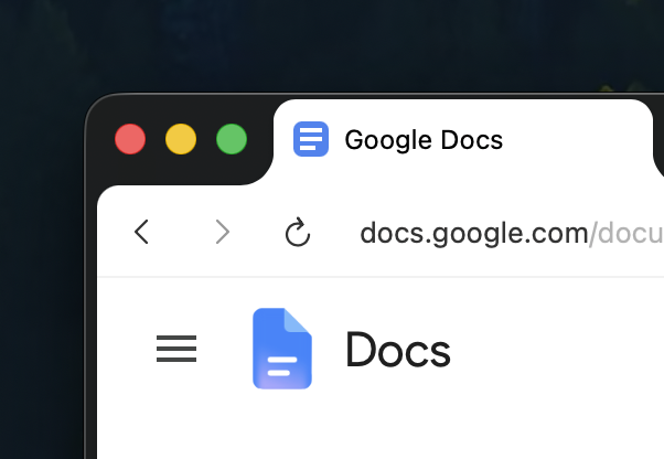
Google's new app icons have started to be applied to actual services. The Workspace app icon redesign, unveiled in late April, began appearing on the web and in select apps around May 18. This applies to Gmail, Google Drive, Docs, Sheets, Slides, Calendar, Chat, Meet, Forms, Keep, Voice, Tasks, Vids, and others.
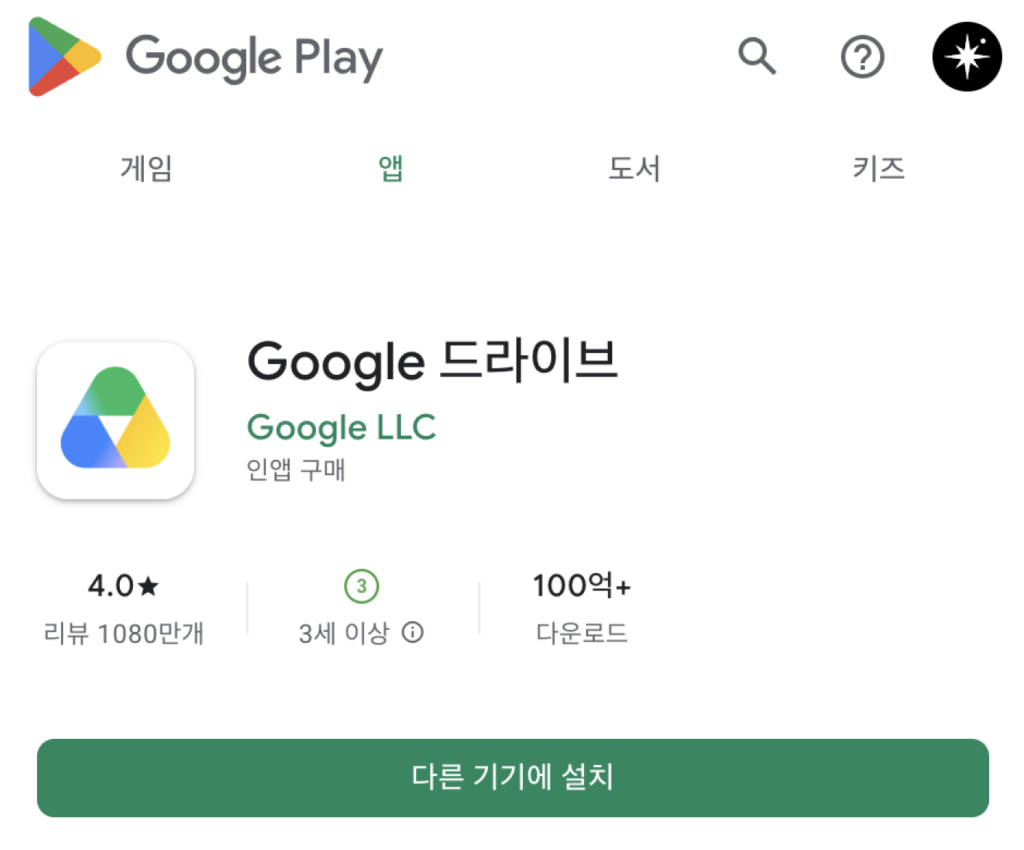
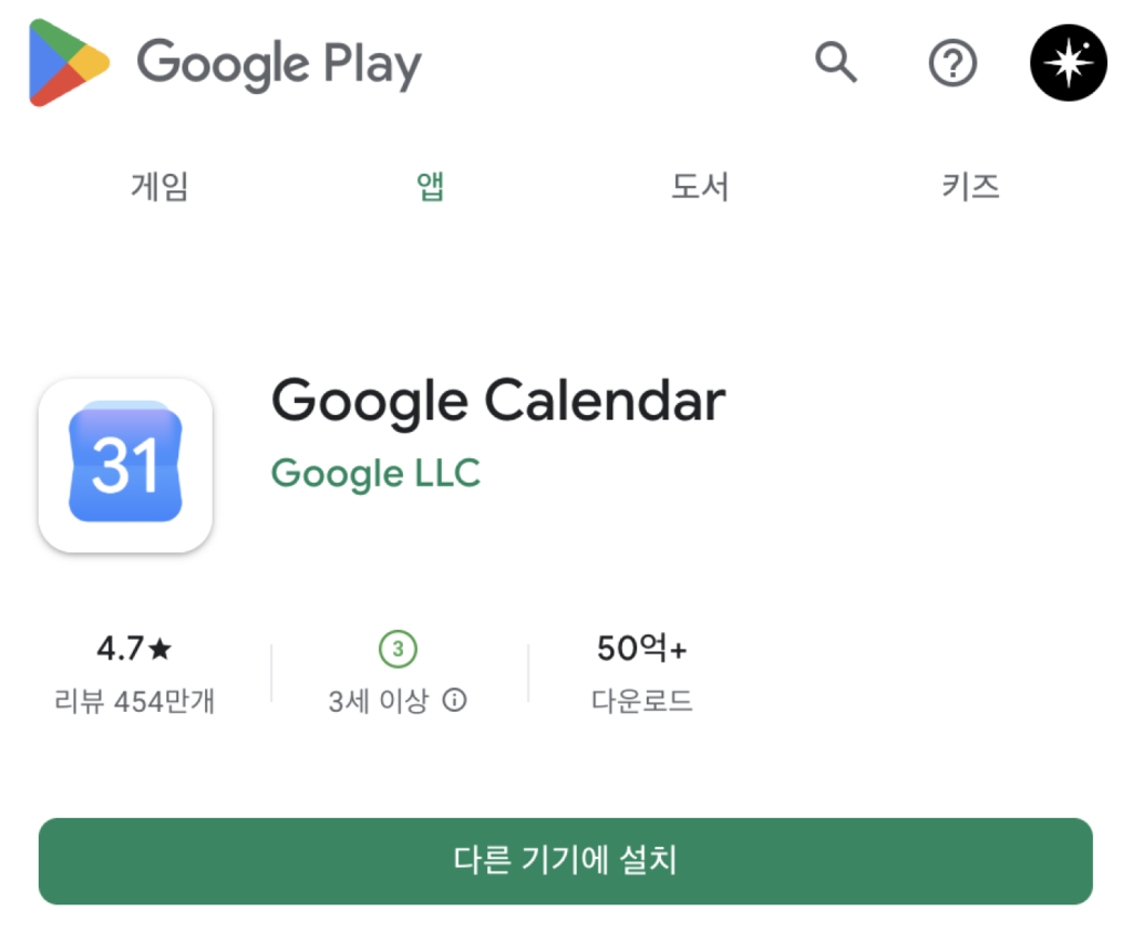
The key element of this change is the gradient. Previously, most Google Workspace icons used a combination of red, blue, yellow, and green. The new icons assign a stronger representative color to each app and organize Google's colors into a soft gradient. Gmail maintains its existing M shape but has become rounder and centered on red. Drive retains its existing triangular structure with rounded corners, while Calendar, Meet, and Chat now give a stronger impression of being closer to a solid color than before.
It appears that Google chose this direction for the sake of distinctiveness. Since 2020, Google Workspace icons have all used similar color schemes, drawing criticism that it is difficult to quickly distinguish between apps. This redesign aims to further separate the shapes and representative colors of each app, rather than grouping all apps under the same color scheme. It is an attempt to make it easier to distinguish apps like Gmail, Calendar, Drive, and Meet more quickly, while maintaining the sense of unity that they are all 'Google apps.'.
The rollout is being confirmed first on the web. New icons have started appearing in the app launcher at the top right of the Google website and on the Chrome new tab page. While there are reports that it is spreading across Android, iOS, and the web, it is not visible to all users simultaneously. Depending on your account, region, platform, and app version, the existing icons may continue to be visible.
This icon redesign is also connected to the Material 3 Expressive trend. Google has recently been expanding rounder shapes, strong colors, gradients, and expressive movements across app UIs, web app launchers, and the Android interface as a whole. Icons are the first area where these changes are noticeable. While not a functional change, it is an update that alters the first impression of the apps users see every day.
More and Sources