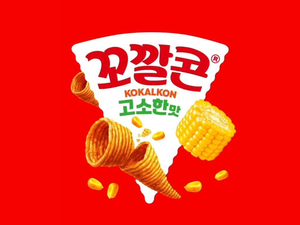
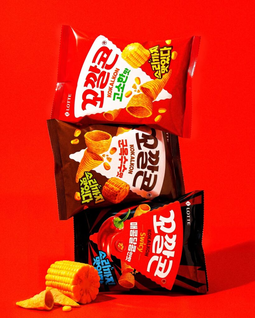
Lotte Well Foods’ flagship snack brand, Kkokkalcon, has revamped its packaging design. This is the first package renewal in five years since 2021, characterized by maintaining existing brand assets while reinforcing visual elements that young consumers can find entertaining. The new packaging also features the English brand name, taking into account touchpoints with global consumers.
For this project, the Lotte Well Food design team handled project management and design, while Thomas Studio was responsible for brand and packaging design. Thomas Studio reinterpreted Kkokkalcon's distinctive cone shape as the brand's core visual asset. The existing triangular template was reorganized not merely as a packaging structure, but as a symbolic element connected to the unique shape of the snack.
The new packaging emphasizes a dynamic impression by arranging the triangular pyramid-shaped BI diagonally. Additionally, the bumpy texture of the snack's surface is reflected as a visual element to intuitively convey the distinctive crispy texture of Kkokkalcon. The background color also features a stylish hue preferred by young consumers, adding a more cheerful and modern atmosphere compared to the previous version.
The color system for each product has also been revamped. The design reinforces the signature colors of each flavor to improve visibility on shelves and highlights the individuality of each product while maintaining the overall brand unity. In particular, the 'Spicy & Sweet' flavor focuses on attracting the attention of consumers in their teens and twenties by applying strong color contrasts and pattern graphics.
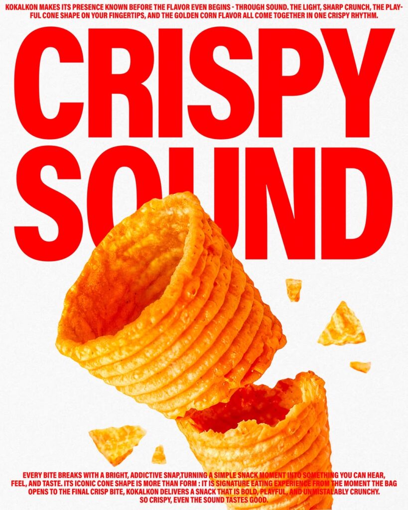
The brand slogan, "Delicious even in sound," has been expanded into an emblem. This serves as a visual device to convey Kkokkalcon's crispy texture and the joy of eating. By delivering images of the product's shape, texture, sound, and taste together on the front of the package, it reinforces Kkokkalcon's unique playful and vibrant brand experience.
More and Sources