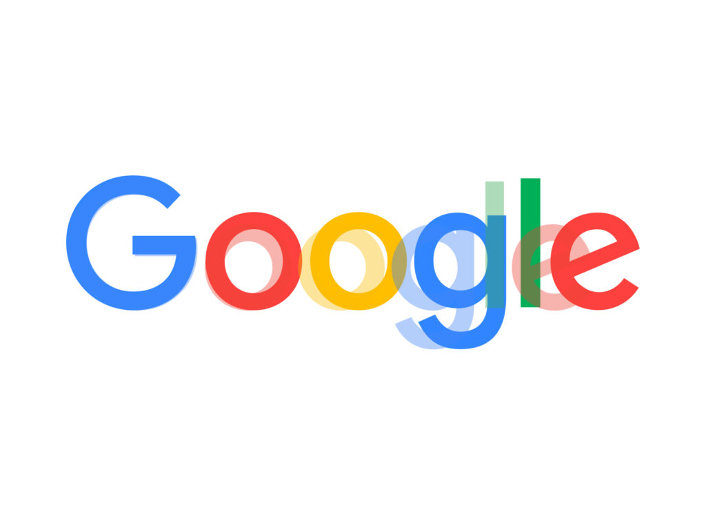
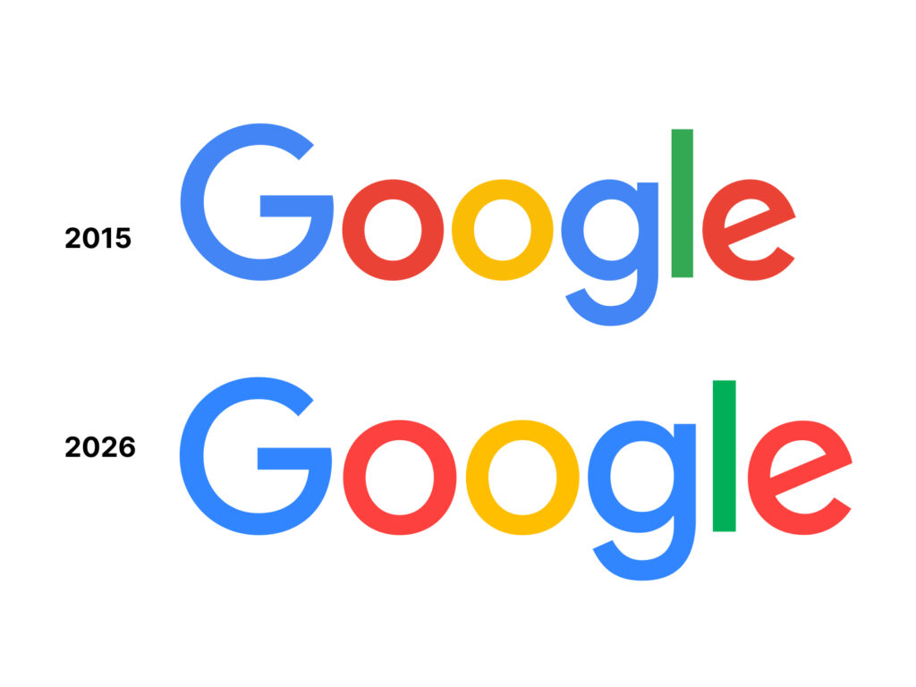
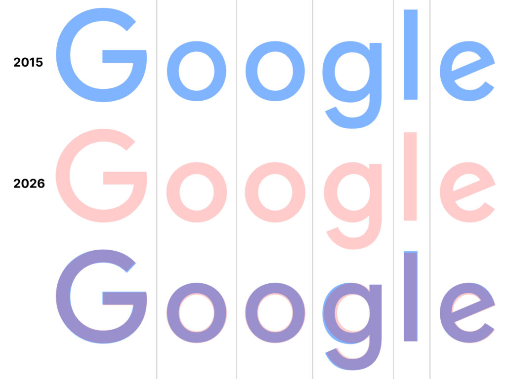
Google has quietly replaced the wordmark it has used for 10 years. The new wordmark has been redesigned based on Google Sans Flex, replacing the previous Product Sans-based logo. The biggest change is the letter proportions. The x-height has been increased, and the overall shape has become less geometric. As a result, readability has improved on small screens, and it can operate more flexibly in AI interface environments.
Through this change, Google is demonstrating a move to integrate its entire brand system into a single type system.
Now, even when new products are introduced, you can rapidly expand based on Google Sans Flex rather than designing a separate wordmark from scratch. In a sense, you are turning the brand language itself into a 'product platform' to fit the Gemini era.
The parts of this change that are particularly frequently mentioned are the lowercase “g” and the italicized “e”.
There were many criticisms that the “g” in the previous wordmark was overly geometric. The balance of the internal space was also somewhat awkward, and the connection of the curves was evaluated as rigid. In the new version, the flow of the curves has been organized more naturally, and the proportions have been adjusted to be stable.
The italicized “e” also undergoes significant change.
The “e” in the Google logo has long been used as a brand symbol, but there have been persistent opinions that previous versions looked visually slightly unstable. This time, the stroke thickness and angle have been readjusted to make it read more naturally within the word.
If the previous logo was closer to “precise mathematical geometry,” the new wordmark is closer to a slightly more human form. It feels like it has moved away from a structure centered on perfect circles and straight lines and has used optical correction more actively.
More and Sources