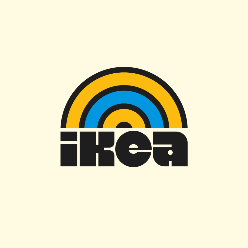
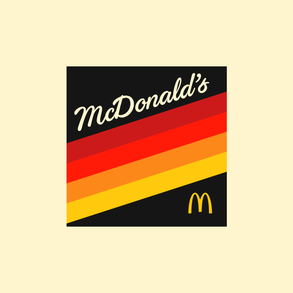
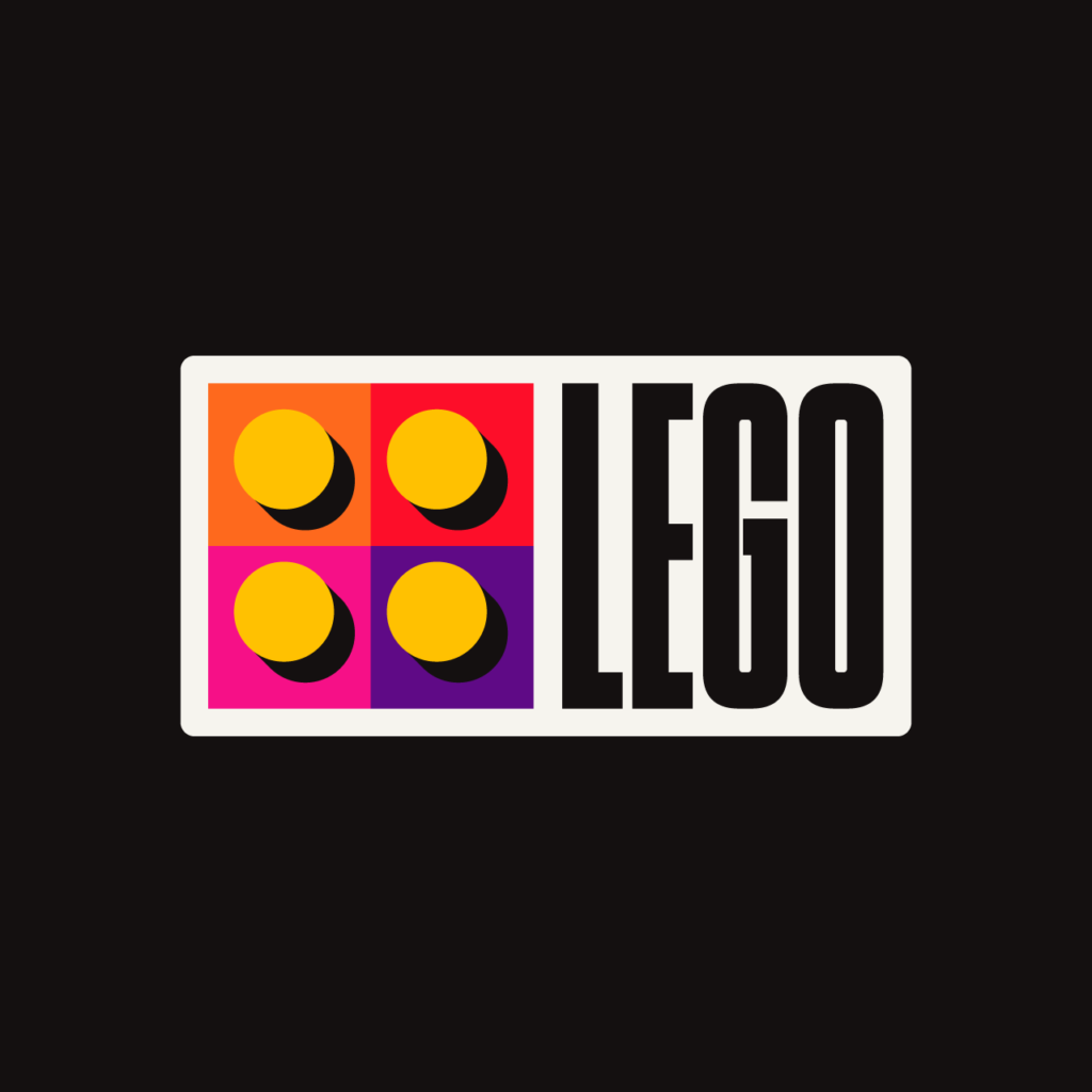
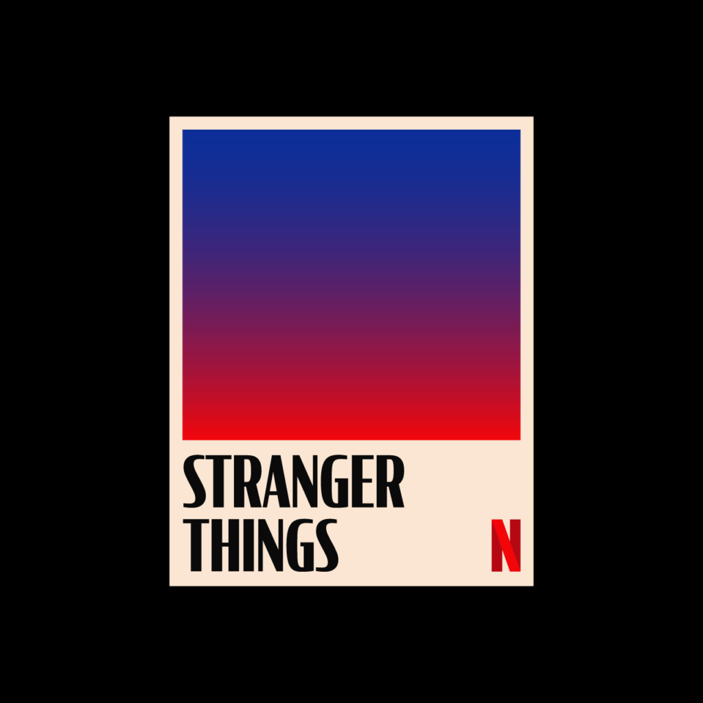
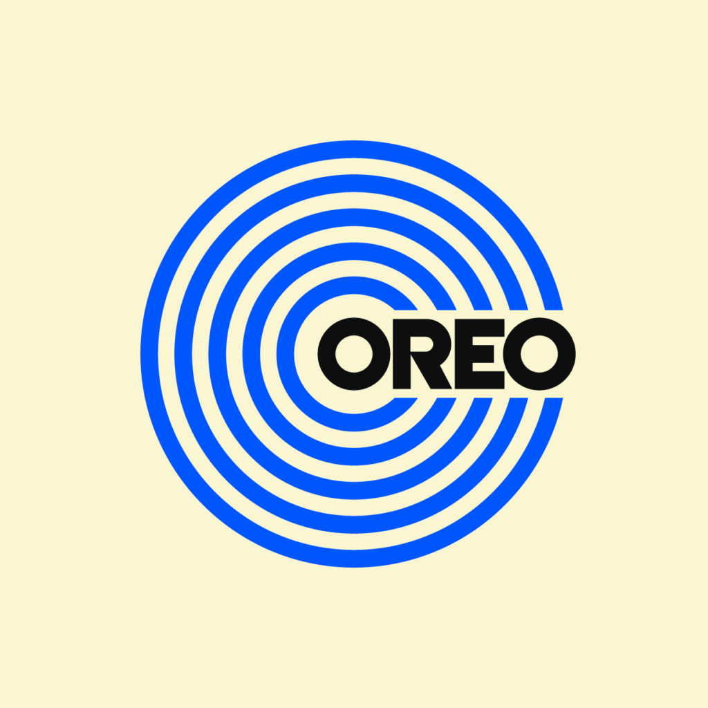
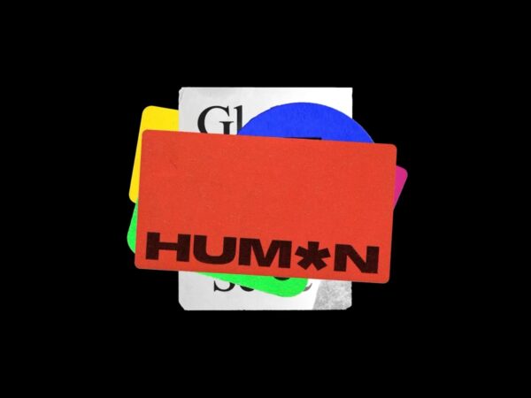
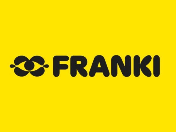
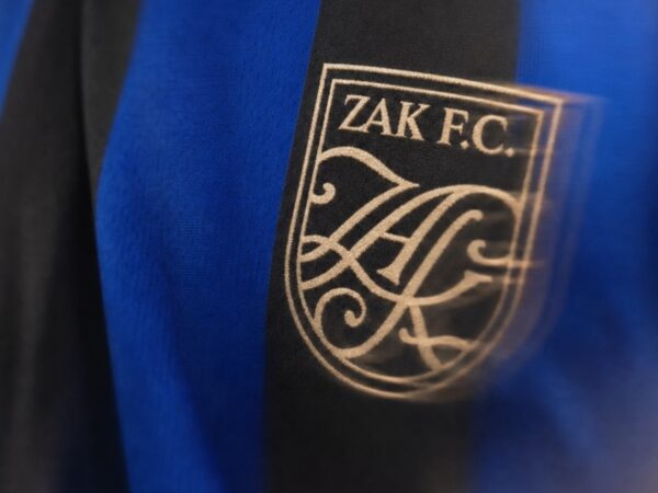
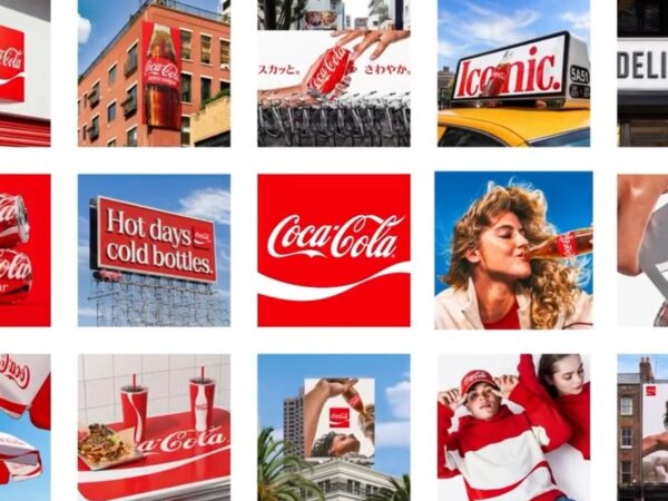
Rafael Serra의 레터링 프로젝트입니다. 유명 브랜드의 로고에서 그래픽 모티브를 뽑아 자신만의 방식으로 디자인했습니다. 서체의 인상과 로고의 형태적 특성을 6-70년대의 색감과 레이아웃으로 조형성을 설계한 것이 독특합니다.
Lettering Series LIV