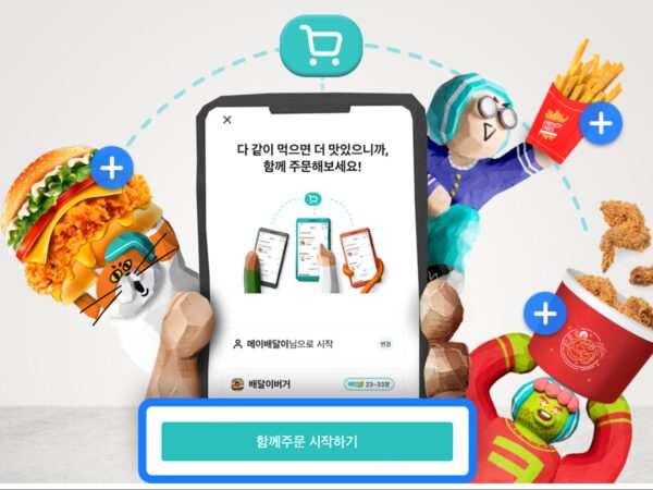
SOCAR Rebranding: From Car Sharing to Lifetime Mobility

Socar has undergone a rebranding. Launched in 2011 as South Korea’s first car-sharing service, Socar has since grown into a mobility platform used by over 10 million people. As the company expanded beyond car sharing to offer a wide range of transportation options and integrated services, its existing brand identity faced limitations in fully capturing the broadened scope and value of the business.

In response, Socar developed a new brand identity that aligns with its expanded service spectrum and evolving user expectations. The most significant change lies in its new symbol. Previously, the brand relied on a graphic element inspired by parking lines, which lacked strong symbolism. The new symbol, however, depicts intersecting roads to embody the concept of mobility, while also directly incorporating the letter “S” from “Socar.”

The logotype has also been updated, shifting from all-uppercase to a lowercase combination to convey a softer and more contemporary image. The new logo is designed for flexibility, allowing it to be seamlessly applied across various touchpoints—including the mobile app, website, and physical signage.

While maintaining the original “Socar Blue” as the brand’s core color, adjustments were made to its brightness and contrast to improve readability. The blue palette was expanded to ensure visual stability across various devices and backgrounds, and a complementary range of gray tones was developed to enhance overall harmony.

ChatGPT의 말: Socar’s brand philosophy is reflected throughout its graphic assets, built around three key design principles: Flexible, Clear & Bold, and Expand. Fluid curves and gradients represent the freedom of movement; strong forms that radiate outward from a central point symbolize empowered, self-directed mobility choices; and linear compositions inspired by motion trails express the continuity and expansion of movement through Socar. These graphic elements are designed not only for static visuals but also to seamlessly extend into motion graphics.

  • Brand Architecture: Cha seungeon, Woo bora
  • Rebranding Planning & Design: Lee jueun, Lee jeonghan, Kim jihye
  • Motion Graphic & Rebranding Film: Cosmic Ray
  • Brand Center Web Development: DFY
  • Brand Photography & Film: Wiyn Agency
(C) Socar
(C) Socar
Yandex Go(C)Magic Camp
(C) Socar
(C) Socar
(C) Socar
(C) Socar
(C) Socar
(C) Socar

More and Sources

Latest articles

Latest Academy

Design for Business