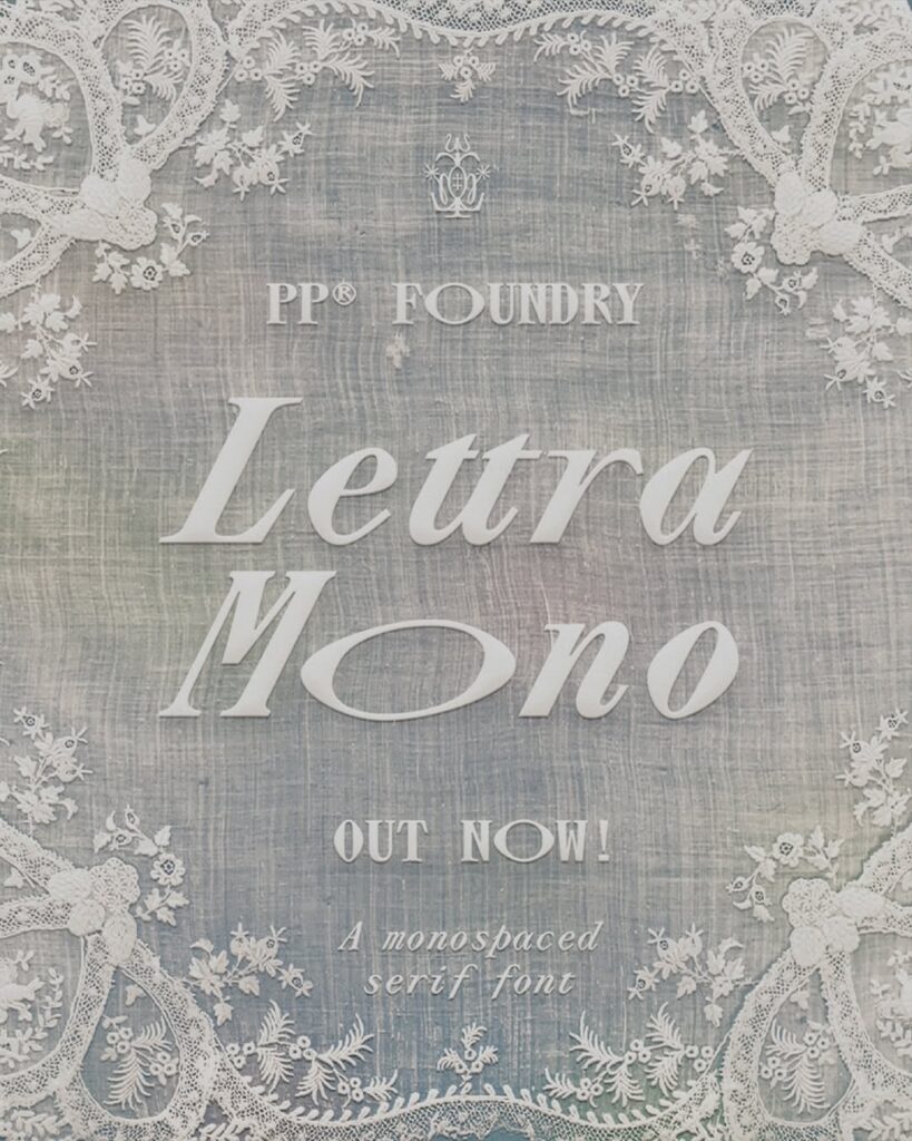
Pangram has unveiled a new campaign for its monospace serif typeface, 'PP Lettra Mono'. Adoratorio, based in Brescia and Amsterdam, handled the concept and art direction for the entire campaign, expanding the single typeface into a visual world that changes across the four seasons.
At the center of the campaign is an '@' symbol placed over a field. The same symbol and location change with the seasons in different colors, textures, and atmospheres, connecting the entire campaign. The typeface's wordmark is embroidered onto old lace, and in posters filled with dense sentences, the shape of a garden dwarf is revealed using variations in letter colors.
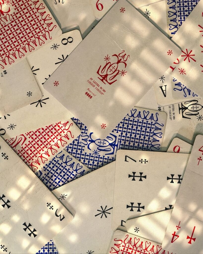
We also produced custom playing cards featuring PP Lettra Mono. The symbols used in the center of the cards are later incorporated into the actual typeface characters, connecting the campaign and the product. We blended scanning, printing, 3D graphics, code, and editorial design, and hidden literary quotations throughout to encourage users to explore the images in detail.
PP Lettra Mono is a typeface that combines classic typewriter fonts with the detailed expressions of botanical atlases, featuring a structure where every character occupies the same width. With strong vertical contrasts and diamond-shaped details, it conveys both mechanical regularity and a decorative impression. The campaign did not limit these contrasting characteristics to digital images but translated them into physical media such as textiles, print materials, and cards.
While typical typeface campaigns focus on directly showcasing letter forms and typeset examples, this project allows you to experience the character of the typeface through seasons, objects, and hidden stories. It is characterized by weaving various production techniques into a single world where they influence each other, rather than separating them into independent outcomes.
More and Sources