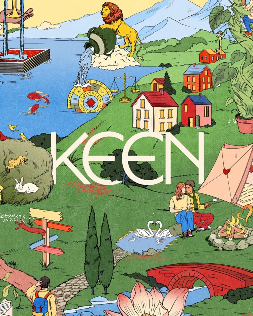
This is the brand identity design for Keen in collaboration with Mother Design. Keen is an online psychic counseling platform operated by Ingenio. Mother Design explained that while Keen has secured loyal users for 25 years, there was a need to expand into a mass-market wellness service.
The new identity treats psychic counseling as a process of viewing present questions differently rather than predicting the future. At the heart of the strategy are the intuition, empathy, and perspective of a human counselor. This serves as a mechanism to explain Keen's distinction in a landscape where AI counseling services and algorithm-based wellness tools are on the rise.
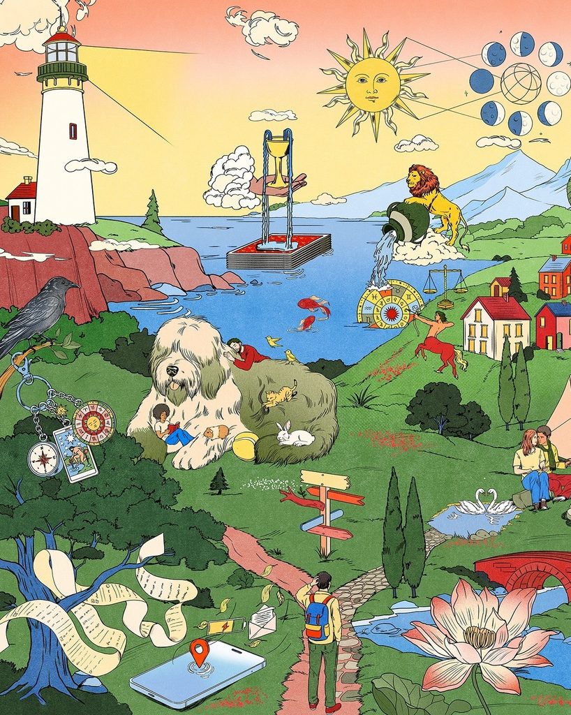
The visual system is based on a large digital tapestry created in collaboration with illustrator María Jesús Contreras. It arranges cities, nature, everyday scenes, and spiritual symbols within a single world. The circular motifs are derived from astronomy, astrology, and the shifting perspectives that occur when viewing the Earth from space. By enclosing complex scenes within circular frames, a structure was created that allows users to zoom in and explore.
The wordmark combines curves with symmetrical letter forms. The color scheme centers on an earthy red reminiscent of early pigments, accompanied by strong secondary colors suitable for digital environments. Consequently, rather than the restrained wellness grammar found in meditation apps, a rich brand world where everyday life and symbolism overlap was chosen.
See more and sources
https://www.motherdesign.com/work/keen