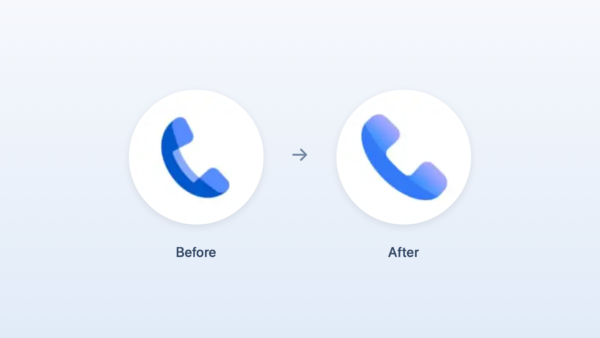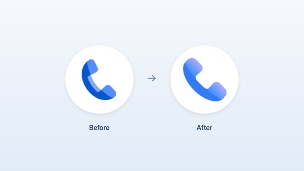
Google has changed the icon for the default Android phone app, 'Phone by Google'. Google unveiled the new icons for the Phone, Messages, and Contacts apps on November 2. After a beta phase, the Phone app began rolling out the new icon in the official Android version 246 starting November 16 (U.S. local time).
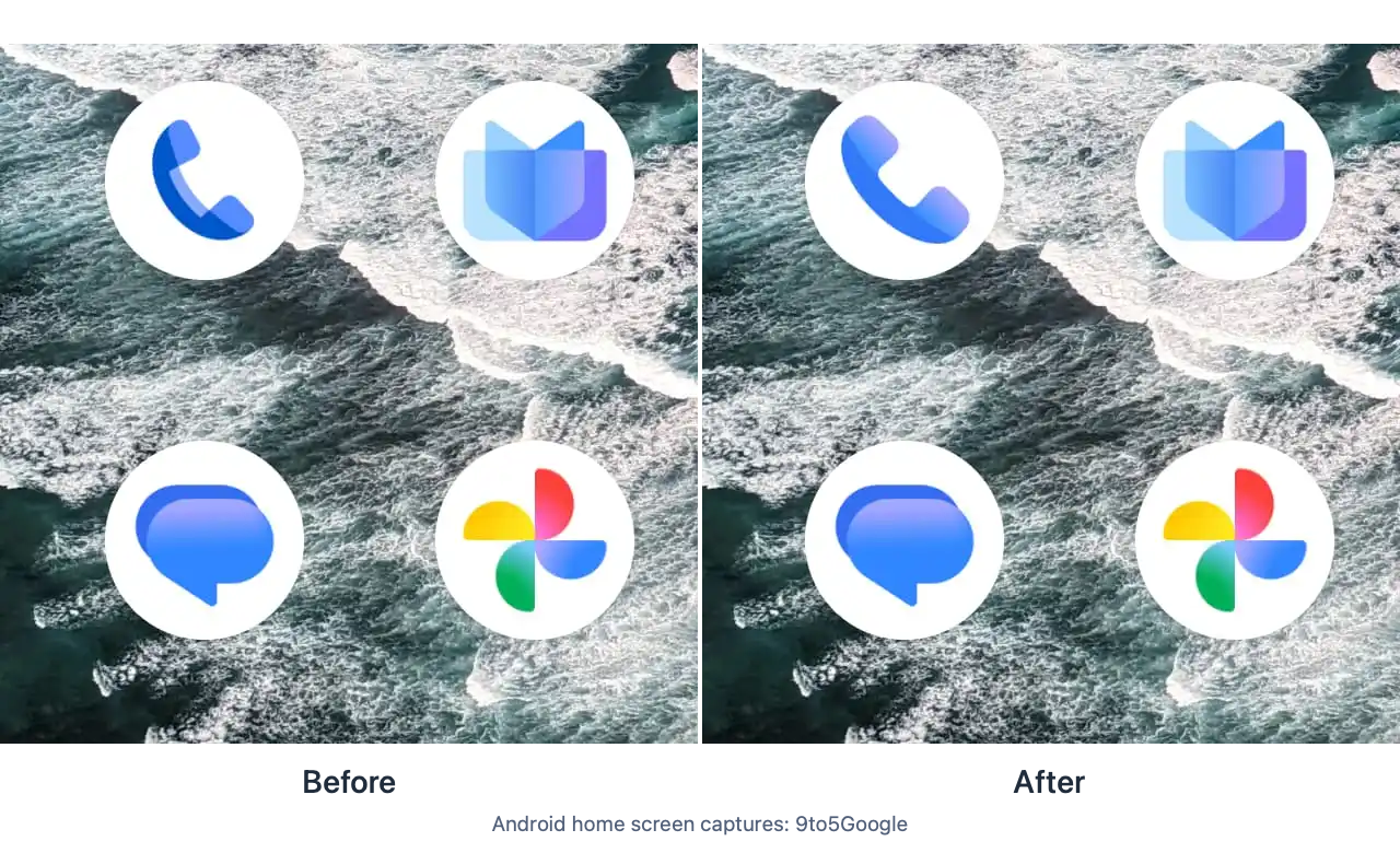
The first noticeable change in the new icon is the size of the receiver. When placing the front and back icons side by side to fit the size of the white circle, the new receiver occupies a larger area within the circle. The direction in which the receiver is tilted and the overall outline are similar to the previous version. While it reads as a familiar phone shape on the home screen, you can see the difference in that the whitespace inside the circle has been reduced.
The previous receiver had a bright blue band running along the inside of a dark blue body. The new icon changes the body to a brighter blue and adds a purplish gradient to both ends that touch the ear and mouth. As the bright internal band is removed, the color connecting the ends of the receiver to the body reveals its form.
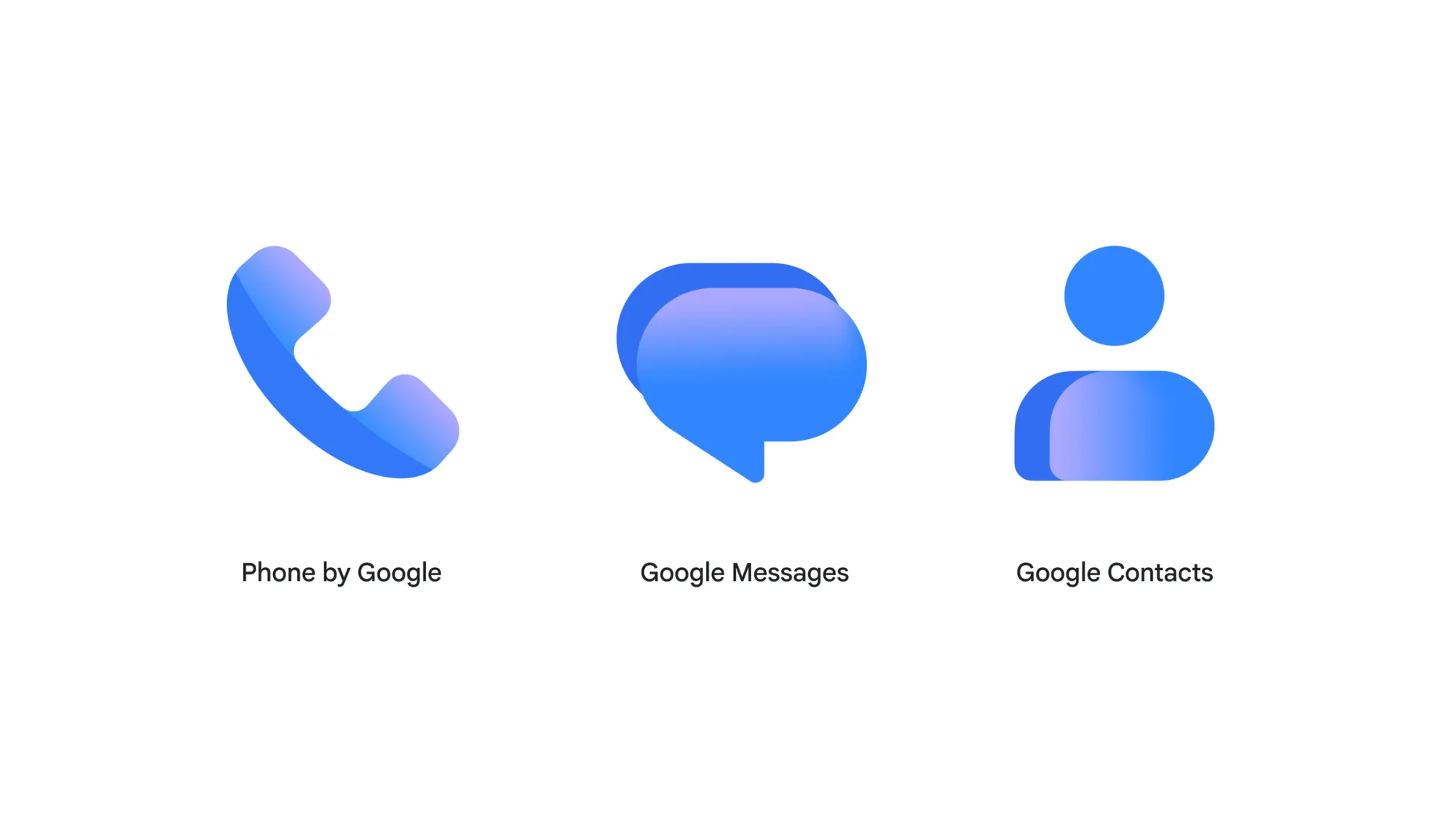
The same color scheme can also be seen in the Messages and Contacts icons. Messages features a gradient applied to overlapping speech bubbles, while Contacts uses a gradient on a rounded shape depicting a person's shoulders. They share a white circle and shades of blue while maintaining the symbols of each app—Phone, speech bubble, and person. Google explained that it adjusted the colors and curvature to make the outlines easily recognizable on the home screen and visually aligned them with its 'G' logo.
More and Sources
https://blog.google/products-and-platforms/products/messages/updated-icons-messages-phone-contacts/
https://play.google.com/store/apps/details?id=com.google.android.dialer