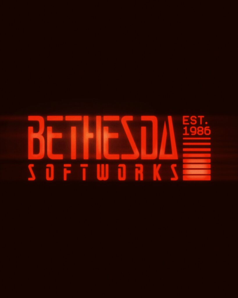
Game publisher Bethesda Softworks has unveiled a new logo to commemorate its 40th anniversary. Bethesda described it as a “logo inspired by our roots.” It has not yet been revealed whether this design is a commemorative logo used only for the 40th anniversary or a new identity to be applied across the entire brand going forward.
The new logo is a significant departure from the black sans-serif wordmark that has been in use since 2010. It uses long, angular letters, strong colors, and a light-blowing effect to evoke retro-futurism and early video game graphics. The name 'Softworks,' which had disappeared from the 2010 logo, has also reappeared.
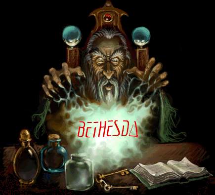
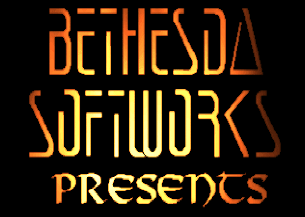
The typography is a modern reinterpretation of the industrial wordmark Bethesda used from the late 1980s to around 2000. In particular, the wide geometric strokes and the sharp cut edges within the letters directly inherit the form of the logo from that era. Unlike the previous design, which emphasized a refined corporate image, it actively reveals the game worlds and genre characteristics that Bethesda has created.
This change aligns with the recent trend of returning to heritage in brand design. Rather than simply restoring the past logo, it expands upon the individuality and memories of the original assets into a new visual language. However, this logo is a design by the publisher Bethesda Softworks and is distinct from Bethesda Game Studios, the development organization that uses the gear symbol.


More and Sources