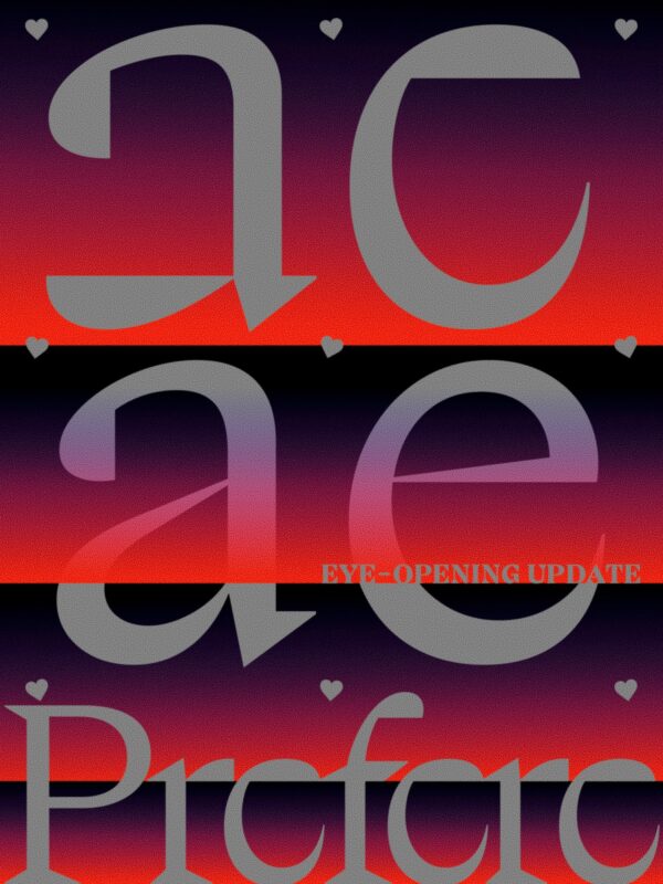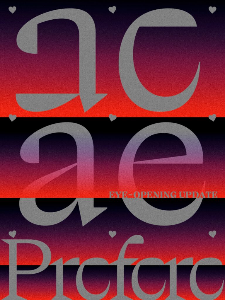
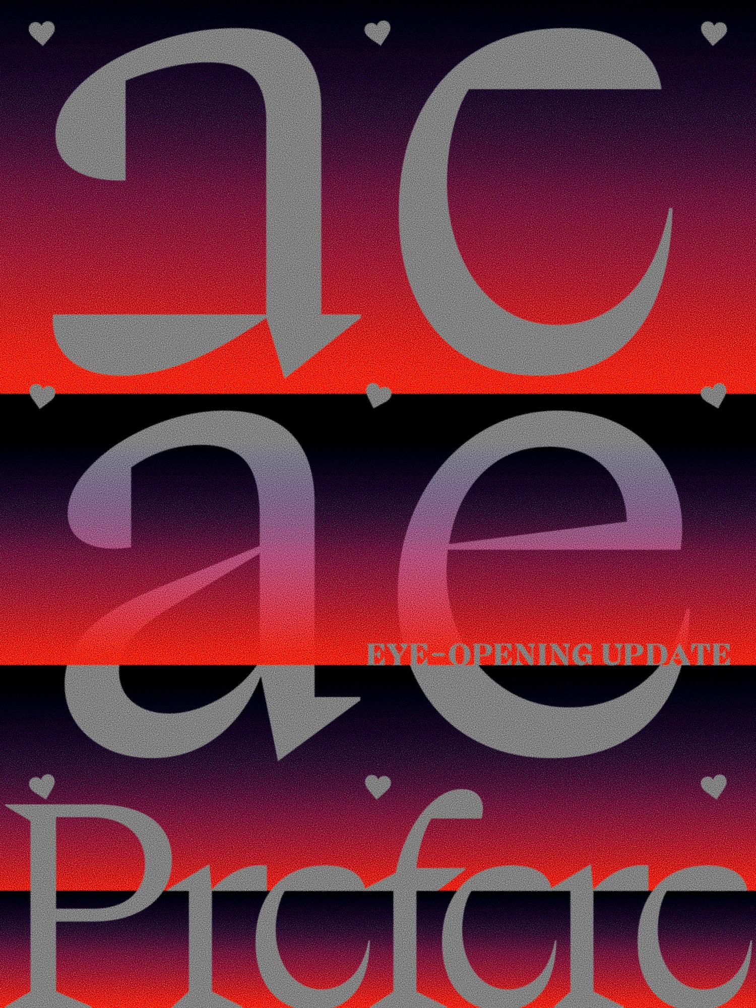
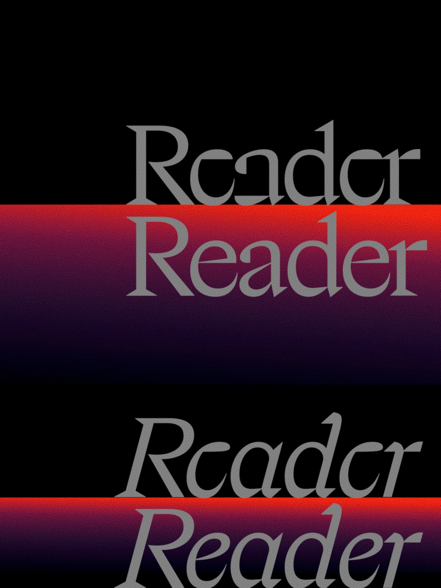
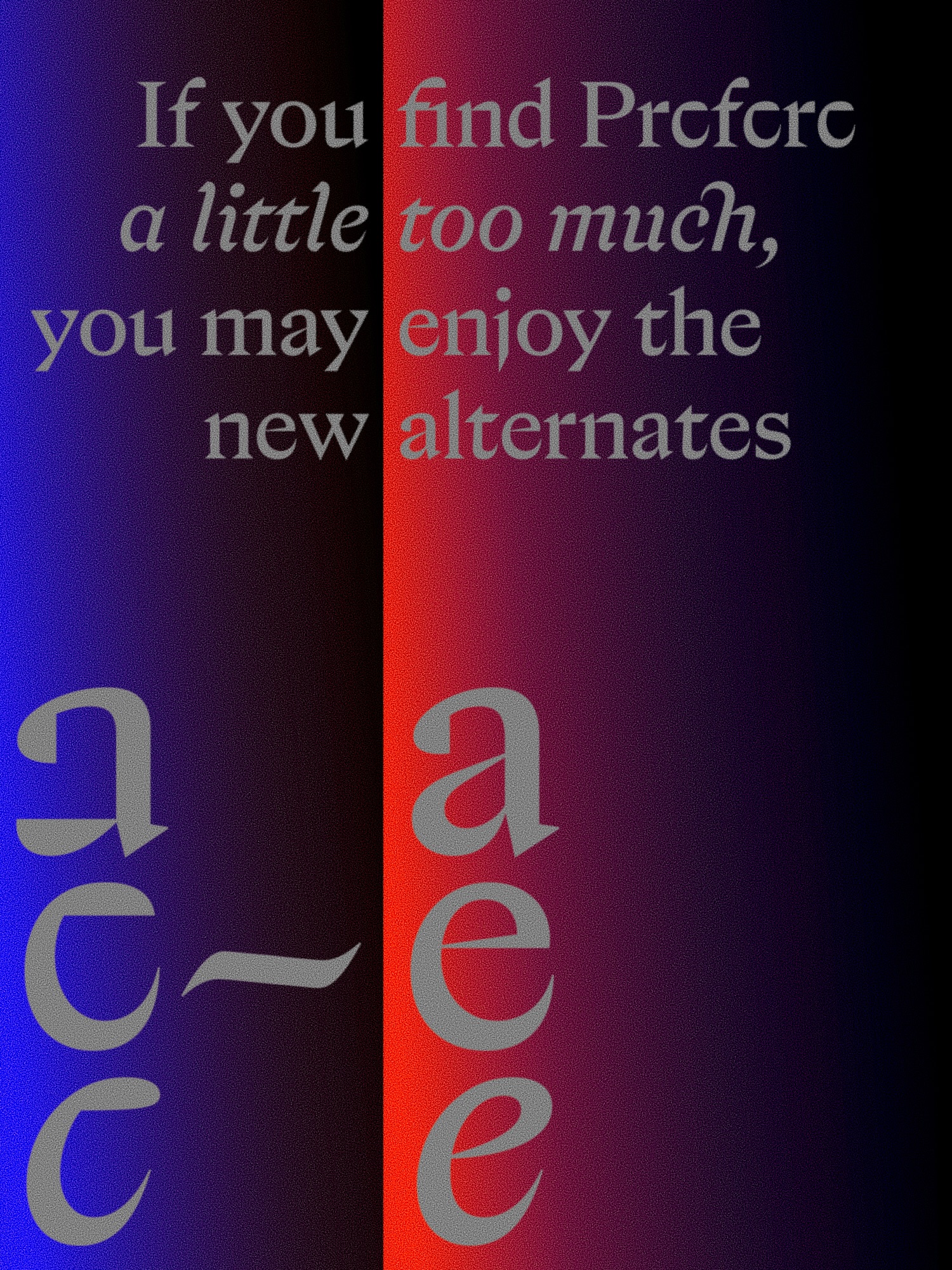
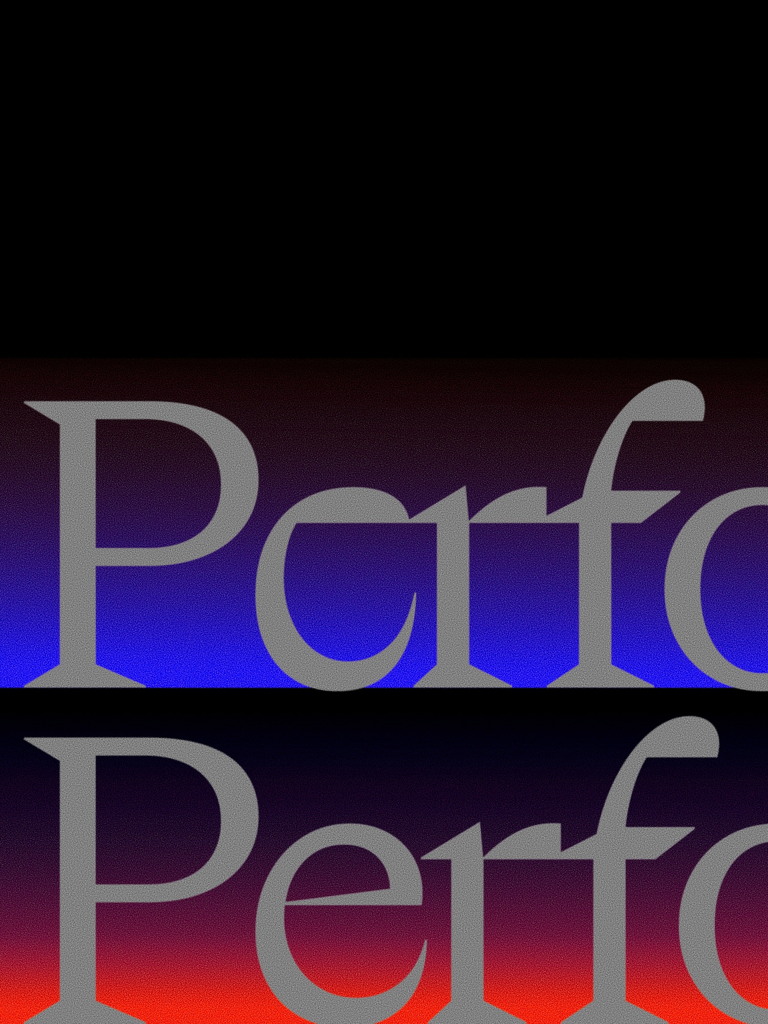
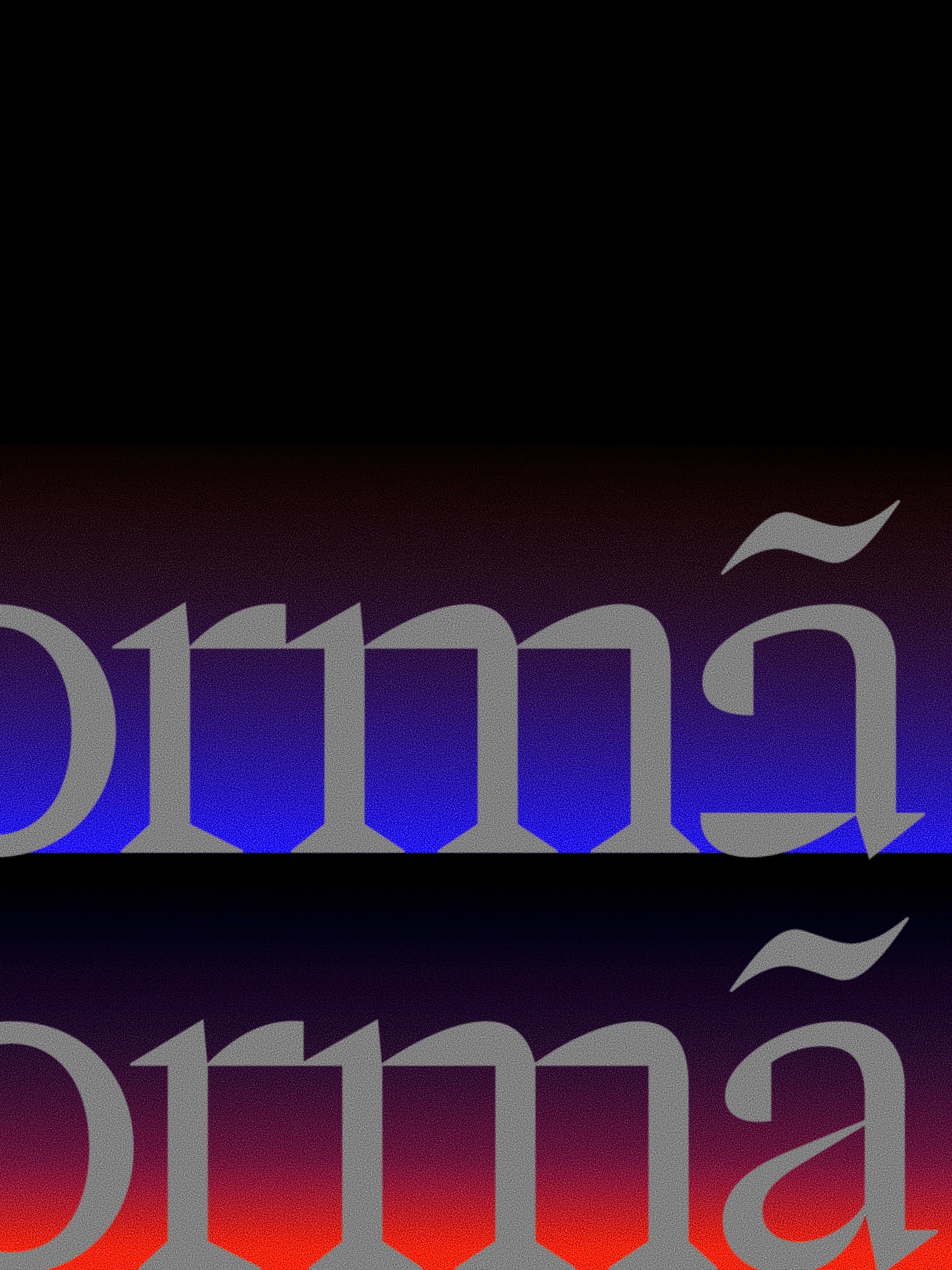
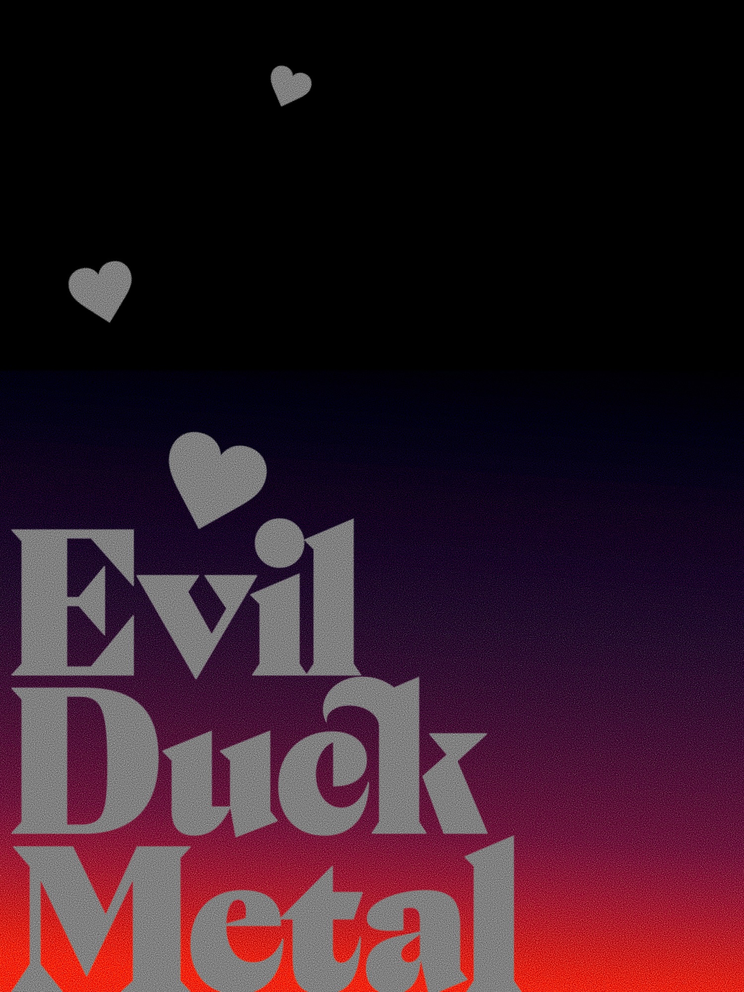
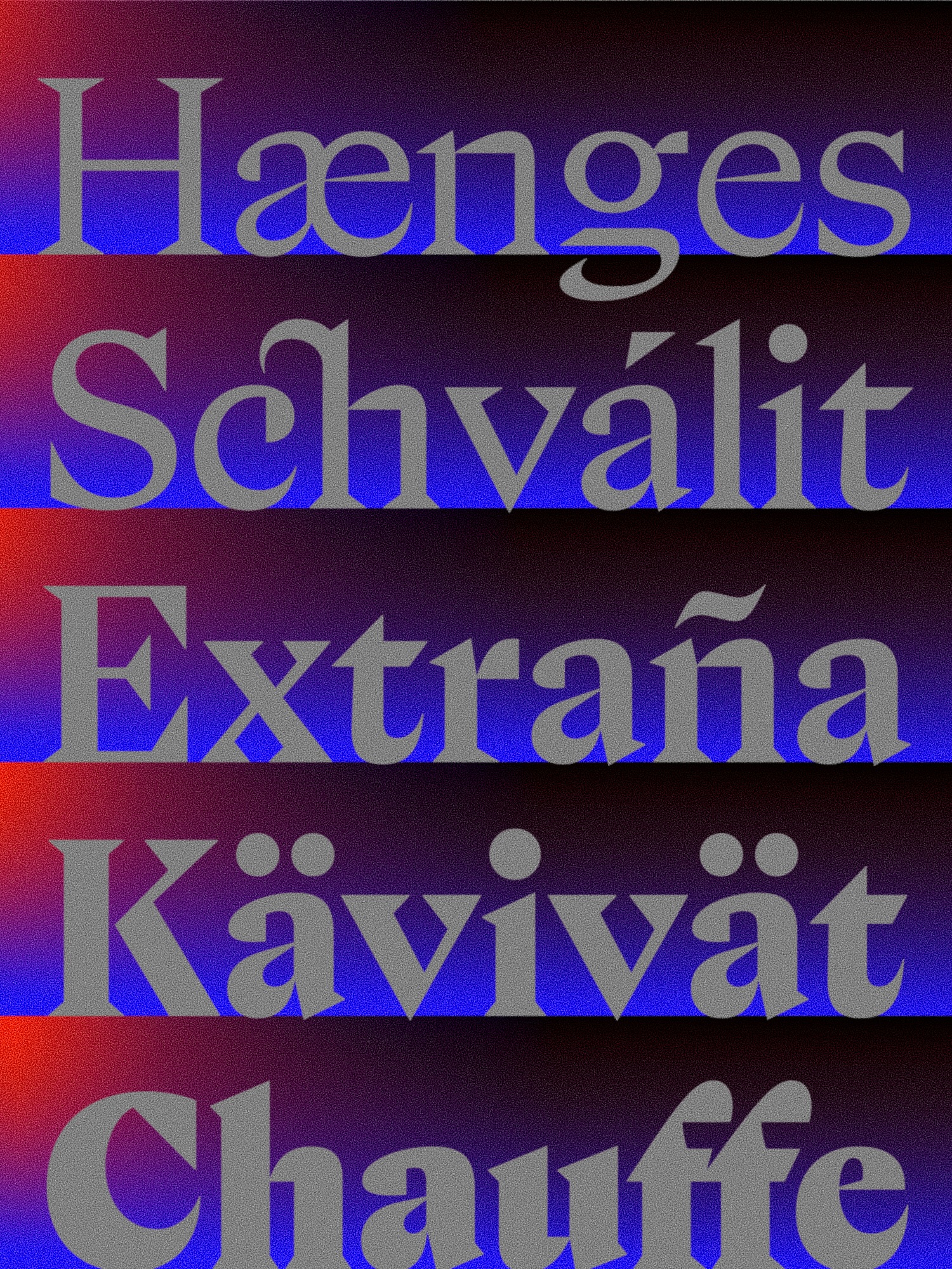
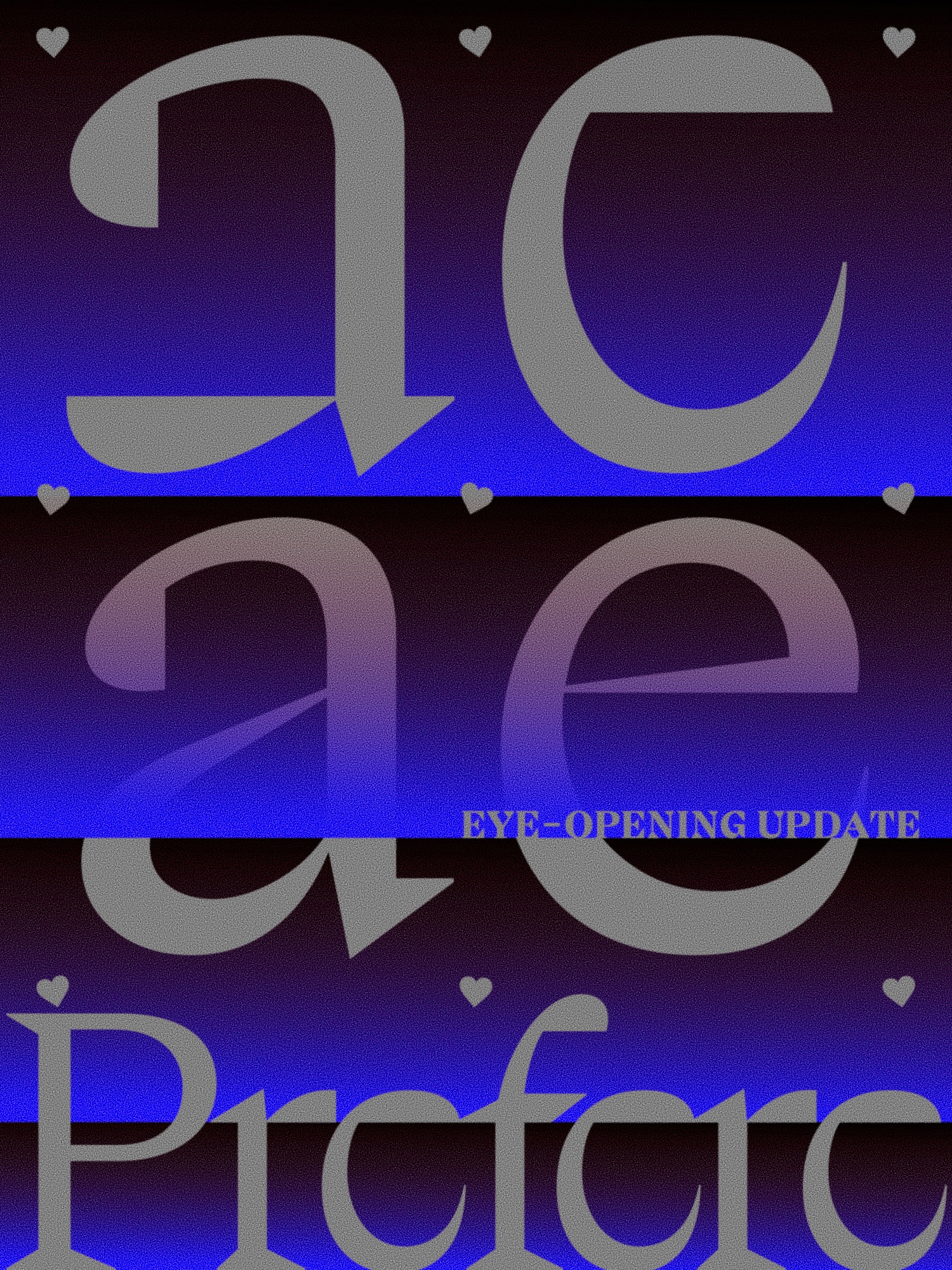
Flight Mode has updated the display serif font FL Prefere. More familiar alternative forms have been added for lowercase 'a' and 'e'. If you enable OpenType style sets, you can change the appearance of the same character while typing.
FL Prefere originated from an experiment in 2021 to create one typeface a day. The creator aligned parts of the letters with imaginary horizontal lines. As a result, the empty spaces inside the letters became flattened, and some letters took on a form with closed internal spaces. The typeface name was also determined by observing how the letters connected when arranged along these horizontal lines.
The existing 'a' and 'e' are letters that reveal this formative rule. The basic form can be used to display the shape of the letters themselves in posters, while the alternative form can be used in places where words need to be read quickly, such as web titles. It is a method of adjusting the impression of the two letters while maintaining their weight and slant within the same typeface.
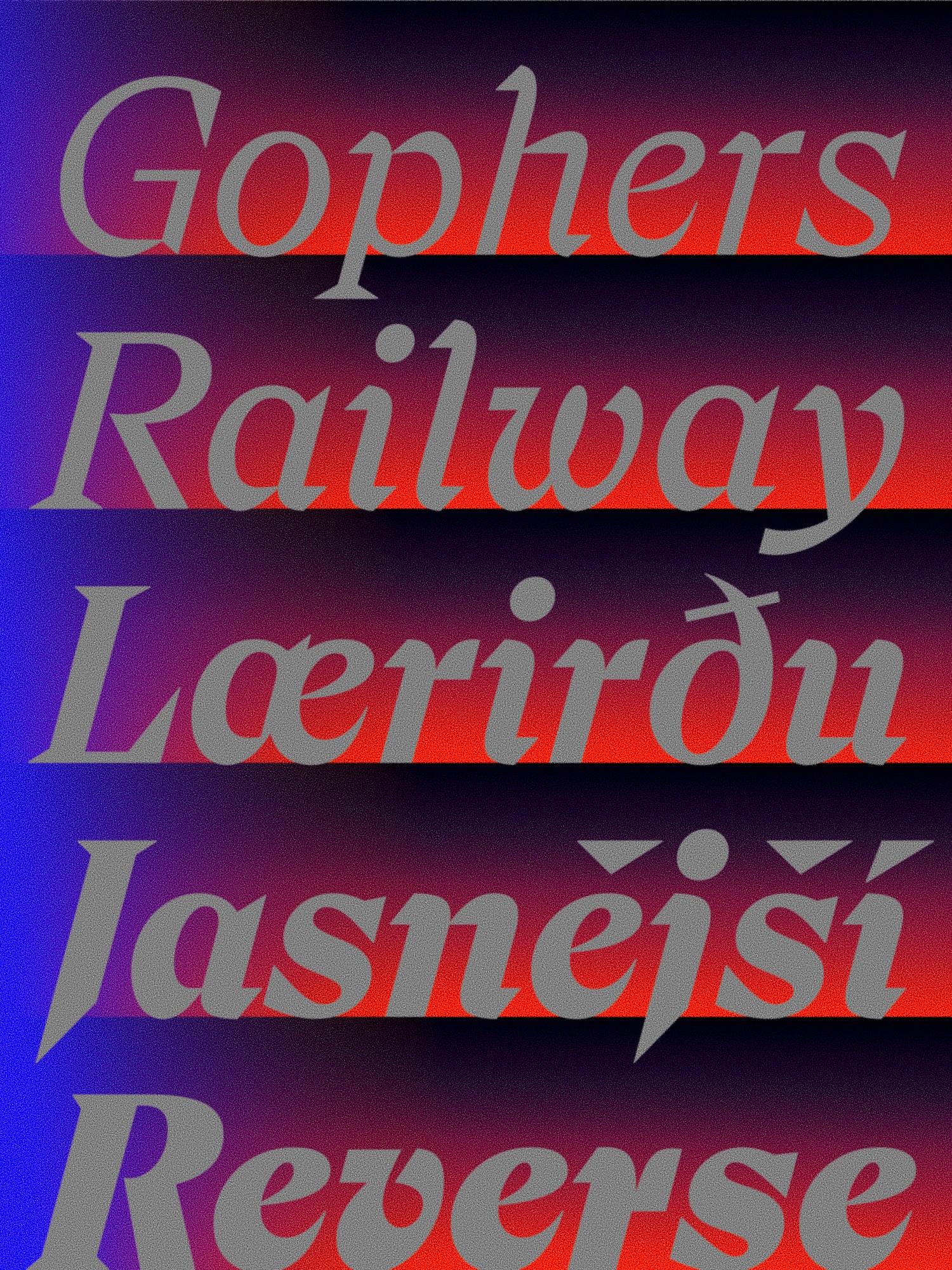
FL Prefere consists of five weights ranging from light to heavy, each with an italic version. You can type text directly on the Contemporary typeface page. Existing buyers can contact the creator to receive free updates.
See more and sources