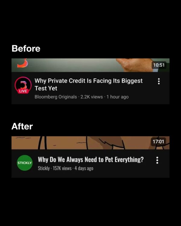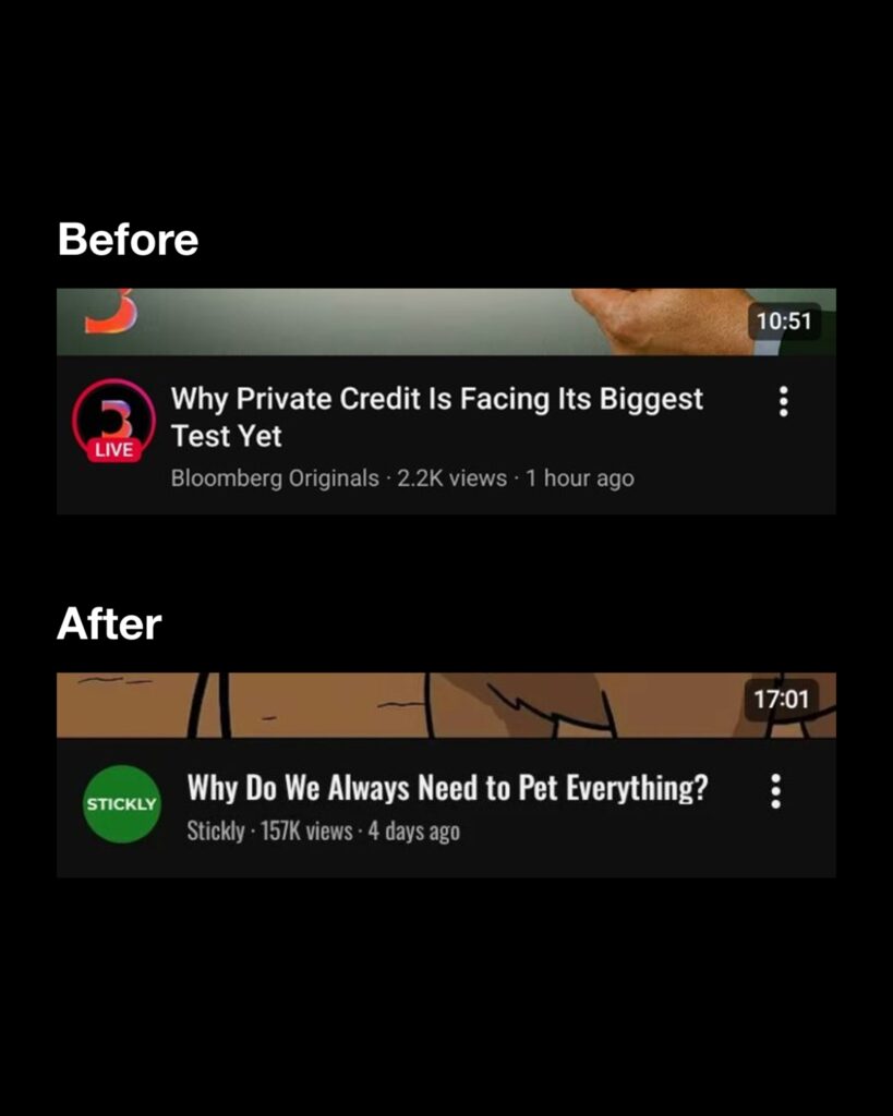
On some screens of the YouTube mobile app, video titles have started appearing in bold, narrow text. If you compare screenshots taken before and after the same video, the line break positions also differ. In the previous version, the first line of the title ended at 'A', but on the screen with the new font applied, it extends to the next word, 'TON'.
Since June, some users have reported that the text on the home feed titles has changed. The new font features thicker strokes, and the letters appear vertically elongated. On Reddit, reactions indicated that it has become difficult to skim multi-line titles as more characters fit into a narrower width. On November 7, a post criticizing the mobile app's font and layout was also uploaded to X. The name and scope of the title font were not confirmed in YouTube's announcement regarding the home redesign.
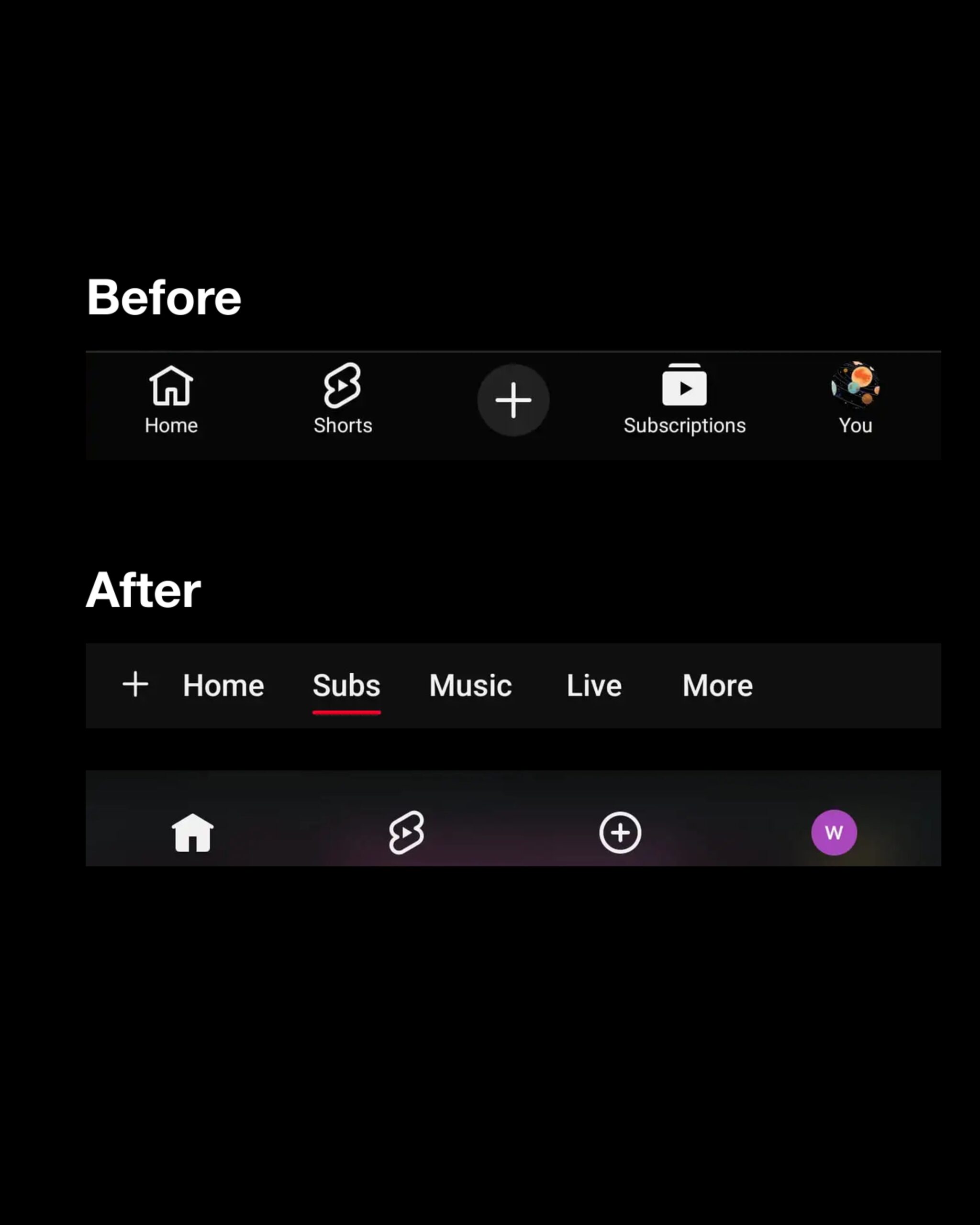
The menu for navigating the home screen has also changed. YouTube officially announced on October 23 (KST) that it would move the 'Subscriptions' tab from the bottom to the top of the home screen. The new screen was confirmed on Android and iOS in early November. Home, Shorts, Create, and My Page remain at the bottom, and subscribed videos can be viewed by tapping 'Subs' at the top of the home screen.
On Reddit, posts emerged from users who habitually pressed the spot where the old subscribe button used to be, only to open the create screen. Some users pointed out that filters such as 'Today', 'Videos', and 'Shorts' are not visible in the new subscription feed. In a voluntary reader poll by Android Authority released on November 11, 92.31% of the 1,274 respondents wanted the restoration of the old subscription tab.
See more and sources
YouTube Official Home Redesign Notice
Screenshots of the same video's title before and after
Home feed title font capture
Existing App Screen Capture · PiunikaWeb
New Font App Screen · BlogAnChoi
November Distribution Screen · 9to5Google
Before and After Comparison of Subscription Tab · 9to5Google
Font Readability Reactions · Reddit
November User Response · X
Subscription Tab User Reactions · Reddit
Readers' Poll · Android Authority