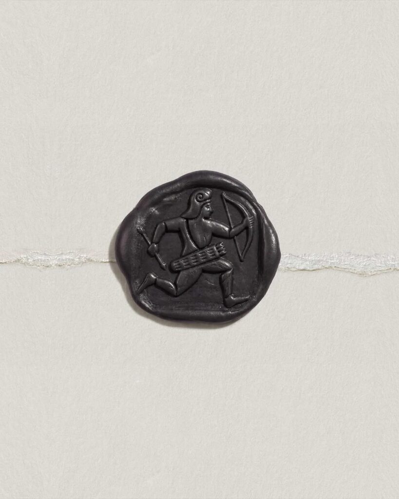
Studio Cera has unveiled a new brand identity in collaboration with Ofform Studio. This project focused on visually expressing the historicity, memory, and diverse cultural layers pursued by the interior architecture studio, Studio Cera. It is characterized by the establishment of a brand system that goes beyond simply implementing minimalist design to simultaneously convey sophisticated structure and a profound narrative.
The brand system was perfected by combining the proportions of classical architecture with modern restraint. Based on lines and grids inspired by architectural drawings and layouts reminiscent of spatial structures, it established a consistent visual language and expressed Studio Cera's sophisticated working methods through restrained graphic composition. Furthermore, the addition of the Archer symbol imbues the brand with mythical symbolism and a human narrative, completing an identity that goes beyond a functional system to tell a story.
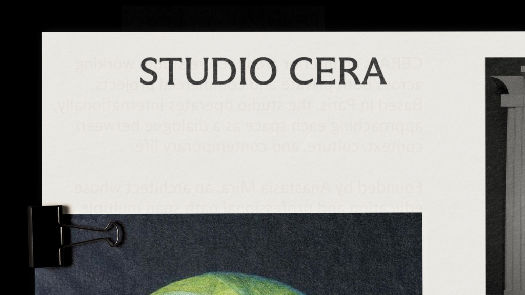
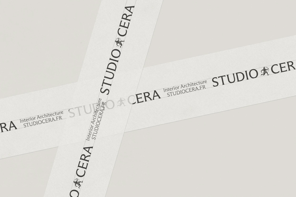
The new identity was designed to be flexibly applied across various touchpoints, including business cards, print materials, and digital platforms. The core of this project is to effectively convey the architectural studio's spatial thinking and cultural depth while leaving a strong impression with minimal graphic elements. As brand design recently evolves beyond simple logo development to build a brand's philosophy and worldview, Studio Cera is garnering attention as an example that connects space, memory, and architectural order into a single, integrated brand experience.

More and Sources