Zonder Studio, Veritas Park Identity Starting from the Clock Tower

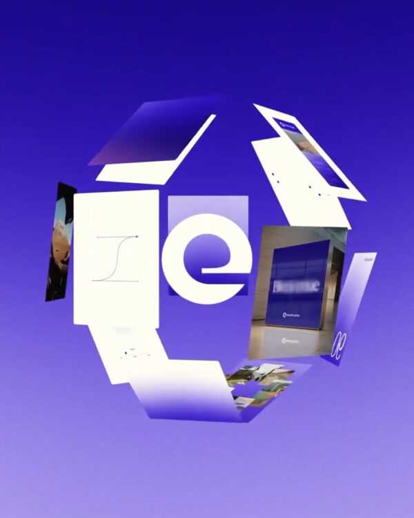
Zonder Studio designed the brand identity for Veritas Park, which is regenerating a former sewing machine factory in Wittenberge, Germany, into a new urban district. Once the largest sewing machine production facility in Europe, it ceased operations in 1991 following the reunification of Germany. Veritas is transforming this long-neglected industrial heritage into a new urban space where residential, work, culture, and research coexist. The identity adopts 'Forever Evolving' as its core message. The logo [… ] located on the factory site

Human, the rhythm of direct verbal conversation

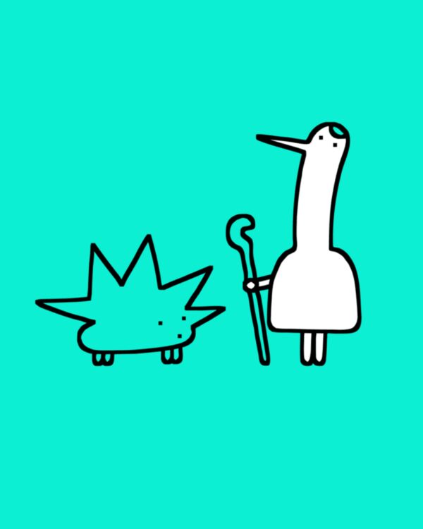
Human, a factual storytelling brand, has unveiled a new brand identity in collaboration with design studio Office of Overview. Produced by Zandland, Human is a video series that conveys the stories of people and communities—stories that are not easily accessible—through an unfiltered perspective. The new design stems from the brand's perspective that "the best way to understand the world is to listen to people's stories directly." The core of the identity is "Jeffersonian Transcription," which records actual conversations. The [… ] that occurs when speaking

Franki, a taste and community-based restaurant platform

Franki, a restaurant discovery and rewards platform, has unveiled a new brand identity in collaboration with global creative studio Koto. Moving away from existing recommendation services that relied on star ratings and anonymous reviews, the platform aims to transform into a community-centric space where actual users' tastes and experiences lead to their next visit. The core idea running through the brand strategy is 'Make Time Dance.' The new identity stems from the personality of the 'Jester,' a cheerful and free-spirited clown. The warm, curved wordmark and Diatype [… ]

Design studio's own football club created with Figma Weave

Design studio ZAK has unveiled its own football club identity, 'ZAK FC,' to align with the World Cup atmosphere. Rather than an actual sports brand launch, this project is an example of extending the studio's internal play and experimentation into brand design. ZAK created its own club, inspired by Hoodzpah Design's transformation of the studio into 'Inter Hoodzpah FC.' Based on the premise of its founding in 2018, 'ZAK FC' playfully [… ] incorporates the symbols and merchandise systems typically associated with a football club.

Coca-Cola Unveils Global Brand Identity Strengthening Symbolic Assets

Coca-Cola has unveiled a new global visual identity system. The goal is to establish a consistent brand experience across more than 200 markets, ranging from packaging and digital experiences to stores, refrigerators, and sales equipment. The new design will be rolled out sequentially, focusing on Latin America, Europe, the Middle East, and Asia. Instead of creating a new logo, this rebranding more actively utilizes the design assets that have symbolized Coca-Cola. Coca-Cola red and white, the Spencerian script logo, the wave [… ]

Sonata, Medical Data Solved Through Artistic Experience

The preventive healthcare service SONATA has launched in New York, San Francisco, and Los Angeles. SONATA is a membership service that integrates whole-genome sequencing, over 140 blood biomarkers, biological age, wearables, and medical records, with continuous management by medical specialists. The annual fee for founding members is $2,500. The brand identity was designed by Little Plains, a New York-based branding and experience design studio. The studio handled SONATA's naming, brand strategy, positioning, language system, visual identity, [… ]

OVO, 에그타르트 페이스트리가 느껴지는 브랜딩

에그타르트 브랜드 OVO가 일상의 작은 즐거움을 브랜드 경험으로 풀어낸 새로운 브랜드 아이덴티티와 패키지 시스템을 공개했습니다. 이번 프로젝트는 브랜드 디자인 스튜디오 The Lab이 진행했으며, 에그타르트의 형태와 제작 과정을 브랜드 전반의 시각 언어로 확장한 것이 특징입니다. OVO는 달걀처럼 단순한 재료도 창의적인 해석을 통해 특별한 경험으로 바뀔 수 있다는 철학을 바탕으로 브랜드를 구축했습니다. 이러한 메시지를 시각적으로 전달하기 위해 […]

SFMOMA Sans, 전시 공간을 위한 전용 서체

미국 샌프란시스코 현대미술관(SFMOMA)이 관람객의 가독성과 접근성을 높이기 위한 전용 서체 SFMOMA Sans를 공개했습니다. 이번 서체는 타입 디자이너 리브 킹(Liv King)이 디자인했으며, 단순한 브랜드 리뉴얼을 넘어 전시 관람 경험 전반을 하나의 타이포그래피 시스템으로 통합하는 것을 목표로 개발됐습니다. 기존 SFMOMA는 인쇄물, 환경 그래픽, 디지털 플랫폼에서 서로 다른 두 개의 서체를 사용해 왔습니다. 이로 인해 매체마다 가독성과 시각적 […]

리액터, AI 월드 모델 서비스

AI 월드 모델 인프라 기업 리액터(Reactor)가 새로운 브랜드 전략과 비주얼 아이덴티티를 공개했습니다. 이번 프로젝트는 Lovework Studio가 맡았으며, 실시간 인터랙티브 비디오를 활용해 창작자들이 직접 새로운 경험을 만들 수 있도록 돕는 리액터의 기술과 비전을 브랜드로 정리하는 데 초점을 맞췄습니다. 리액터는 AI 월드 모델을 위한 인프라 레이어를 구축하는 기업입니다. 게임 개발자, 애플 출신 VR 전문가, 코더들로 구성된 팀은 […]

틴더 리브랜딩, 관점이 더해진 데이트

틴더(Tinder)가 약 10년 만에 첫 대규모 리브랜딩을 공개했습니다. 이번 프로젝트는 디자인 스튜디오 포르토 로샤(Porto Rocha)가 맡았으며, 새로운 세대에게 틴더를 다시 매력적인 데이팅 플랫폼으로 제시하는 데 초점을 맞췄습니다. 새로운 브랜드의 핵심은 ‘목소리’입니다. 포르토 로샤는 틴더의 언어를 신뢰할 수 있는 데이팅 칼럼니스트처럼 설정했습니다. 유머와 솔직함, 위트와 공감을 오가며 데이트의 복잡한 감정을 다루는 방식입니다. 이를 위해 가상의 페르소나 […]

RUGIET, 볼드한 남성 건강 브랜드

남성 건강 및 퍼포먼스 메디슨 브랜드 러짓(Rugiet)이 새로운 브랜드 전략과 비주얼 아이덴티티를 공개했습니다. 이번 프로젝트는 펜타그램(Pentagram)이 맡았으며, 빠르게 성장하는 남성 건강 시장 안에서 러짓의 관점과 존재감을 더 선명하게 만드는 데 초점을 맞췄습니다. 러짓은 남성의 건강, 활력, 자신감, 장기적인 웰빙을 개선하기 위한 개인화된 임상 기반 케어를 제공하는 브랜드입니다. 이번 리브랜딩은 이러한 의료적 신뢰성을 유지하면서도, 보다 직접적이고 […]

세븐일레븐 코리아, 7 비주얼 아이덴티티

세븐일레븐이 한국 매장을 위한 새로운 비주얼 아이덴티티를 공개했습니다. 이번 리브랜딩은 서울 기반 브랜딩 스튜디오 MHTL이 디자인했으며, 세븐일레븐의 상징적인 숫자 ‘7’을 중심으로 브랜드 시스템을 새롭게 확장한 것이 특징입니다. 새로운 아이덴티티는 기존 로고의 핵심 요소인 대각선 구조와 초록, 주황, 빨강 컬러 팔레트를 기반으로 합니다. MHTL은 이 요소들을 단순한 로고 장식이 아니라 다양한 접점에서 활용할 수 있는 모듈형 […]

Design for Business