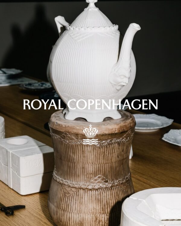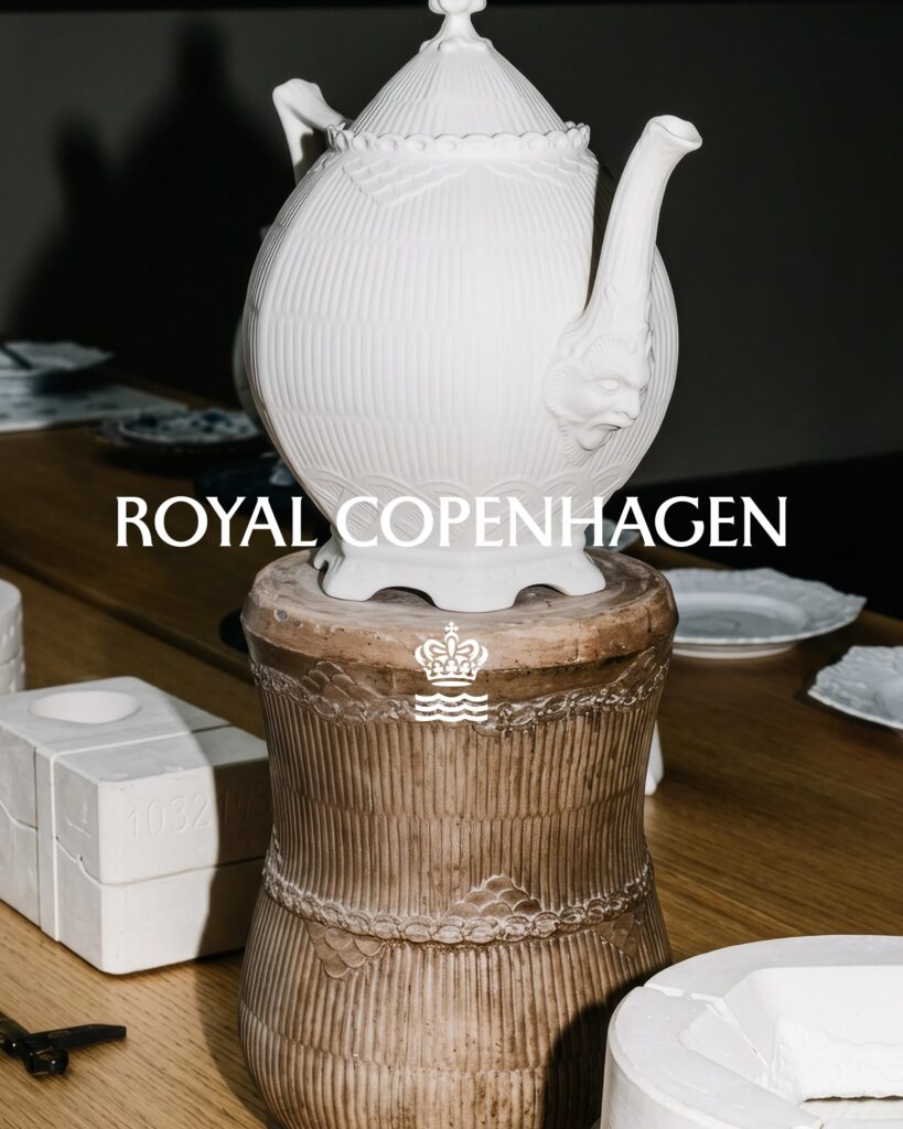
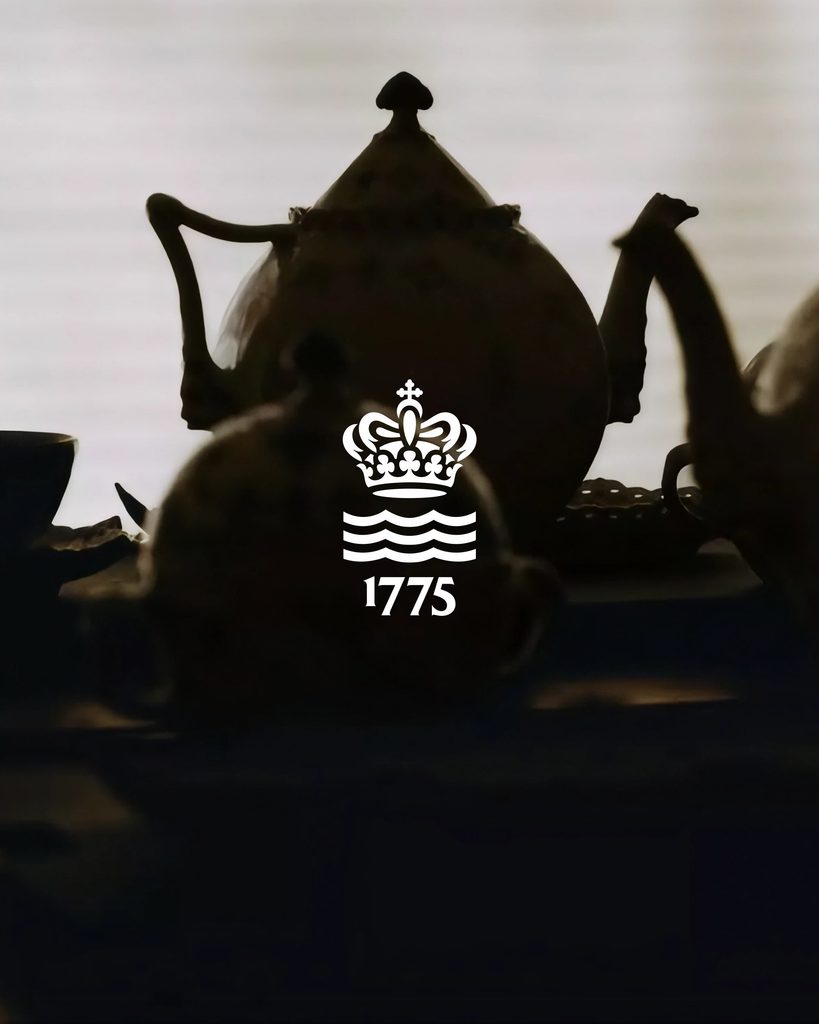
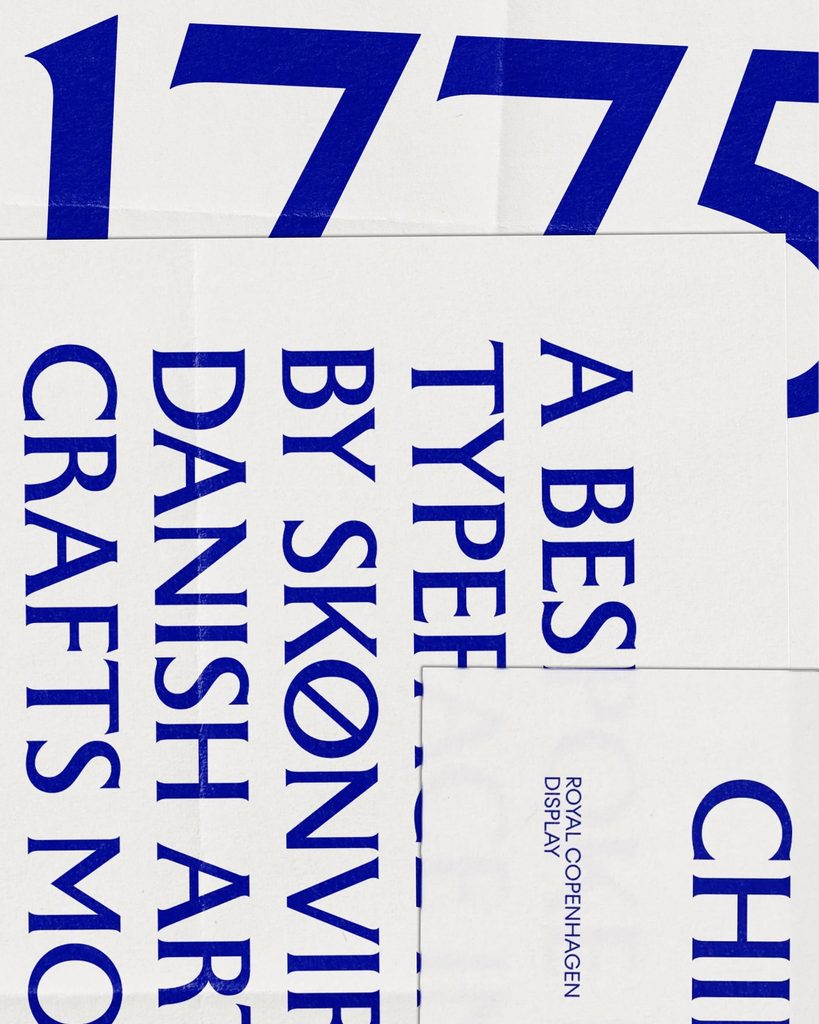
This is a brand identity design created by Royal Copenhagen in collaboration with the Danish design studio Kontrapunkt. The project refined the long-standing crown and wave motifs and developed a dedicated typeface that reflects the delicacy of porcelain. It encompasses visual design, campaigns, photography and video, and the writing style that conveys the brand's story. It was conducted based on the brand's craft tradition, established in 1775 under the patronage of the Danish royal family, and the life experiences embodied in its products.
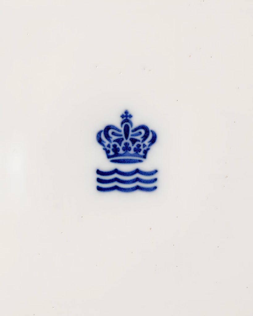
At the heart of the new identity are a crown and waves. Royal Copenhagen has traditionally imprinted a royal emblem, three waves, and the signature of the artist on the underside of its products. These markings signify the authenticity of the product, the royal history, and the handcrafted nature of the production. Contrapunkt maintains these familiar symbols while refining the form with sophistication. It is combined with a proprietary typeface designed to capture the delicate impression of the porcelain.
The phrase that runs through the brand is "Royal Copenhagen is made with life." It captures the brushstrokes of the artisans who create the pottery, along with the lives of the people who use the dishes. Family meals, anniversaries, everyday coffee-drinking, and the experience of passing the products down to the next generation serve as the subject matter of the brand's story. The structure is such that the narrative, which begins during the production process, continues through the moments of using the product and the process of cherishing it for a long time.
The rebranding also refined the method of conveying these stories. It designed the sequence and hierarchy of messages and addressed the campaign concept and content creation together. It integrated photography, video, and motion expression into the process of creating the logo and typeface. A crown and waves represent the brand's history, while the exclusive typeface and stories about daily life constitute the new identity.
See more and sources